Good afternoon, ModBloggers! It’s a sunny day, there’s a cool breeze, maybe you’ve got a frosty beverage in your hand…you know what that means, right? That’s right: Time to kill some m.-fuckin’ zombies. Just follow Jayse‘s lead and you’ll be just fine.
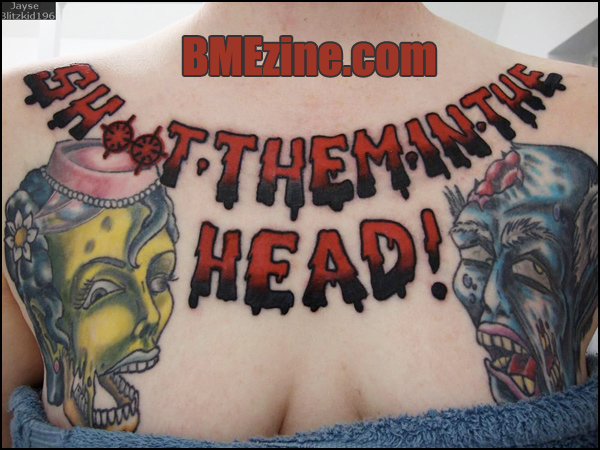
(Tattoo by Geary Morrill at Splash of Color in East Lansing, Michigan.)
See more in “Sci-Fi Tattoos“ (Tattoos)
 BME/News and Modblog highlight only a small fraction of what
not enough visuals, and too much text.
arrgh this would be so nice if the text was centered around the neck.
haha congrats on modblog!
loved the fact that the text is huge!
adore the idea. could have been executed in soooooo many different (better?) ways.
but kudos on the very tight ink 🙂
I’m crazy about this!!!!
(ps how do i make it so that my name will link to my iam page? Am i just retarded?)
@Jane.Jones: just put the link to your iam on the “website” space on the reply box
Hasnt this been posted already??? Or did I just see it on BME and cringe because of the centering?
zombies are really evolving this past couple of years, theres a new game called dead space and for all those gamers out there who play left for dead , killing zombies has changed alot. now that theres large tanks and smoking zombies and ones that jump from building to building and being declared infected the second they die instead of crawling from there graves half decade even movies have changed the look of zombies for examples planet terror and 28 days later and resident evil in comparison to the old movies night of the livign dead and short music movie with micheal jackson , i cant recall the name of the song. i think we need to up the designs with our new knowledge of zombies or infected bodies for those who wish to glorify there limbs and body parts with the glorifaction of the lifeless flesh tearring zombies
The text doesn’t look like a tattoo…maybe it’s my eyes…but WOW…This goes top of the list for best chest pieces…
i agree with 10… txt looks fake almost?
But i do <2 the text
text is definitely photo-shopped
it looks fake because it doesnt look like its sitting on the skin, possibly a trick of the light, but since you cant see the pore holes as usually you can it looks fake. not sure to be honest, but its sick regardless.
Damn, you guys are too good. It’s all Photoshopped, obviously. Everything. All you see around you…Photoshopped.
Is this a fallout 3 reference?
😮
just wondering.
Knowing Geary, it ain’t a photoshop.
I’m envious. Even though Geary provided me with a phenomenal zombie/raptor piece of my own.
i wonder if it will scare her baby while she is breastfeeding…?
I guess this is well-executed, but a pretty poor choice. Cheesy font and obviously way too crowded. It’s almost like they didn’t consider the fact that it was going to be on a body.
i don’t know if i entirely like the placement/hierarchy of the piece.. i agree with the whole not centered thing and how the text might be too big…
but i still love this way more then is healthy. i’m going to sneak a zombie tattoo in somewhere eventually.
If you actually Check out her page, you will realize that the text (even tho it looks like it) isn’t photo shopped…
this isn’t really my cup of tea… i think it could have been executed better, but as long as she loves it, thats all that matters…right.
Will you marry me?
please.
yay the faces! the text is… its alright. Looove the girls jaw.
I am really keen on the text/whole idea of the piece.
Is it just me or does it look like the text was added at a later date? Like it’s an addition to the two heads.
Correct me if I’m wrong…
i love horror/zombie themed pieces..i may have to get one one day
i love that you could see a picture of this womans face and be utterly clueless that she is into tatts let alone has a huge chest piece! nice going!
i also ♥ LOVE ♥ how people jump to the ‘ITS PHOTOSHOPPED!’ conclusion. nice.
It looks great, but then again it looks weird….. or is it just me?
Love the placement of the heads!
That is ugly and very poorly executed.
at first glance it looks fake but if you look closer you can tell its real. i lovee the text :]
I think the text looks fake because the faces are healed/slightly faded while the text is freshly done?
for the zombie lovers who like a laugh. I hope you’ve already seen this but if you haven’t : http://bouncewith.me.uk/europe/8027043.htm
swine flu….
its happening
xanders got a good point it might scare her child while its breast feeding lol
Is this an MC Chris rant reference? Or just a quote of common zombie knowledge?:
http://www.youtube.com/watch?v=HZsDUSxK5Fs
It bothers me how much I do not like this. The design is so poorly considered and I think it is too big. I guess it upsets me to see a tattoo on such an unpleasant subject (Honestly? ‘Shoot them in the head’ on your chest?) done badly, or what I consider to be bad. I genuinely love the joke, but it’s better committed to a t-shirt where bad designs enhance the joke instead of making it pitiable.
Zombies!
3 (Vomit) – haha thanks.
10/11/12/13 – nope, not shopped.
15 – also no
17/32 – I don’t plan on having kids let alone carrying them. But if by some mistake I end up breastfeeding, thank god for Childhood Amnesia. Or I could just cover the tattoo up.
33 – nope
I wanted the text to be the main point of the tattoo, thus why it’s so big. It’s also not done yet, I’m planning on getting a purple background which should help to tie everything together.
thanks for all the positive comments, everybody that had them. 🙂
Forget trying to sound clever: This bitch is stupid.
Like the text, though not a fan of the OO being crosshairs. should be actual OO imo.
😀
I agree with skwid on the “oo” but that’s just personal preference.
A purple background? That sounds fantastic! I can picture that looking really good when it’s done.
god damned! zombies are the most beautiful undead persons!!!!!!!!!! |
Love the Zombies, thats it.
I’m not a huge fan of this. I certainly love seeing zombie tattoos, but the layout of this piece just looks funny, like it was kinda thrown together without much thought.
I like the way the text was done!
It really threw me off that this is a chest piece but the zombies actually extend onto her boobs (most chest pieces I’m used to seeing don’t extend that low) but I like that about it! Makes it unique 🙂
i LOVE the fact that the Os are crosshairs, i wouldn’t do it any other way! 🙂 the red just pops! i love the thick black outline, and the fade from black looks great. i think it looks wonderful!