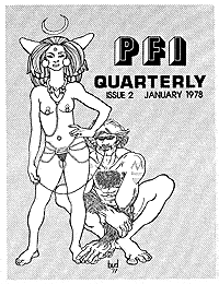
 Chronologically this article should have preceded the previous one because Gauntlet had published several issues of its piercing magazine before the opening of the store. The reason for the slight detour will be explained a little later. When I first started Gauntlet, publishing a piercing magazine couldn’t have been further from my mind. But it quickly presented itself as a very natural aspect of the work I was doing. As piercing enthusiasts began hearing about Gauntlet, a typical type of correspondence started to arrive in the mail on a regular basis. Up to that time people who were into piercing were pretty much on their own. If they wanted a piercing they had to figure out how to do it themselves or get a sympathetic friend to assist them. There was no readily available resource for information on piercing technique or for the tools and materials to do it. In general the results were less than satisfactory. Piercing enthusiasts were also widely scattered all over the globe and for the most part very closeted. Consequently many of the letters I received contained the same two questions: First, how do I pierce my or my girl/boyfriend’s insert name of piercing here? Second, how do I go about meeting other people into the scene? Needless to say answering these questions repeatedly made it quickly apparent that there had to be an easier, more professional way to meet the demand. The obvious solution was a magazine. Since there was clearly a growing interest in piercing, why not? My artistic background aside, I had no knowledge or experience along this line. Perhaps if I had, I might have thought twice about pursuing the matter, but like a rushing fool I began making plans and gathering the information and resources I needed. Early in the days of the T&P group, someone had suggested we call ourselves “Piercing Fans International.” The name never stuck in no small part because the members were pretty much people who lived in the Los Angeles area. However, when I was trying to think of a name for the magazine I remembered the suggestion. Finding enough material to put out a monthly would have been a major challenge, but a quarterly seemed within the realm of possibility. So the magazine quite naturally became Piercing Fans International Quarterly, or PFIQ for short. Doug was an avid photographer, especially where piercing was concerned. Although he had a fine camera and some basic skill in using it, his philosophy was that if you took enough photos, some of them were bound to turn out. Consequently he spared no opportunity to take lots of pictures of piercings and pierced people whenever he had a chance. I had free access to these and figured that they would provide an ongoing source of material for the magazine. Under Doug’s influence I also went out and bought a good camera and spent some time learning how to use it. After all, Doug wasn’t always around when a photo opportunity presented itself. A regular contributor to the magazine was a local gay artist who went by the name of Bud. His work occupied thirteen of the first fourteen covers and after we went to color appeared regularly inside. I had seen his work in the gay S/M magazine Drummer. How we actually met and connected, I’ve forgotten. I do remember that he did some tattoo designs for some clients of Cliff Raven, a T&P group regular. Bud’s imaginative pen and ink drawings show the strong influence of both comic and early fantasy and sci-fi art.
|
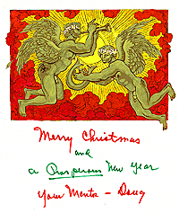
Doug was very taken with Bud’s work and even commissioned him to do a watercolor Christmas card design to send out to his piercing enthusiast friends. It shows a pair of pierced cherubs playing musical instruments. Fortunately Doug left the small painting in my care otherwise it probably would have been destroyed by his wife after his death.
By September of 1977 I had managed to assemble what I thought would be enough material for the inaugural issue. It seemed only natural that this issue should contain an interview with Doug. He was, in my eyes at least, the man responsible for setting everything in motion. There was also an article about male infibulation entitled “The Story of Nils.” It was one of Doug’s stories and included photos he had taken of a T&P group member who went by the name of Viking Navaro. To round out the primary content there were about a dozen photographs by an Australian photographer named Johnny Lee. Just how Doug had obtained them I don’t know, but they were all of attractive pierced women, a couple with pierced nipples, but most with ear or nostril piercings. They had the look and feel of photos dating from the 50s.
With all the requests I’d received from people wanting to meet others into body piercing, it was clear the magazine needed classified ads. I called these “Pin Pal” ads. The original intent was just to make them part of the content, but on further consideration I realized it would be better to print them separately and mail them with the magazine, not in it. There were several reasons. Initially we allowed people to include addresses and phone numbers in their ads. But since privacy was an issue, it would have meant not being able to sell the magazine on newsstands. The other reason was one of cost. It would have been a lot more expensive to put them in the magazine and much cheaper to just print them inexpensively at a local quick-print shop.
I soon stopped accepting personal contact information in ads altogether. Why give any would-be competitor such easy access to my clientele? From then on we offered a mail forwarding service so subscribers could confidentially contact one another.
The next challenge was to get the material assembled into a magazine and printed. Through a T&P connection I was introduced to a man in San Francisco named Lee who had a small print shop. He was known in fist fucking circles as the publisher of the T.A.I.L. (Total Ass Involvement League) newsletter. At the time he undertook the printing of PFIQ, his shop was proudly printing a four-color image — four runs through a one-color press — of a muscular arm inserted into a tattooed male butt. Needless to say he wasn’t squeamish about the content of PFIQ. In addition Lee knew and introduced me to a graphic artist who was able and willing to assemble my collection of material into magazine layouts.
Materials in hand I boarded an airplane for San Francisco. I’d made an appointment to spend a day with the layout artist watching, overseeing the project, and proofreading the copy while he was typing it into his professional IBM Selectric. In that one day I learned enough that when I returned home I was able to do the layout of almost every issue of the magazine that followed. The artist charged me a little under $200. It was without question one of the best deals of my life.
I’ve discussed earlier what layout was like in the days before the home computer. The magazine layouts were done on large sheets of light weight white cardboard printed with a grid of squares in pale blue ink. The film used to make the printing plates is insensitive to that particular “non-reproducing” color. Everything that was to appear had to be stuck onto the page. The artist applied a thin layer of a sticky wax to the back of the pieces. This acted as an adhesive, but made it easy to lift and reposition them if necessary. The pale blue grid made lining things up a lot easier, though it was still a time consuming process.
Wherever a photograph was to be inserted, the artist would lay down a rectangle of an adhesive backed red film called rubylith. While pale blue was invisible to the film, the red was perceived as black. Thus when the layout was photographed, on the negative that was shot there would be a clear “window” into which would be taped a negative halftone of the image. Every photo was measured, and using a special tool called a “proportion wheel,” sized so the printer would know how large to make it to fit the layout.
With the layouts complete I went to see the printer. His shop foreman took them and the photographs into the darkroom and started the process that would produce the printing plates. From there it was onto the press.
|
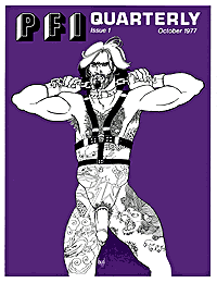
The issue had 16 pages. Its original print run was 500 copies of the magazine and “Pin Pal” ad sheets. The cost of the job was just shy of $500. The subscription rate was $12.00 per year domestic, $14.00 overseas. The October 1977 issue was soon being put into envelopes and mailed to subscribers. Unfortunately I can’t remember how many actual subscribers we had at the time, but there were a number of copies left over. These eventually sold out over the counter and to new subscribers, and in time I had the issue reprinted.
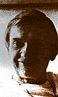
As I mentioned earlier, this issue featured an interview with Doug. While the magazine was in production and being printed, he was out of the country. I knew that he was very closeted about his piercing activities, but as a tribute to him I still wanted to use a photo with the article. But there was no way to get ahold of him for his approval. As a solution I thought I could resolve the problem by having the printer “solarize” the image. That’s a process of making it so high contrast that it’s reduced to only a few tones, and I thought it would provide sufficient disguise so that he wouldn’t be quite so recognizable. Nowadays solarization can be done easily with a good computer program. Unfortunately, at the time I didn’t even know there was a word for what I wanted much less how to describe it. The printer tried to follow my instructions as he understood them, but the result was less than satisfactory.
|
in PFIQ issue 1.
Doug returned as I was preparing the first issues to be mailed. I proudly presented him with a copy of this history making document, but my pride and enthusiasm were short lived. He was very displeased that I had included a recognizable picture of him. Caught between hurt and anger at myself, on the verge of tears, and knowing that it was too late and too expensive to have the magazine reprinted, I went to the hardware store after Doug left and bought a can of matte black spray paint. Returning home, flushed with upset and humiliation, I took a piece of thin cardboard and cut a rectangular hole in it the same size as the photo and started obliterating the evidence of my poor judgement by placing the stencil over the images one by one and spraying a swath of black paint across Doug’s face. As soon as the paint dried the magazines were stuffed back into their envelopes. I couldn’t wait to be rid of them as quickly as possible and immediately took the first batch to the post office just down the street. It’s possible some of these copies still exist in someone’s collection today. If so, they now know why Doug’s face is obliterated.
I’ve no recollection how many copies endured this defacing, but several hours later and before I could mutilate any more, Doug called me. He apologized for overreacting and said that since the only people who would be receiving the magazine would be piercing enthusiasts, many of whom already knew him, it seemed silly to worry about. Besides, the circulation was very small. As a result the remainder of the magazines were mailed out with his face unobscured.
Collectors may be interested to know that there is a subtle but distinct difference between the first edition of issue #1 and the reissue. In the first edition purple and brown inks were used on some of the inside pages. To save money on the reissue, only the cover has purple ink.
|
 BME/News and Modblog highlight only a small fraction of what BME has to offer. Take our free tour and subscribe to BME for access to over 3 million body modification related photos, videos, and stories.