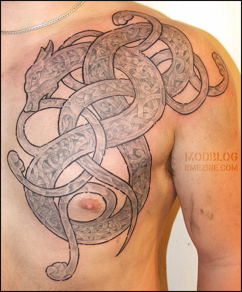
This gorgeous freehand Celtic knotwork piece was done by Jeppe Isbak at I.C. Art Tattoo in Denmark.

This gorgeous freehand Celtic knotwork piece was done by Jeppe Isbak at I.C. Art Tattoo in Denmark.

 BME/News and Modblog highlight only a small fraction of what BME has to offer. Take our free tour and subscribe to BME for access to over 3 million body modification related photos, videos, and stories.
that shading is to die for
that shading is to die for
now _that’s_ good celtic.
now _that’s_ good celtic.
WOW!!! I love it. I want some sort of celtic design at some point. This looks fantastic.
WOW!!! I love it. I want some sort of celtic design at some point. This looks fantastic.
It looks amazing except for all the blank spots in the outline. I’m sure it’s supposed to be like that since there’s so many of them but i really hate it! Sad to say it since it’s obviously great work
It looks amazing except for all the blank spots in the outline. I’m sure it’s supposed to be like that since there’s so many of them but i really hate it! Sad to say it since it’s obviously great work
I was thrown off by the blank spots in the outline as well. It looks like it might be still healing, and those are cracks in the (possibly a little too-dry) tattoo where the skin is bending and the tattoo is still scabby.
I was thrown off by the blank spots in the outline as well. It looks like it might be still healing, and those are cracks in the (possibly a little too-dry) tattoo where the skin is bending and the tattoo is still scabby.
I just dont liked the outer line, but it’s my point of view.
Agreed with Liz, to die a hundred times.
I think the white spots are like little broken parts, just an effect.
I just dont liked the outer line, but it’s my point of view.
Agreed with Liz, to die a hundred times.
I think the white spots are like little broken parts, just an effect.
This is gorgeous work…maybe I’m going against popular opinion, but I liked the breaks in the outline, it reminded me of a design on an old tombstone or church…love this!!
This is gorgeous work…maybe I’m going against popular opinion, but I liked the breaks in the outline, it reminded me of a design on an old tombstone or church…love this!!
That is a great design. Not sure about the breaks though.
That is a great design. Not sure about the breaks though.
I like this! I am no expert on anything like this but it looks to me like the ‘blank’ spots are where the ‘cracks’ run to the edge? As if it is made of stone?
I like this! I am no expert on anything like this but it looks to me like the ‘blank’ spots are where the ‘cracks’ run to the edge? As if it is made of stone?
i actually quite like them and pretty much share the sentiments of Venusimpelz.
also, isnt that ink on his arm? i assumed at least part of it was still fresh cos of that so it will probably look a little different eventually…
i actually quite like them and pretty much share the sentiments of Venusimpelz.
also, isnt that ink on his arm? i assumed at least part of it was still fresh cos of that so it will probably look a little different eventually…
definitely love the inside stone celtic work, very well done.
I think the outline could have been thinner though…As I think the thing that is throwing it off is the big bold black outline
definitely love the inside stone celtic work, very well done.
I think the outline could have been thinner though…As I think the thing that is throwing it off is the big bold black outline
pretty sure the blank spots on the outer edge are to make it look more like old/crumbly stone. difficult to tell with the picture being so much smaller than real-life-size though.
pretty sure the blank spots on the outer edge are to make it look more like old/crumbly stone. difficult to tell with the picture being so much smaller than real-life-size though.
Stunning!
Stunning!
that is amazing. i wish i could steal it
that is amazing. i wish i could steal it
i’m usually not too fond of celtic designs as they have unfortunately become very “flash art”-ish. but this is great work — i especially love the stone look. definitely unique.
i’m usually not too fond of celtic designs as they have unfortunately become very “flash art”-ish. but this is great work — i especially love the stone look. definitely unique.
Yeah those cracks give an ‘authentic’ feel and stop it from being a bog standard Celtic tat.
Stunning shading work. Totally adore it.
Yeah those cracks give an ‘authentic’ feel and stop it from being a bog standard Celtic tat.
Stunning shading work. Totally adore it.
i LOVE the contrast of the dark black border against the soft grey shading. Very different, very pretty.
i LOVE the contrast of the dark black border against the soft grey shading. Very different, very pretty.
Oh my gosh, that is beautiful. LOVE it. The grey shading is amazing.
Oh my gosh, that is beautiful. LOVE it. The grey shading is amazing.
truly beautiful
truly beautiful
I don’t think thats traditional celtic, it looks more nordic to me or even nordic anglo-saxon. The knotwork style looks to late, maybe 8th century, to be true celtic.
– sam
I don’t think thats traditional celtic, it looks more nordic to me or even nordic anglo-saxon. The knotwork style looks to late, maybe 8th century, to be true celtic.
– sam
I love it.
I love it.
Also, 10 points for Sam.
Also, 10 points for Sam.
That may be one of the most beautiful tattoos I’ve ever seen.
Wowch.
That may be one of the most beautiful tattoos I’ve ever seen.
Wowch.
Jewpunk is right on, this isn’t Celtic, it’s Nordic, from the Viking era. They’re obviously very similar stylistically (perhaps because the Vikings invaded the UK and Ireland and stayed there for a while), but Celtic designs tend to be symmetrical and the knot patterns more “orderly”, while Viking designs aren’t.
Check out Danish tattoo artists Erik Reime and Colin Dale at Kunsten på Kroppen (“the art on the body”) for some excellent stippled/dot-shaded examples of the style.
I wish Jeppe Isbak had a site, I’d love to see more of his work!
(Hey Shannon, might want to change the title & copy…)
(Hey Shannon, might want to change the title & copy…)
I’m a huge fan of Celtic. It’s very closely related to the Celtic design,but I’d have to agree with it being closer to the Viking style. That’s beautifully shaded. It’s not an in your face,over done thing. Very Nice – whether it’s Celtic,or Nordic.
I’m a huge fan of Celtic. It’s very closely related to the Celtic design,but I’d have to agree with it being closer to the Viking style. That’s beautifully shaded. It’s not an in your face,over done thing. Very Nice – whether it’s Celtic,or Nordic.
I think it looks great. I am Norwegian and I am looking for something similar, not as big, but I want the “carving” to be like on the Gokstad viking ship.
I think it looks great. I am Norwegian and I am looking for something similar, not as big, but I want the “carving” to be like on the Gokstad viking ship.
To go even further, i´d say this looks Anglo-Saxon rather than Nordic or Celtic.
To go even further, i´d say this looks Anglo-Saxon rather than Nordic or Celtic.
looks like Jelling style work; 10th century Nordic art.
looks like Jelling style work; 10th century Nordic art.
Looks totally Nordic! I saw this photo and thought “holy shit thats nice”
Looks totally Nordic! I saw this photo and thought “holy shit thats nice”