For those who aren’t art history majors, De Stijl was an artistic movement from in and around the 1920s. You may not know it by name, but you’d probably recognize some of the art. Most notably Piet Mondrian’s Composition series, a white background with thick black lines filled in with red, blue and yellow. The movement was wide reaching and affected not only artists, but architects, fashion designers, and even a musician. The key elements of the movement were horizontal and vertical black lines, rectangular forms, and only incorporated red, blue, and yellow for colors, as well as black, white, and grey.
IAM: KnifeInTheMachine has taken these elements to heart, and with the help of his artist, Jerson Filho from Brazil, have created a stunning piece that fits into the De Stijl style perfectly.
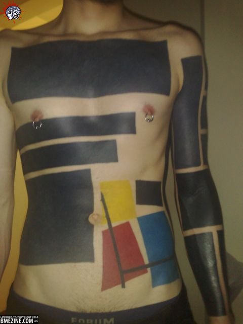
If you’re an IAM member, head on over to his page to check out some more pictures of the piece.
 BME/News and Modblog highlight only a small fraction of what
I’ve always loved how this tattoo works against his body. Stunning.
I’ve always loved how this tattoo works against his body. Stunning.
Brutally awesome.
Brutally awesome.
it’s ‘Mondriaan’ instead of ‘Mondrian’, just for the record 🙂
it’s ‘Mondriaan’ instead of ‘Mondrian’, just for the record 🙂
@jvn: From wiki:
In 1911, Mondrian moved to Paris and changed his name (dropping an ‘a’ from Mondriaan) to emphasize his departure from the Netherlands.
@jvn: From wiki:
In 1911, Mondrian moved to Paris and changed his name (dropping an ‘a’ from Mondriaan) to emphasize his departure from the Netherlands.
I dig it all, especially the arm.
I dig it all, especially the arm.
Sorry but the supposed Mondrian piece is a complete failure. Mondrian never used tilted shapes in any of his pictures. Completely ruins the effect of having a solid & harmonious structure in place. Also the many black shapes around the ‘Mondrian’ thing are just plain retarded. Can’t see what this is supposed to have in common with the De Stijl movement (apart from the fact that they also used simple geometric shapes in their art). Just looks cluttered – the simplicity & minimalism of the style are completely lost….
Sorry but the supposed Mondrian piece is a complete failure. Mondrian never used tilted shapes in any of his pictures. Completely ruins the effect of having a solid & harmonious structure in place. Also the many black shapes around the ‘Mondrian’ thing are just plain retarded. Can’t see what this is supposed to have in common with the De Stijl movement (apart from the fact that they also used simple geometric shapes in their art). Just looks cluttered – the simplicity & minimalism of the style are completely lost….
I really like this. Not just because I’m an art nerd but because it just looks really good on him.
I really like this. Not just because I’m an art nerd but because it just looks really good on him.
awsome!
awsome!
* IAM: KnifeInTheMarathon
The belly design is inspired by Theo van Doesburg “Simultaneous Counter-Composition” (1929-1930) and by Kasimir Malevich “Black Square” (1930).
* IAM: KnifeInTheMarathon
The belly design is inspired by Theo van Doesburg “Simultaneous Counter-Composition” (1929-1930) and by Kasimir Malevich “Black Square” (1930).
“Simultaneous Counter-Composition” inked by xbicudox
“Simultaneous Counter-Composition” inked by xbicudox
Love it!!
Love it!!
I really love this. The whole design is nicely balanced and not as simple as it first appears. I’m very jealous.
I really love this. The whole design is nicely balanced and not as simple as it first appears. I’m very jealous.
@ #6 — I don’t mean to be rude, but isn’t art supposed to be interpretive? I mean, everyone’s borrowed an idea for inspiration at some point. It looks good as a tattoo and as a nod to Mondrian, so why be the textbook art snob and harsh on someone else’s interpretation of a widely acknowledged and widely reinterpreted piece of art?
@ #6 — I don’t mean to be rude, but isn’t art supposed to be interpretive? I mean, everyone’s borrowed an idea for inspiration at some point. It looks good as a tattoo and as a nod to Mondrian, so why be the textbook art snob and harsh on someone else’s interpretation of a widely acknowledged and widely reinterpreted piece of art?