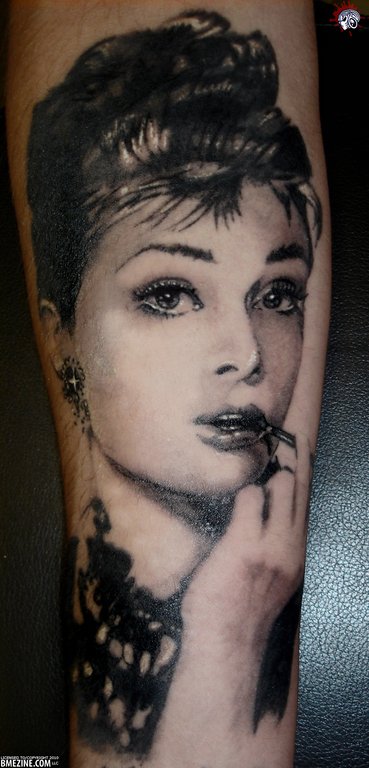
If you don’t know who the portrait of the woman below is, then you need to stop everything you’re doing and go watch Breakfast at Tiffany’s. You see, this young woman portrayed here is none other than the eternally beautiful Audrey Hepburn, in her role as Holly Golightly.
Now, the question always seems to come up when talking about actresses like Audrey Hepburn. Is she the most beautiful actress ever? What about Liz Taylor, Anne Margaret, or Isabella Rossellini? At some point or another, they were all considered to be pinnacle of beauty. Do you have a favorite?
As for Audrey up there, the portrait was done by LiquriceTattoo, and can be found in the portrait tattoo gallery.
 BME/News and Modblog highlight only a small fraction of what
the proportions are off. sorry. It’s not horrible, but it bothers me that it doesn’t look right. It’s Audrey – she’s always supposed to look “right.”
to back up what I’m saying – check out the source photo. It was originally flipped. http://tinypic.com/r/21mrtdu/7 look at something simple like the height of the hair or the size of the ear/earring.
I love that movie. Audrey Hepburn is cute but from that era there are many actresses that I find far more beautiful, Sophia Loren, Ingrid Bergman, Vivien Leigh, Rita Hayworth, Jayne Mansfield… Grace Kelly, of course.
I’ve always been really partial to Bette Davis though. I know she’s not a classic beauty but she’s awesome.
I feel like I’m forgetting someone… They were all so glamorous and Humphrey Bogart was the man.
@Jen: Sophia Loren! That’s who I was thinking of when I wrote Isabella Rossellini.
But you’re spot on with all the names.
Also, this is just my personal opinion, but I really feel like modblog would be greatly improved if you picked mods that were very high quality (or low quality as a warning to others) instead of mods that you feel like writing a paragraph about to start a discussion on a topic you like. The discussions here should be kept mostly to mods as this is “modblog” and not always be some aspect of life that you find fascinating like pretty classic actresses.
There was a time when high quality mods and interesting/beautiful photos were displayed with no text other than the title, and that was perfectly fine – and better than mediocre mods including a barely related discussion question. Not many people here actually discuss your topics anyway. Usually they just fight about whether what you post is appropriate or not. So maybe take a hint from that?
@meow: in my humble opinion, the displayed tattoo is of a very high quality! Seems like the impression/definition of ‘high quality’ is a pretty subjective one, doesn’t it?
Fantastic execution of this amazing portrait!
actually… this is one of the few “quality” portraits shown in awhile!! it’s very well done… proportions or not… does it look like her? hell yes, does it look like she has fetal alchohol syndrome? no.
awesome use of white for the accents, and the artist worked the area and size well… nothing distorted.. who cares if he gave her smaller hair and different earings.. kudos to him for spicing it up.
its my personal opinion that this tattoo looks better than the photo.
when comparing the two its obvious that the artist changed the hair a bit. the necklace seems to geta lil lost but im sure all of those things are intentional. thats how portraits are supposed to be. draw the eye to whats important. that would be the face. the artist is simply tricking you to look at the face and not the hair and necklace.
if you look at any good tattooed portraits you would see that example time and time again. a+
hahahaha. Meow is such a bitch
I don’t know, I’m still in doubt about this one.
I absolutely Adore Audrey, and to me she was the epitome of beauty in a flirty fun way, without losing the class. And when I look at the tattoo, I agree that it’s well executed, but at the same time I see little things that irk me, and of which I think it could’ve been done slightly better (I guess my main peeve here is the jawline and the mouth).
Otherwise, very nice 🙂
It’s one of those tattoos that was done with good technique but questionable execution. It’s not the completely hilarious mess that the Neil Patrick Harris tattoo was, but at the same time you look at the lips and the jawline and the cheekbones and the inability to translate the look in her eyes (which is difficult to reproduce) and you’re just like “eh, not quite Audrey.” Why the decision to alter her full, pouty bottom lip to that crooked lip with a corner on it somehow? Why exclude the hollow in her left cheek? Why decrease the distance between her nostrils and her pupils? Why change the angle of her head? I wish there were artist commentary on these tattoos when they were posted to give some artist perspective on any challenges etc. that they faced in trying to pull them off.
I <3 Audrey but Isabella Rossellini is pretty damn fantastic too!!!
In changing things, he lost “Audrey”
and that hair looks like a mess piled on top of her head in the shower. I’m pretty sure that wasn’t on purpose.
Portrait tattoos are about realism (most of the time at least) not about the artist’s impression of the piece. This artist isn’t horrible at portraits, but it’s far from perfect. If you loved Audrey so much that you want a picture of her on you for the rest of your life, you’d probably want it to actually look and feel like her. I’m glad that some of you think it does look like her, and I hope the owner of the tattoo thinks that. However, my opinion is that it’s lacking.
The quality comment was a general comment. I’m sick of the stupid discussion questions in every single post, and I wish Rob would just shut up for a post or two. Well, at least he doesn’t say “keep on keeping on” every post, so I guess we can be thankful for that.
All this blog needs to be interesting again is some discretion when choosing your submissions and for Rob to get his own personal blog so he can stop using this one to socialize.
@meow: I hate to break it to you, but I don’t actually ask questions in “every single post”. Plus, if you just want me to post a pic without commentary, then just look at the pictures and skip the text. But if you’d rather just criticize regardless of the content, well then keep on keeping on. 🙂
Oh, as for the tattoo, you also have to remember that this is on skin, on someone’s leg. It could be that her face is elongated simply because of the way the leg is positioned.
You could accept criticism a little more gracefully. If you’re not open to the opinions of people, disable comments.
oh har har, Rob
Glad you appreciate my humor meow. I like that you keep me on my toes.
Liquorice Tattoo are happy to discuss any tattoos we post and challenge/accept criticism as and where appropriate, however we are not in the habit of entering into arguments about artistic license.
The tattoo is on a fairly thin forearm and some distortion may have occurred but the most important thing is the wearer of this tattoo is beyond delighted.