Kim had this done by Midas at Cobra Custom in Plymouth, MA.
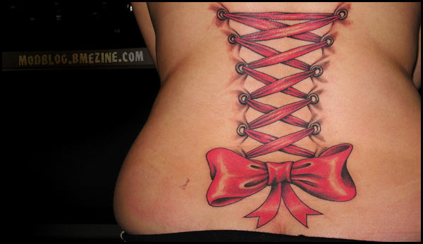
Kim had this done by Midas at Cobra Custom in Plymouth, MA.
 BME/News and Modblog highlight only a small fraction of what BME has to offer. Take our free tour and subscribe to BME for access to over 3 million body modification related photos, videos, and stories.
it’s so realistic!!
i love how it was shaded to look like skin was really being pulled 🙂
Beautifully done 😀
I dont think that this would have looked so well done if this woman would have been thinner.
Wow… very very very realistic.
I agree with #3, she looks gorgeous with a little bit more “meat on her bones”. She’s definitely not fat, just a little bit padded. Very pretty 🙂
wlcm2t3hmachine : I dont think that this would have looked so well done if this woman would have been thinner.
You just had to bring weight into this didn’t you? Even ‘thin’ girls have skin that can stretch on their backs.
I think it’s a beautiful tattoo, and no matter what weight she is, it will be a beautiful tattoo for a long time.
Just to add to that, I think every one on here needs to shut the fuck up about peoples weights. Everybody is different, and your not going to be seeing a ‘perfect’ body on anyone thats here, and we all have different ideas of what a ‘good’ body is.
ModBlog is for Body Modification, not Body Shape.
This tattoo is fucking beautiful. So is the lady.
This is one that I wouldn’t mind seeing copied over time. Beats the tribal tramp stamp hands down.
am i the only one who finds it a little bit gross?
Personally I think that they brought up her weight simply because she looks more attractive with a little bit more weight than a stick thin girl. However, I think we can respect all body shapes, even if some of us do prefer the more voluptuous chickadeeees.
Very nice tattoo indeed, the shading on the bow is superb.
People are starting to get far to touchy whenever weight is mentioned on here.
Its a beautiful tattoo and incredibly well done
i feel like they made too much ‘skin’ all the corset peircings ive seen dont seem to pull quite that much. but thats only from pictures i’ve never seen one in persons so i could be wrong? but from the looks of the ones on here they only seem to pull in a smal bit in comparison to the tattoo which seems as thought is pulling a good amount of skin becasue its so heavily shaded
#9 compliments don’t have to involve insults
Beautiful. Very sexy.
#12 where was the insult?
wow – i really, really like this.
nice tattoo.
i dont think the bow really goes with the rest. its too big. throws off the realisticness of the rest of it. but its still oober cool. i am a fan
so beautifull… i love it!
really really cool tattoo
I absolutely love this! I personally think the bow tops the whole thing off. All around I think it’s a sexy tattoo 🙂 I wish I had thought of it first haha 😉
#11 I believe there is more stretching in the tattoo because it’s done more in the style that the skin is almost like fabric not that the skin is pierced. the rings in the tattoo are metal eyelets like the ones I used in the corset I made, they reinforcing lacing holes, they aren’t piercings.
The shading around the “skin pulls” is amazing, it looks so realistic! It’s an excellent idea pulled off to perfection.
i think i agree that the bow is too large and detracts from the overall tattoo. the ribbon doesn’t look like it could be made into a bow that full…or maybe i just don’t want the bow to be that full 🙂
really beautiful, though. i love the metal eyelet things (what are they called? not rivets…damn) instead of piercings. nice!
This is really gorgeous. I think that it looks beautiful. And I think this sort of tattoo would look just as beautiful on a very thin woman as well, as well as a very heavy woman, or any woman for that matter, it would just be different. This to me, seems to fit her body perfectly!
well done tattoo! 🙂
It’s a lovely tattoo! I actually reallly like the bow, although I do agree that it’s a bit big–that’s the beauty of art. You can make something look how you want it to look, not how it does look in real life.
And the hole-reinforcments are called grommets.
What a cute idea… even better that it was actually executed very well in terms of shading (but I guess if it weren’t, why would it be on ModBlog!?) Looks great!
I love that, the bow is gorgeous.
I love this tattoo. And I really like that it looks as though her skin is becoming the fabric of the corset, rather than like she has corset piercings. It gives it a sort of creepy quality.
wow, looks so pretty!..
and that will not reject!
(i was going to say never but with my luck i’d piss off some bodmod diety somewhere and sudenly all her pink would fall out, and it would be all my fault and i’d feel horrible.)
Oh, this is beautiful! I love ink and I love corsets – why do other people have all the best ideas before I do?!
I think the big bow could have possibly been there first and the rest could have been added later. Overall, a very nice picture and a nicely executed tattoo.
that’s the most beautiful corset tattoo I’ve seen yet
Gorgeous tattoo! Very cute idea…
woah guys. I didnt say that comment up at number 3 because she was fat. I dont care. I weigh like 100 lbs, and I dont care if the tattoo was on a fat chick or not, Im just saying that if she would have been thin it wouldnt have the same affect… which.. it WOULDNT because skinny people arent as rolly curvy, we’re more subtle… so the design wouldnt be so profound… and that was ALL that I was getting at.
12– I’m sorry, I didn’t mean to include an insult in there. I think that people of all different types of body shapes can be equally gorgeous and attractive, however since I am a curvy girl, it’s what I’m used to and what I personally find attractive– however really skinny girls also have their spark.
Again, wonderful tattoo.
i thinks its really nice!
It’s beautiful – I really wish I’d thought of it first =D
I’ve seen quite a few corset tattoos before but thisis definately one of the nicest.
That looks fucking AWESOME ++
Real corsets tie at the middle, not the bottom…
I have a big pink bow on my back too (only have done at the moment) I hope when mines finished, it looks as awesome as this =]
Oh and i think this tattoo is very complimentry to her body shape, looks great
=D
This is an absolutely fantastic tattoo! I love it, and I want one now.
Beautiful.. Just gorgeous… Imagine wearing a corset and then having someone take it off to see that… YUM
The shading makes it look so real! Everytime I look at it, I forget that it’s tattooed – it really looks like her skin is being pulled. Absolutely fantastic.
I also love the big bow. If they had gone more “accurate” with the width of ribbon that it was laced with, the bow would be pretty thin and flimsy. The bigger the better with bows, I say!
It sort of makes me think… what’s underneath the corset? Heheh well, what I mean is the illusion that she’s wearing a second skin is there… and it makes me imagine that there is something else hidden under the skin 😉
I see ass-crack!!! All jokes aside… (yeah that’s me being funny!) it’s a great tattoo.
Pretty.
awwwww one of the prettiest corset tattoos i have seen around.
i would like to see some shadows “under” the ribbons and whatnot to give it more of a 3d effect.
I def. noticed the crack lol. I understand why 3. said it wouldn’t look as good on a thin chick, bc it would have to be smaller & less detailed bc thinner people are obviously not as wide.
I love this tattoo though. Great illusion.
Beautiful work.
man, I said that the illusion would be lost, gawd damn.
she has very sexy curves ; soft huggable sexyness
omg i loooooooooooooooooooooooooooove this! i want something similiar done somewhere *off to design*
oh my god. your tattoo is so pretty. i love it. really realistic
Oh my gosh! Tht’s so freakin’ cool!!! 😀 Very realistic
i want one -.- …. that’s such a gorgeous tattooo
Wow….and I thought our corsets were good!!!
looks shit when theres the skin pulling thing there, other than that its pretty cool