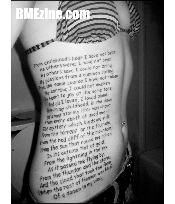
My my, how cultured we are this evening! First Dali, and now this poem by Edgar Allen Poe, “From Childhood’s Hour,” as worn by SeamlessKameleon. I think in big text pieces like this, the letters should either be identical or look like neat, natural writing; this falls nicely in the latter category for me.
(Tattoo by Cherri at Lovedog in Santa Cruz, California.)
See more in “Lettering Tattoos“ (Tattoos)
 BME/News and Modblog highlight only a small fraction of what
NOOOOO COMIC SANS
Hahaha, that’s not quite Comic Sans, is it?
Haha, thats fuckin’ huge!
that text+that peom=fail
way, way, way too close to comic sans….
The poem is actually called “Alone”
I live the poem, and for that much lettering… at least she picked a good spot…
Green Carnation – Alone. Great version of this in wonderful musical format.
i was told by a tattoo artist that i couldn’t get big blocks of text like this as it would eventually run together or something…. is that true? I was bummed
at least its well executed, even if im not a fan of giant walls of text. looks clean
it’s called “Alone” 🙂
missionary would be so damn distracting…
Whatever happened to ‘a picture is worth a thousand words’?
Glad Michalangelo wasn’t born one of today’s ‘artists’, all we’d have is a bunch of scribbling,… UGH.
inkfaery, i wonder the same thing. if her body changes due to children etc if it would destroy the text. it would be interesting to see someone get say a news article or the entire body done up in text.
still, a great piece. i’m sure it was fun to tattoo as much as it was to get tattood.
I love that poem so much!
Large blocks of text look amazing.
I’m not a fan of the lettering, but at least it is neat.
Oh noooo. Comic Sans? I can’t stand the font choice. 🙁
Yay for kelley on modblog
comic sans? … really? -.-
If not exactly Comic Sans, at least tragically close to it. Some nice flowing script would have been so much better. Oh well, at least it’s readable, unlike all the tattoos with all caps gothic lettering.
Love the poem and I actually rather like the font choice. I think it looks almost child like, innocent in a way and unpretentious. Which is good for a piece that runs the risk of looking overly pretentious and self important. I really like it a lot.
That was my favorite poem when I was a teen. I had it memorized and used to write it all over everything.
Great choice!
A good thing about the font is that it’s extremely easy to read…. 🙂
thats fucking ugly. not a fan
Is it “The red cliff of the mountain” or is it supposed to be “The red cliff or the mountain”?
Interesting tattoo!
@ Dennis: “the red cliff of the mountain”
i like it!
why??? why comic sans???
I like the font. I don’t like squigly fancy shit that you have to squint at for 5 hours to read.
i think all you people need to get the fuck off of 4chan an realize that the tet i suppose to look almost child like and is supposed to be redable i think Viking Valkyrie is one of the only people here that gets it
MARRY ME!!!!
– I have the first line tattooed on my back!!
😀
Nicely done but there’s never a good reason to use comic sans. Ever.
That’s always been one of my favorite’s of Poe’s work. I do agree that the font suits it because it makes it seem innocent yet for such long text, I think another font would have suited it better.
Otherwise, it looks great.
what a mess of a tattoo.
so badly executed and thought out, completely RUINS this girls body
Comic Sans…all over your body…dear lord.
deeply emotional and yet so child like and innocent. gives me a deep warm feeling. I really love it !!
I really feel sorry for some of the comments above, some people just did not get it.
Dear SeamlessKameleon, wear it with pride, it is so great !!!
sorry, i hate this. its a nice poem n all, and im sure she had a great reason behind it, but bottom line is that its not really aesthetically pleasing….
cant wait till she has kids!
What, no boobies showing?
Althought I do not like this tattoo, and I hate, HATE large amounts of lettering like this, especially on ones side (as I like to say, its a waste of valuable realstate, imo), I must give props to the fact that it is neatly written (as can be on a side torso) and it is legible, and will continue to be legible for years to come.
The most common mistake is so simple, its always too small.
I can see the consult of this tattoo now :
Customer: ” I want to get some lettering”
“Artist: “Okay, great, what would you like to get?”
C: “This paragrah”
A: “No, you cant, it would be too small, it wont look good after a short amount of time. You would have to do that pretty big.”
C: “Well, I really want it. so, how big are we talking?”
A “Like, Backpiece big, or like Panel big.”
C: “Okay.. Lets do it.”
*artist is happy atleast 1/100 clients understand this*
Most text-ellent.
haha, thanks alex. words right outta my mouth.
and who says everyone in this overpopulated disgusting world wants to have kids anyway?
i happen to really LIKE my body, especially after my piercings and tattoos. i appreciate everyone’s opinions though.
I like it the tattoo. And assuming every female has the need to breed is pretty lame. Tattooed skin is vulnerable to many different factors (sun exposure, weight fluctuation, accidents, surgeries, age, flying alien hedgehogs) so is any ink truely safe?
I love this poem. Personally not fond of the lettering choice, but I don’t agree with those calling for script – that would just make it look too pretentious. I just really, really hate Comic Sans or anything that appears even remotely close to it.
But I adore pure text tattoos. They’re just so intriguing, since tattoos are traditionally images, or text and images combined.
The text is too busy in my opinion, i like when ppl keep it short. Not a fan of the font but whatever floats her boat 🙂
boring.
enjoy having a black blob on your stomach later.
she must have typed out the text in Word. those capitals at the beginning of every line look so wrong.
thou shall not adorn your bodies with walls of text
cheesus rice has spoken
i don’t really care for the font but i feel that any font should be uniform. i hate when i see script tats with the same letters repeated but none of them look the same. every ”e” is different etc. a friend recently got a small text tattoo on her arm and its in script, it has two e’s in it and one has a giant ”e” loop and the other you can barely tell there IS a loop!
why is it that some tattoo artists do freehand if they can’t make it uniform? it looks like someone took a sharpie and just wrote on a person :/
i’d like to get text someday but fear that i’d have the same problem, and i wouldn’t want to seem rude like ”hey can you tattoo script uniformly so it’s not all messed up?’ haha.
🙁
• 100% PURE HATE FOR COMIC SANS! (Or, anything that looks like it.) = FAIL
• Text is center-justified, making the paragraph look sloppy = FAIL
• This will bleed and look like shit in 5 years = FAIL
With a big block of text like this, I’d think you’d want to format it in a word processor and get the artist a printout to trace rather than have them do it freehand. I can’t think of many large chunks of text I’d like to get tattooed with, but if I were to do it, it would be in (at least) 48 point Helvetica, bold, or HelveticaNeue Black, double spaced and left-justified. That center-justified text is *almost* worse than the font, but not quite.
I like the poem. Not to fond of the placement or the font. But it’s a good idea…
at #46: large blocks of text set in Helvetica are a big no-no. It just doesn’t read well. not that i like comic sans, hell no! every typographer’s biggest nightmare.
When she’s on the beach I wonder if ppl stop her and ask to read it…..wouldn’t it be awkward. I mean you can’t chit chat cause they’re reading and you may cause them to lose their spot, and then they have to start again! But I do think it’s cool, I guess she could just tell ppl to piss off!
LOL @ comic sans.
So long as she like the tattoo (her tattoo!), isn’t that all that really matters?
So long as she likes the tattoo (her tattoo!), isn’t that all that really matters?
i’ll bet the tattoo artist was happy to do this piece :/
Damn I was going to do this. Oh well i’ll just have to think of something else.
I have this till “and all i loved, i loved alone” on my calf.
iLOVE it!
I’m about to get this done trash polka style