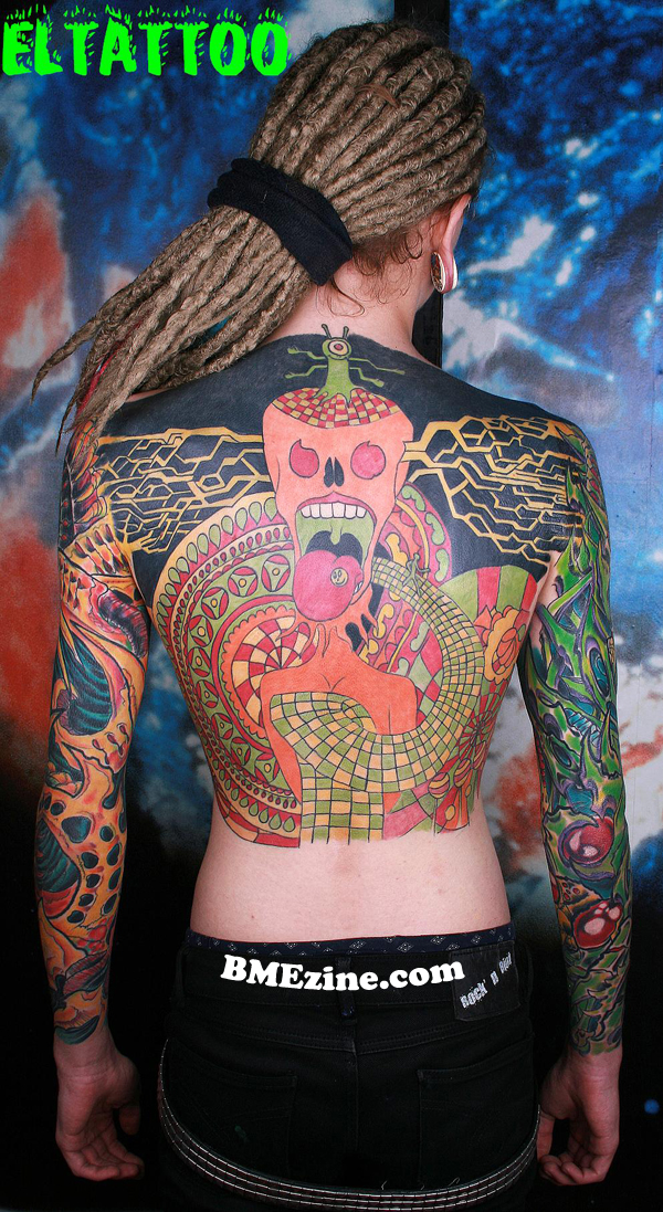
If it’s not Brasil, it’s Russia flooding my inbox. It makes me happy though because it seems like every other country is still super stoked and excited about the body mod world in which we live in.. Today’s Russian tattooer is mysteriously known as “El Tattoo”. That’s literally all I’ve got as far as background on him. This is a bio mech body suit that’s in the works. Click through for more photos.
See more in “Biomechanical Tattoos“ (Tattoos)


 BME/News and Modblog highlight only a small fraction of what
those tattoos are amazing. those ears, not so much.
hey asshole put your belt on the right way or dont wear one at all you look stupid
xXx– hahahahaha. this.
Agree about the ears, they definitely need some love, disagree with xXx..no need to be the asshole anonymously tearing at someone you don’t know.
goddamn i love the color in the tattoos…and is that plankton at the top of his backpiece? that would be really awesome if it is.
it’s like an acid trip on his back and arms, love it. not normally my style but i can’t help but dig this. the sacreligious zombie is fucking great, hope to see it when it’s filled in. but yeah, learn to put your belt through the loops.
i’m normally not a fan of the biomech stuff but i thinks this is kinda cool
NOT BEING AN ASS! Just giving my professional, constructive criticism. But the biomech is a bit flat. Looks incomplete. I see that this is stated as a biomech suite, but i must point out that it is in fact not. I like the zombie on the front, but not bio. Same with the back. Over all, looks clean, but, not bein an ass, but not someone I personally would have work done by. For all i know he’s been at it for 6 mnths, then its great. But, if he’s been at it for much longer, then i stick with my above opinion. That’s it. OK, now i’ll wait for people to bash me for this.
my inner dork went “Jesus, thats a sick Giratina tattoo!! oh wait, no. Yes, no.”
haha looks like plankton from spongebob squarepants! XD
Tattoos look horrible. Aaron Cain ripoffs circa 1995. BME can be better than this…
Omg the pussies in here that have no balls to actually sign in before commenting their ignorant shit talk.
There is nothing wrong with this man’s work??? It looks great and I can’t wait to see the chest piece when it’s finished.
Rachel when are we requiring the log in to comment? It’s really sad that people are so fucking lame.
It makes me sad to come on here to look at beautiful people doing cool stuff with their bodies, and in turn get upset and feel like I need to defend them against morons with no backbones…
I should be posting a wonderful comment about how nice it is to see such an attractive young man with so much coverage of beautiful work.
I love his arms!
i’m not normally a fan of biomech but i think this is pretty sweet. although, i agree that this is not a biomech suit. im excited to see what the final zombie piece looks like. good stuff.
but people should be aloud to hate all they want. this is AMERICA (in my best red neck accent, of course). =]
keep up the good work BME.
*most* BME comments are bad enough to rival You Tube comments in negativity and downright meanness. I don’t even know why I bother reading them anymore.
Anyone else think of Distict 9 lookin at his left arm? Prawn?
Its not a bio-mechanical suit, as mentioned, its just two sleeves. Nothing wrong with that, just a bit of false advertising. To me, the style looks cartoon-y and sketchlike, rather than the very detailed, incredibly well executed biomechanical that the best artists in this field can put out. Question is whether thats deliberate or not…
Dude’s the biomech is awesome, the rest if crap. That’s an objective stance too.
LOVING the front torso piece
those ears look stressed out, but it happens
if the artist had never used black in the beginning we would have pulled off a realistic bio-mechanical sleeve.
with just using colour an artist can form light and shadow depth and hight in there work.
complimenting colours such as red and green can make red-greenish grey, and green-redish grey shadow tones that show depth rather then just using red next to green with a black line in btw. also it looks rather graffiti like as to flat, think of yellows perseved light and violets perseved as shadow over nice work eltattoist
there is also a remarkable decision in contrast with each sleeve work one is completely coloured in cool field of colours and the opposite arm is rather warm and bright field of colour.
and those dreads are awesome
The dreads are awesome, the tats are amazing, and the guy is hot.
I just did an image search on google for sex and this picture came up…
Weird…
(no I’m not serious.)
the one on his front reminds me so much of Cannibal Corpse’ Eaten Back To Life cover
http://2.bp.blogspot.com/_H9F1DlCd0bY/SLXM7yYPPUI/AAAAAAAAD1I/ta5hPxZGrGU/s400/Cannibal+Corpse+-+Eaten+Back+To+Life+-+Front.jpg
Love all of it XD
Once again, gonna hold my tongue cuz mom taught me better. But I have to agree with #7, #16 and #10. And #2, you’re being a dick. But you’re right, this kids doing it wrong.
And Snap Dragon – I got enough balls for both of us.
I have never been able to GET a BME Account for some reason. And I gave up trying. Meh.
I think the sleeves are awesome, I have wanted to get some BIO-MECH work done and those make me want to call up my artist to start some planning.
i have to say to #19, trip. if the artist used some shading with the black, it would have stood out way better. before i go and do a realistic piece that has color, i ALWAYS use black and gray tones. the different shades of black and gray will make the colors stand out much better. the problem here is….no one knows fer sure if this “is” the way he/she meant to do it. that’s it. doesn’t make anyone of us an ass. constructive criticism. if we all just kissed ass and said it was the greatest, will the artist learn something from this? answer is no. if an artist is told that every piece they do is “perfect” even when shitty looking, how will he or she know to do different? over the last 13 years, i’ve taken the worst criticism and improved from it. if you cant take the heat as they say, get out of the kitchen!! last thing, if im not logged in when i write this, then use my name and go to my page. there you’ll see some work that ive done. then, people can go thru and ripped them all apart. do so, and ill know what im doing wrong and learn from it!