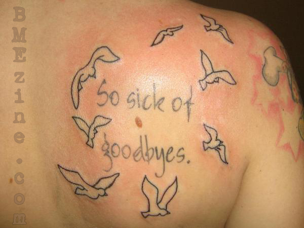
I saw this tattoo submitted by April_Eileen and knew I had to post it. While I’m certain this is a memorial tattoo it seemed fitting since my best friend moved away yesterday. I’ve been feeling pretty sad and this tattoo summed up how I feel quite well. Luckily, my best friend is only a 3 hour drive away so I will see her, just nowhere near as often. I can certainly relate to the sentiment of permanent goodbyes as well. The tattoo was inked by AJ Pell in Fredericksburg, VA.
I have to say, the lettering on this tattoo is fabulous. I love the soft colour and the watery look of it. Perfect choice.
 BME/News and Modblog highlight only a small fraction of what
Beautiful, its moving, and i can totally understand the emotions behind it.
all the best =]
Paul x
Beautiful, its moving, and i can totally understand the emotions behind it.
all the best =]
Paul x
underdone. will not loko good or read well in the lettering in a few years. nice sentiment though
underdone. will not loko good or read well in the lettering in a few years. nice sentiment though
This had better be a Converge reference!
This had better be a Converge reference!
beautiful and meaning ful. AbbY
beautiful and meaning ful. AbbY
Nice idea, but that lettering won’t hold up to the test of time. And the bird are very blah.
Nice idea, but that lettering won’t hold up to the test of time. And the bird are very blah.
i think the lettering looks kinda ghetto in comparison to the rest of it. some parts look darker than the rest. i would make it more bold. but that’s just me.
i think the lettering looks kinda ghetto in comparison to the rest of it. some parts look darker than the rest. i would make it more bold. but that’s just me.
I hate to be cynical of other people’s bodies, But purely aesthetically, the mole throws this whole piece off for me.
I hate to be cynical of other people’s bodies, But purely aesthetically, the mole throws this whole piece off for me.
@6 – same here. I feel like the placement of the tattoo should’ve been different because of that
I think the lettering would’ve been better had the lines been darker, like the lining on the birds.
@6 – same here. I feel like the placement of the tattoo should’ve been different because of that
I think the lettering would’ve been better had the lines been darker, like the lining on the birds.
The birds are alright, but I really dislike the lettering
The birds are alright, but I really dislike the lettering
It’s a sparklehorse lyric. Very sad : (
It’s a sparklehorse lyric. Very sad : (
is it just me or does the lettering look like it was done before?
the birds are the only part that look irritated
is it just me or does the lettering look like it was done before?
the birds are the only part that look irritated
I think the lettering is faded because it’s older, and the birds are new.
I think the lettering is faded because it’s older, and the birds are new.
It somehow reminds me of Kurt Halsey and his drawings.
It somehow reminds me of Kurt Halsey and his drawings.
Sloppy lettering. Compare the weight of the lines in the “y” to any of the others letters. Did the “artiste” decide to design a font as he went along? Look at the four “o”(s), all different.
Sloppy lettering. Compare the weight of the lines in the “y” to any of the others letters. Did the “artiste” decide to design a font as he went along? Look at the four “o”(s), all different.
@JD: I don’t think it’s a font, I think it’s copied from handwriting.
Anybody have any idea if the pink-outlined stars on the shoulder are actually pink/red ink, or is that blood (e.g. from being tattooed with a fluorescent ink that’s not visible in daylight)?
@JD: I don’t think it’s a font, I think it’s copied from handwriting.
Anybody have any idea if the pink-outlined stars on the shoulder are actually pink/red ink, or is that blood (e.g. from being tattooed with a fluorescent ink that’s not visible in daylight)?
It’s probably a Sparklehorse/Mark Linkous memorial.
Mark Linkous, the frontman, songwriter and multi-instrumnetalist of the band, killed himself 3.5 months ago.
Sich of Goodbyes is a song off their “Good Morning, Spider” album.
It’s probably a Sparklehorse/Mark Linkous memorial.
Mark Linkous, the frontman, songwriter and multi-instrumnetalist of the band, killed himself 3.5 months ago.
Sich of Goodbyes is a song off their “Good Morning, Spider” album.
I kind of want to hear the song now.
The pink around the stars is tattooed that way, a pink shade, at least that’s what it looks like to me.
I also don’t think the lettering is that colour because it’s faded, I think it was intended to look like it was watery. I could be wrong but it looks to me like it was intended to look like watered down brush strokes. It reminds me of some of the Japanese calligraphy fonts I have on my computer.
Youtube is your friend:
http://www.youtube.com/watch?v=pbDzob84Tok
Youtube is your friend:
http://www.youtube.com/watch?v=pbDzob84Tok
looks like Sparklehorse.
looks like Sparklehorse.
I was also thinking this was a Converge reference.
I was also thinking this was a Converge reference.
kind of looks like it was designed in MS Word ’96
kind of looks like it was designed in MS Word ’96
6: Are you sure you meant to say ghetto?
Anyways, I like the font.
6: Are you sure you meant to say ghetto?
Anyways, I like the font.
Love Converge. Don’t care too much for this.
Love Converge. Don’t care too much for this.