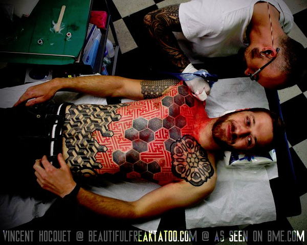
It’s common these days to see geometric tattoo projects that use multiple patterns puzzle-fit up against each other, but I really like the way that this works when those patterns are done in different colors — red and black in this case — to push them onto different layers visually. It both strengthens each individual piece of geometry, and helps them work together as well. Vincent Hoquet (note his new URL of beautifulfreaktattoo.com) has been featured regularly on ModBlog, and while it’s getting a little dated now I want to remind you that I did a lengthy interview with him in 2008 that you can read here.

 BME/News and Modblog highlight only a small fraction of what BME has to offer. Take our free tour and subscribe to BME for access to over 3 million body modification related photos, videos, and stories.