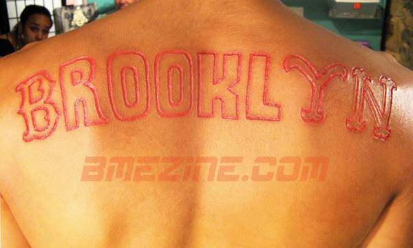
By way of Williamsburg comes this cutting by Brian at PURE:

By my count, we’ve got characters from the Brooklyn Dodgers, Brooklyn Cyclones, the Knicks and the Mets. Am I missing any? Islanders, maybe?
Also, upon seeing this piece, an inspired Stephon Marbury had a Starbury logo branded on his ass and set up a shoe kiosk on Fire Island. True story.
 BME/News and Modblog highlight only a small fraction of what
Boston Red Sox
Boston Red Sox
Boston Red Sox
Boston Red Sox
It’s close, but I’d be willing to bet the “B” is supposed to be for the Dodgers …
It’s close, but I’d be willing to bet the “B” is supposed to be for the Dodgers …
It’s close, but I’d be willing to bet the “B” is supposed to be for the Dodgers …
It’s close, but I’d be willing to bet the “B” is supposed to be for the Dodgers …
Yeh, thats a dodgers font. Red Sox? You guys in Boston have waaaaaaay too much free time.
Yeh, thats a dodgers font. Red Sox? You guys in Boston have waaaaaaay too much free time.
Yeh, thats a dodgers font. Red Sox? You guys in Boston have waaaaaaay too much free time.
Yeh, thats a dodgers font. Red Sox? You guys in Boston have waaaaaaay too much free time.
Ahh sorryyyy
Ahh sorryyyy
Ahh sorryyyy
Ahh sorryyyy
Yeah, Jordan, you did forget one…..the YANKEES? Hello!!!!!!
Yeah, Jordan, you did forget one…..the YANKEES? Hello!!!!!!
Yeah, Jordan, you did forget one…..the YANKEES? Hello!!!!!!
Yeah, Jordan, you did forget one…..the YANKEES? Hello!!!!!!
“Fuck you, okay? I was born in Brooklyn, Brooklyn, okay? My accent is a fucking Brooklyn accent, okay? Okay? “
“Fuck you, okay? I was born in Brooklyn, Brooklyn, okay? My accent is a fucking Brooklyn accent, okay? Okay? “
“Fuck you, okay? I was born in Brooklyn, Brooklyn, okay? My accent is a fucking Brooklyn accent, okay? Okay? “
“Fuck you, okay? I was born in Brooklyn, Brooklyn, okay? My accent is a fucking Brooklyn accent, okay? Okay? “
sacrilege. (red sox & yankees together? no.)
decent cutting though, could have been spaced out a little better
sacrilege. (red sox & yankees together? no.)
decent cutting though, could have been spaced out a little better
sacrilege. (red sox & yankees together? no.)
decent cutting though, could have been spaced out a little better
sacrilege. (red sox & yankees together? no.)
decent cutting though, could have been spaced out a little better
I happen to know it took you some time to remember what was missing yourself Brian!
I happen to know it took you some time to remember what was missing yourself Brian!
I happen to know it took you some time to remember what was missing yourself Brian!
I happen to know it took you some time to remember what was missing yourself Brian!
yes, because it’s not red sox writing, it’s dodgers as stated above.
yes, because it’s not red sox writing, it’s dodgers as stated above.
yes, because it’s not red sox writing, it’s dodgers as stated above.
yes, because it’s not red sox writing, it’s dodgers as stated above.
it’s deffinately a boston B.
it’s deffinately a boston B.
it’s deffinately a boston B.
it’s deffinately a boston B.
Hmm. Not a big fan of all the different letter types used. Nice cutting regardless though.
Hmm. Not a big fan of all the different letter types used. Nice cutting regardless though.
Hmm. Not a big fan of all the different letter types used. Nice cutting regardless though.
Hmm. Not a big fan of all the different letter types used. Nice cutting regardless though.
Where Brooklyn at?!?!
Where Brooklyn at?!?!
Where Brooklyn at?!?!
Where Brooklyn at?!?!
You’re all right, okay? The “B” for the Brooklyn Dodgers and Boston Red Sox is the same font. Geez.
You’re all right, okay? The “B” for the Brooklyn Dodgers and Boston Red Sox is the same font. Geez.
You’re all right, okay? The “B” for the Brooklyn Dodgers and Boston Red Sox is the same font. Geez.
You’re all right, okay? The “B” for the Brooklyn Dodgers and Boston Red Sox is the same font. Geez.
Ehh… Yankees..
Reppin Coney whaat whaat.
Ehh… Yankees..
Reppin Coney whaat whaat.
Ehh… Yankees..
Reppin Coney whaat whaat.
Ehh… Yankees..
Reppin Coney whaat whaat.
cool idea with the different fonts
cool idea with the different fonts
cool idea with the different fonts
cool idea with the different fonts
Actually Brian they are slighty different. See, winners use the Dodgers font while only a complete loser would ever use the Sox font, because you know, thats what sox fans are.
Actually Brian they are slighty different. See, winners use the Dodgers font while only a complete loser would ever use the Sox font, because you know, thats what sox fans are.
Actually Brian they are slighty different. See, winners use the Dodgers font while only a complete loser would ever use the Sox font, because you know, thats what sox fans are.
Actually Brian they are slighty different. See, winners use the Dodgers font while only a complete loser would ever use the Sox font, because you know, thats what sox fans are.
I thought the L and Y should of been closer together. Either way… I’m from boston, and baseball bores the hell out of me. ZZZZZZ
I thought the L and Y should of been closer together. Either way… I’m from boston, and baseball bores the hell out of me. ZZZZZZ
I thought the L and Y should of been closer together. Either way… I’m from boston, and baseball bores the hell out of me. ZZZZZZ
I thought the L and Y should of been closer together. Either way… I’m from boston, and baseball bores the hell out of me. ZZZZZZ