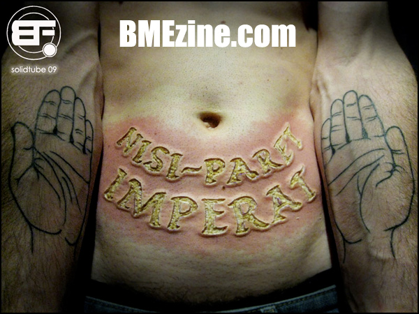
Apologies, folks: Technical difficulties today, but I’ll try to get caught up this evening. Until then, how about this wild electrocautery branding piece by Brenno at Body Factory in Trieste, Italy. My Latin is more than a little rusty, but the Internets lead me to believe this is a Horace quote that translates to, “Unless it obeys, it commands.” That said, I’ve been bested by information online before, so if this is actually a line from an Eagles songs or something, hey, don’t shoot the messenger.
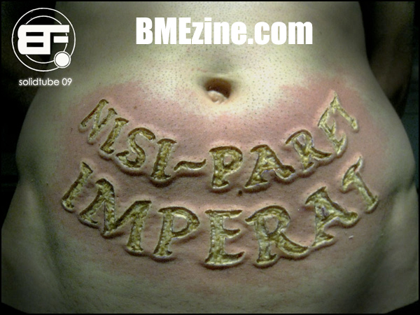
A close-up of the fresh brand, after the jump.
See more in “Misc. Modern Branding“ (Scarification)
 BME/News and Modblog highlight only a small fraction of what
Ow
Ow
it’s beautiful, but it just looks so goddamn PAINFUL.
it’s beautiful, but it just looks so goddamn PAINFUL.
yikes! impressivee and uncomfortable. it made me cringe
yikes! impressivee and uncomfortable. it made me cringe
looks fucking painful!!
but damn good too 🙂
looks fucking painful!!
but damn good too 🙂
as nice as the line work or what the fuck ever you would call that is, this looks horrible. yellow flesh does not look good in the least. i hope it heals well, hope to see a follow up
as nice as the line work or what the fuck ever you would call that is, this looks horrible. yellow flesh does not look good in the least. i hope it heals well, hope to see a follow up
Why is it yellow?
Why is it yellow?
Lovedarling-
I think it’s adipose tissue; the fat over his stomach.
Lovedarling-
I think it’s adipose tissue; the fat over his stomach.
this is really impressive.
this is really impressive.
OBEY.
OBEY.
mmm sexy V line too. great branding, and i also say fucken ouch, man!
mmm sexy V line too. great branding, and i also say fucken ouch, man!
beautiful but i echo the sentiment of ‘OW!’..and yes, thats adipose tissue (95% sure) showing through as all the cutaneous tissue has been cauterised away, the lack of blood makes it look a lot more yellow than in a standard scalpled cutting… im not easily rattled but i think in this case, the cleaness wound makes it more apparent how deep it is, not to mention the wheal under the cauterisation..not happy tissue!
That said…AMAZING!
beautiful and possibly the only thing that has grossed me out in a long time on here 😀
beautiful and possibly the only thing that has grossed me out in a long time on here 😀
I like the hands arent mirrored and are both a little different
I like the hands arent mirrored and are both a little different
man, the branded flesh looks… maggoty. i’m sure it’ll look absolutely gorgeous when it heals, but right now it’s pretty repulsive. beautiful work, though!
man, the branded flesh looks… maggoty. i’m sure it’ll look absolutely gorgeous when it heals, but right now it’s pretty repulsive. beautiful work, though!
i really really like the hand tats
i really really like the hand tats
that looks brutal..
but pretty cool none the less
that looks brutal..
but pretty cool none the less
The reason it looks yellow and magotty is because it is adipose tissue. The reason it looks dope is because it is!
The reason it looks yellow and magotty is because it is adipose tissue. The reason it looks dope is because it is!
amazing, respectable!
amazing, respectable!
that looks awesome. i love hands tattooed on arms.
that looks awesome. i love hands tattooed on arms.
I’m cool!
I’m cool!
reminds me of when i stepped in between my flat iron and i burned my foot…and how i slept with icebags on my feet because the throbbing of the burn would not stop.
what do they recommend to do after this sort of branding? im assuming the throbbing is 100000x worse :/
reminds me of when i stepped in between my flat iron and i burned my foot…and how i slept with icebags on my feet because the throbbing of the burn would not stop.
what do they recommend to do after this sort of branding? im assuming the throbbing is 100000x worse :/
Hot damn, that actually made me gag a little….
Hot damn, that actually made me gag a little….
this makes me want to eat some scrambled eggs.
this makes me want to eat some scrambled eggs.
I can smell the burning flesh.
I can smell the burning flesh.
This made me cringe. But it’s beautiful.
This made me cringe. But it’s beautiful.
I would love to see this healed!
I would love to see this healed!
Am I the only one who thinks that’s really hot, rather than gross? No pun intended.
Am I the only one who thinks that’s really hot, rather than gross? No pun intended.
Ooo would love to see this healed!!
Ooo would love to see this healed!!
I never cringe at things but this did it.
it looks amazing as though
I never cringe at things but this did it.
it looks amazing as though
Wow, that looks amazing! And what a great quote. Would very much like to see this healed.
Wow, that looks amazing! And what a great quote. Would very much like to see this healed.
OH WOW!!! This is SO HOT:)
Im in love!
OH WOW!!! This is SO HOT:)
Im in love!
This is beautiful, but just the thought of sitting through that makes me cringe. Respect for the pain threshold.
This is beautiful, but just the thought of sitting through that makes me cringe. Respect for the pain threshold.
*shudder* I can’t even beleive to imagine how painful that must have been to do!
*shudder* I can’t even beleive to imagine how painful that must have been to do!
Brenno Rules!!!
Brenno Rules!!!
I’m sure it will look good healed but that gives me the heebie jeebies.
I’m sure it will look good healed but that gives me the heebie jeebies.
laura, i found this totally sex-tastic too!
laura, i found this totally sex-tastic too!
The fact that its yellow is throwing me off…
The fact that its yellow is throwing me off…
*pukeface!!!*
*pukeface!!!*
That is so amazing!!!! It’s beautiful!
That is so amazing!!!! It’s beautiful!
The whole sentence is:
Ira furor brevis est, animum rege, qui nisi paret, imperat.
it means:
Rage is a short fit, control your mind/passion, if it doesn’t yield, compel it!
besides this piece looks raw! hope those scars won’t be weather sensitive… kudos
The whole sentence is:
Ira furor brevis est, animum rege, qui nisi paret, imperat.
it means:
Rage is a short fit, control your mind/passion, if it doesn’t yield, compel it!
besides this piece looks raw! hope those scars won’t be weather sensitive… kudos
by far..the best branding i’ve ever saw..just incredible..
by far..the best branding i’ve ever saw..just incredible..
insane
insane
i’m totally grossed out and amazed at the same time.
wow.
i’m totally grossed out and amazed at the same time.
wow.
i think it’s very interesting. it does seem like the colors are a bit off though. i’m gonna guess that it wasn’t quite that yellow in real life. possibly the camera or post processing.
i think it’s very interesting. it does seem like the colors are a bit off though. i’m gonna guess that it wasn’t quite that yellow in real life. possibly the camera or post processing.
Late to the comments, but the coloring is just burnt skin. Any meat will change color when you cook it, right? This branding is so pristine and tidy it’s tough to tell, but I don’t think it’s so deep as to be fat.
The brand with the forearms is inspired. Simple and effective, just how we like it. 🙂
Late to the comments, but the coloring is just burnt skin. Any meat will change color when you cook it, right? This branding is so pristine and tidy it’s tough to tell, but I don’t think it’s so deep as to be fat.
The brand with the forearms is inspired. Simple and effective, just how we like it. 🙂
Holy crap, how can you handle the pain….
Holy crap, how can you handle the pain….
Almost hard to look at… cant wait to see a healed pic 😀
Almost hard to look at… cant wait to see a healed pic 😀
Amazing work!
Bravissimo Brenno, il migliore 🙂
Amazing work!
Bravissimo Brenno, il migliore 🙂
That looks painful as all hell.
But I bet it will look sharp as hell when it heals.
That looks painful as all hell.
But I bet it will look sharp as hell when it heals.