During my year long stint living in Las Vegas I met Cheyne. Of all the tattooed people I have met over the years, he has has one of the more interesting tattoo. His torso is an amazing Japanese style body suit, and his extremities are a collection of randomness, including lots of pop culture tributes. Of his pop culture tattoos, my favorite is this Harry Potter portrait by our mutual friend Mike Demasi.
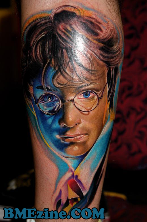
To see more of Cheyne’s work, including several pieces most teenage girls would be proud to have, keep on keeping on.
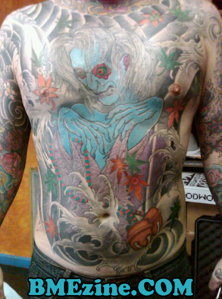
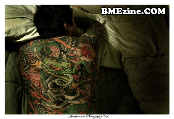
Chest and back by Dana Helmuth.
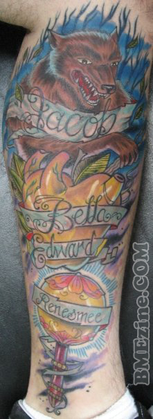
Twilight tribute by Miles Larsen of Dandyland Tattoo San Antonio, TX.
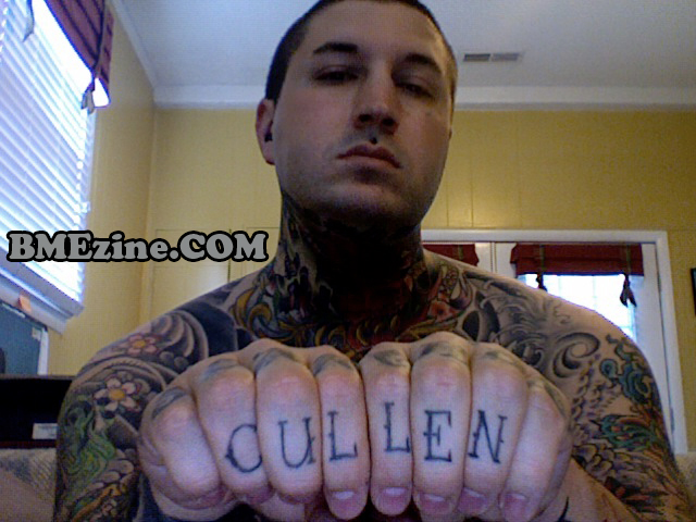
A little more Twilight love by Josh Petty.
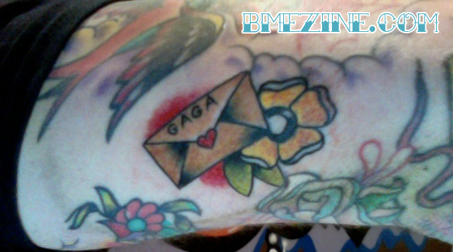
Love letter to Lady Gaga
Cheyne is currently in route to California, hence why I can’t get a hold of him to find the artist name who did the Lady Gaga letter. He is seeking piercing work in the Bay area, so if anyone knows of any shops hiring shoot him a message.
 BME/News and Modblog highlight only a small fraction of what
AMAZING, assurdo
AMAZING, assurdo
Wow. Dig teh colors in the Harry Potter tattoo.
Wow. Dig teh colors in the Harry Potter tattoo.
* the
* the
fuck yes, Harry Potter.
fuck yes, Harry Potter.
That Harry Potter tattoo is incredble!
That Harry Potter tattoo is incredble!
aside from the blue eyes in the harry potter one, its fantastic!
aside from the blue eyes in the harry potter one, its fantastic!
Behold, the rare and elusive -male- Twilight fan.
Joking aside though. I’m with the others on the Harry Potter portrait. Though I prefer his back piece more than anything else.
Behold, the rare and elusive -male- Twilight fan.
Joking aside though. I’m with the others on the Harry Potter portrait. Though I prefer his back piece more than anything else.
The Potter tat its almost, no it is !!! 3d in places,,,,just amazing……
The Potter tat its almost, no it is !!! 3d in places,,,,just amazing……
The Harry Potter one is amazing, I love this two sided tattoos. Want to do one myself. =D
The Harry Potter one is amazing, I love this two sided tattoos. Want to do one myself. =D
AHHHHH! Awesome Harry Potter tattoo….puts mine to shame! lol
AHHHHH! Awesome Harry Potter tattoo….puts mine to shame! lol
the cullen is the gayest thing in the world. wow
the cullen is the gayest thing in the world. wow
Would the letter be from lady gaga? you normally put the senders address on the flap side…
Would the letter be from lady gaga? you normally put the senders address on the flap side…
I love this man. <3
-Caleigh
I love this man. <3
-Caleigh
gotta love the extracontrast that was done in photoshop. the numbers don’t lie. One wonders what this tattoo actually looks like?
gotta love the extracontrast that was done in photoshop. the numbers don’t lie. One wonders what this tattoo actually looks like?
I thought HP had green eyes? Anyway, they are cute, and I always put my address on the top left corner and the recepients on the middle?
I thought HP had green eyes? Anyway, they are cute, and I always put my address on the top left corner and the recepients on the middle?
Harry had green eyes!! And while being an amazing bit of work, that tattoo is technically a fail. Which is a shame, because it looks fantastic.
Harry had green eyes!! And while being an amazing bit of work, that tattoo is technically a fail. Which is a shame, because it looks fantastic.
It’s about time Cheyne’s homosexuality was brought out in public. Good job Sean.
It’s about time Cheyne’s homosexuality was brought out in public. Good job Sean.
Man, loving the Harry Potter tatt, apart from the fact that Harry is meant to have green eyes.
Easy mistake to make though as Daniel Radcliffe who plays Harry Potter in the movies has blue eyes and they don’t give him contacts or anything.
Man, loving the Harry Potter tatt, apart from the fact that Harry is meant to have green eyes.
Easy mistake to make though as Daniel Radcliffe who plays Harry Potter in the movies has blue eyes and they don’t give him contacts or anything.
ian – photoshopped or not its still better than any portrait tattoo you’ve ever done
ian – photoshopped or not its still better than any portrait tattoo you’ve ever done
Technically, it’s a tattoo of Daniel Radcliffe as Harry Potter, so the blue eyes are correct… as #18 said, they don’t give Daniel contacts to make his eyes green. That’s more of the fault of the people making the movie than it is of the tattoo artist, who was most likely using an image of Daniel as a reference. That has always been something that bothered me about the movie though.. Rowling put a lot of emphasis on the fact that Harry’s eyes were green, and many people always tell him that he “has his mother’s eyes”… wow, my life is sad.
Technically, it’s a tattoo of Daniel Radcliffe as Harry Potter, so the blue eyes are correct… as #18 said, they don’t give Daniel contacts to make his eyes green. That’s more of the fault of the people making the movie than it is of the tattoo artist, who was most likely using an image of Daniel as a reference. That has always been something that bothered me about the movie though.. Rowling put a lot of emphasis on the fact that Harry’s eyes were green, and many people always tell him that he “has his mother’s eyes”… wow, my life is sad.
To think though, they gave the girl who played bella contacts when really her eyes are blueish green, and twilight was originally on a tighter budget than the hp flicks, wasn’t it?
To think though, they gave the girl who played bella contacts when really her eyes are blueish green, and twilight was originally on a tighter budget than the hp flicks, wasn’t it?
yeah the Harry Plopper piece is super saturation city..
could care less for the rest of the potter and cullen nonsense
yeah the Harry Plopper piece is super saturation city..
could care less for the rest of the potter and cullen nonsense
simpsons movie reference ftw < 3 spiderpig spiderpig does whatever a spiderpig does..
simpsons movie reference ftw < 3 spiderpig spiderpig does whatever a spiderpig does..
dude, twilight tattooo….i am appalled
dude, twilight tattooo….i am appalled
……………that twilight tattoo is fucking terrible.
……………that twilight tattoo is fucking terrible.
Dan- Thanks for the anonymous critique. I’m glad you follow my work. Too bad you sling shit anonymously, or we all might get a chance to look at your work, and see what we’d see.
alas.
Dan- Thanks for the anonymous critique. I’m glad you follow my work. Too bad you sling shit anonymously, or we all might get a chance to look at your work, and see what we’d see.
alas.
I remember reading somewhere, that Radcliffe’s eyes were too sensitive for the contacts or something. They could have just used advanced ptohoshop or some rot to turn his eyes green, dunno why they didn’t. Might have taken some time (I guess they would have to work frame by frame? I don’t really know anything about this kinda thing), but the budget would have easily covered it.
But the tattoo is pretty cool.
I don’t really like the Twilight-tattoo. I don’t really understand why anyone would like the books/movies enough to get themed tattoos, but more than that I just don’t find it pleasing to the eye. The wolf doesn’t look that good, and the piece isn’t really flowing. But each to their own, I’m positive he’s happy with it 🙂
I hoped I would never have to see a twilight tattoo. But it was bound to happen.
I hoped I would never have to see a twilight tattoo. But it was bound to happen.
Its funny how no one has really said anything about my front or back. The hp and twi tattoos make up about 10 % of the work on me if that. I got the tattoos because the subject matter kept me happy for atleast a portion of time which is more than I can say for most peoples motives. The image of the hp is not photoshopped its also on mike demasis myspace. I also have work from Derek noble. Pows one. Norm. Nd. Few others. But a Japanese style suit does cover most of my body. All done by Dana helmuth.
Its funny how no one has really said anything about my front or back. The hp and twi tattoos make up about 10 % of the work on me if that. I got the tattoos because the subject matter kept me happy for atleast a portion of time which is more than I can say for most peoples motives. The image of the hp is not photoshopped its also on mike demasis myspace. I also have work from Derek noble. Pows one. Norm. Nd. Few others. But a Japanese style suit does cover most of my body. All done by Dana helmuth.
HARRY POTTER ONE=YES
HARRY POTTER ONE=YES
I’m gonna join in with the other sad fucks here and moan that Harry is meant to have green eyes. A blue-eyed Harry on my skin would bug the hell out of me.
I’m gonna join in with the other sad fucks here and moan that Harry is meant to have green eyes. A blue-eyed Harry on my skin would bug the hell out of me.
To all the comments about how lame his twilight tattoo is- did you ever thinks that might be somones name? My best friends nephew is named Cullen. Think before you type people.
To all the comments about how lame his twilight tattoo is- did you ever thinks that might be somones name? My best friends nephew is named Cullen. Think before you type people.
and if it is a twilight tattoo.. so damn what??
and if it is a twilight tattoo.. so damn what??
@Ian, Mike Demasi is probably one of the top 5 guys for color realism, his work doesn’t need photoshopping.
@Cheyne, I too am a bit surprised there is not a single comment on your Japanese work. Had I posted it on it’s own I am sure it would have gotten a lot of positive comments.
@Ian, Mike Demasi is probably one of the top 5 guys for color realism, his work doesn’t need photoshopping.
@Cheyne, I too am a bit surprised there is not a single comment on your Japanese work. Had I posted it on it’s own I am sure it would have gotten a lot of positive comments.
“@Ian, Mike Demasi is probably one of the top 5 guys for color realism, his work doesn’t need photoshopping.”
not even in the top 5. with guys like Nikko, Devries, Carlton and many others, he is just one of many. I never said his work needede it, just that this was photoshopped. Please don’t think to lecture me on tattooing, or the people in the industry. I know most of the big players in this industry….. and frankly someone willing to post much of the shit that gets posted on this website might want to take a backseat when it comes to decifding what is good and what isnt.
Color realism (not even realism.. thanks for misusing the term) is the flavor of the week in tattooing. open your eyes.. its the new tribal.
His back piece is unbelievable! Really nice guy too.
His back piece is unbelievable! Really nice guy too.
The Harry Potter one made the loving and obsessive fangirl rise up in me.
GOOOD LOOK AT DAT SHADING!
*swoon*
The Harry Potter one made the loving and obsessive fangirl rise up in me.
GOOOD LOOK AT DAT SHADING!
*swoon*
Haha, the little Gaga love letter. That’s so clever, I love tattoos like that.
Haha, the little Gaga love letter. That’s so clever, I love tattoos like that.
I’d have shouted “Awesome, masterpiece!!!!” if it was drawn on a simple piece of paper, but not on someone’s skin
I’d have shouted “Awesome, masterpiece!!!!” if it was drawn on a simple piece of paper, but not on someone’s skin
the back and the chest is amazing. and I find the twilight leg to be interesting. not my cup of tea, but it’s refreshing to see that twilight doesn’t just appeal to 14 year old girls or 40 something housewives. the apple/heart is a cute idea.
the back and the chest is amazing. and I find the twilight leg to be interesting. not my cup of tea, but it’s refreshing to see that twilight doesn’t just appeal to 14 year old girls or 40 something housewives. the apple/heart is a cute idea.
i take it back.. didn’t even pay attention to the other tattoo.. lol i think its awesome. 🙂
i take it back.. didn’t even pay attention to the other tattoo.. lol i think its awesome. 🙂
cheyne needs to come back to las vegas!
cheyne needs to come back to las vegas!
potter <3
potter <3