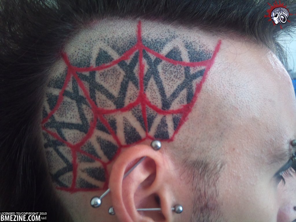
IAM: Sleazy sent in this image of his newest addition. It’s a dot-work flower of life, framed by a spider’s web. Physically it fits his head really well, and the design is well executed. It seems that the flower of life seems to be a common design choice when paired with dot-work, and it’s easy to see why. The chaos of the dots coalescing into a universal design creates a sense of order where there is none. The framing of the web, at least to me, appears to be what is holding the flower inside. Internally there is both chaos and order, held together only by the smallest of threads.

Fil from Broad Street Studio in Bath is the artist.
 BME/News and Modblog highlight only a small fraction of what
Great description, Rob
My first ModBlog! Woo!
not very well done to be fair. each to there own though
beautiful work.
What part of it isn’t well done?
I couldn’t be more pleased with it anyway!
As you said, each to their own.
I agree with Job Betts. The red line work could be much cleaner.
Like the concept thought.
Makes me miss my trag to conch…nice work as well
I guess it’s just the spiders web that kills it for me! the stipple work behind it is really nice!
Just to make one thing clear the spider web wasn’t meant to be clean.
It’s meant to be a scratchy red web.
the red web has an appeal of anarchist feel, the scratched, etched like lines imply a freehand punk appeal, which frames the fine detail of the stippled dots
I think it looks amazing!
I’m so fucking jealous!
the dotworks a bit scratchy as well as the red web but if thats the effect youre goin for than good for you!