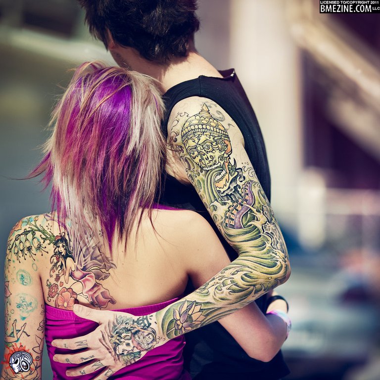
Here’s the other photo I mentioned earlier that was sent in by FemaleHumanoid. The focus here is not just on the couple, but also their tattoos. In fact I’d hazard a guess that the point of the photo is to showcase the work, that just happens to be on these two individuals. As with the earlier post, you’ll definitely want to go to the gallery to see the full sized version of this photo so you can get a better look at the tattoos.
Post navigation
5 thoughts on “Together”
 BME/News and Modblog highlight only a small fraction of what BME has to offer. Take our free tour and subscribe to BME for access to over 3 million body modification related photos, videos, and stories.

nice
I really like this picture but I do have one complaint: the BME logo is placed right on top of the tattoos and in the main focus area. It takes away from the artistry of the picture. If it was moved to the right it wouldn’t distract from such a wonderful picture.
those colours are pretty intense. awesome work!
@cocktail: When users upload images, they are given the option to choose the placement of the watermarks. By default I believe it is the black bar on the bottom left, and Team BME logo in the upper right, but before images are submitted all users can move the logos however they wish.
This is the lovely work of photographer Benoit Paillé and was indeed for showcasing the tattoos. The rest of this beautiful series can be found here: http://www.flickr.com/photos/benoitpaille/sets/72157606805969078/