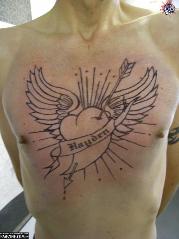
We’re going big for Black Friday with this branding by Quentin from Kalima Emporium in Sussex. Now the first photo isn’t the best quality, but you should get an idea of what it looked like immediately following the branding.
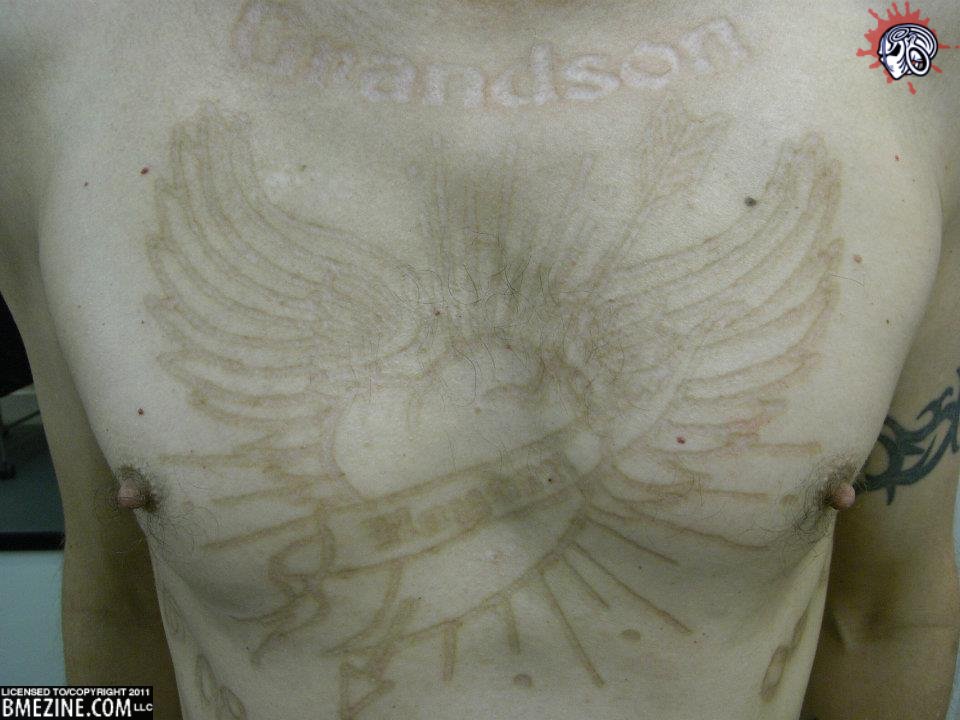
Now, a few months later, here’s how it looks.
I’d say it looks pretty damn good. It also appears that he’s gotten more work done since the initial branding, although I don’t know if that’s more branding or white ink.


 BME/News and Modblog highlight only a small fraction of what
all the work is branding,it is a memorial branding and i have added to it since these were taken,once i get a photo i will email one in
all the work is branding,it is a memorial branding and i have added to it since these were taken,once i get a photo i will email one in
all the work is branding,it is a memorial branding and i have added to it since these were taken,once i get a photo i will email one in
It seems the letters are a little hard to read, and probably will be less legible over time. perhaps a simpler font would have helped?
It seems the letters are a little hard to read, and probably will be less legible over time. perhaps a simpler font would have helped?
It seems the letters are a little hard to read, and probably will be less legible over time. perhaps a simpler font would have helped?