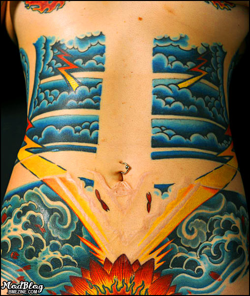
I was asked to post a frontal shot of Essie’s great tattoo by Needles from Last Rites (and scarification by Keith Alexander and Erik Sprague, and others). Anyway, here you go!

PS. I was a bit surprised how few people grokked the scar.
I was asked to post a frontal shot of Essie’s great tattoo by Needles from Last Rites (and scarification by Keith Alexander and Erik Sprague, and others). Anyway, here you go!

PS. I was a bit surprised how few people grokked the scar.
 BME/News and Modblog highlight only a small fraction of what BME has to offer. Take our free tour and subscribe to BME for access to over 3 million body modification related photos, videos, and stories.
more awesomeness! Thank you.
Personally I love the way the scars look within the tattoo.
more awesomeness! Thank you.
Personally I love the way the scars look within the tattoo.
Shannon, its not that we don’t like the scar, its just that, since it really doesn’t have much of a tradionally eye-pleasing shape nor does it actually look like anyting really so we just don’t understand exactly why its there and what it means.
Just like you critique tattoos, we’re critiquing the scar. I understand its hard to get things perfect for scars, but if that was supposed to be symmetrical and straight, they weren’t just a bit off.. they were REALLY off and the scarring is extremely uneven, not just slightly, so something was done unevenly.
The FRONT scar looks MUCH better. its even and symetrical, much more pleasing to the human eye (since infact humans are attracted to symmetrical designs) .. the back is not even near that nor does it flow with her body at all
I know not all scarrings are for esthetic purposes or for artistic expression, but if that’s the case I think the only way for someone on the outside looking in is to explain what its meaning is and why it looks the way it looks. That’s all. Its not that i don’t like the scar, its that i don’t understand it.
wow,this is just lovely
wow,this is just lovely
Actually, I kind of like the lack of symetry (sp?) and what have you on the back – moreso then the font, too.
I really like the tattoos bellow the navel, particularly the lightening striking down into explosion, hahaha. But it really is very beautifully done, I’m amazed. I wonder if she intends to add something more to it up the blank spot in the middle?
IMO, the front is even more impressive than the back. I am a massive fan of the concept of ‘ma’ in Japanese art; using the negative space as the main focus, while the colour only serves to emphasise the actual lack of coulour.
In short, I love it! Very impressive!
IMO, the front is even more impressive than the back. I am a massive fan of the concept of ‘ma’ in Japanese art; using the negative space as the main focus, while the colour only serves to emphasise the actual lack of coulour.
In short, I love it! Very impressive!
I hope so too! Its amazing how the tattooing makes the scar stick out so wonderfully. without it you can hardly see the scar.. but once ink is put in, the contrast is evident that the scar looks like something was carved out (which.. well.. is true) of the tattoo. I love the top part of the scarification, the smaller “V” shape at the top. it would be great to see that surrounded by bright dark hued ink.
I hope so too! Its amazing how the tattooing makes the scar stick out so wonderfully. without it you can hardly see the scar.. but once ink is put in, the contrast is evident that the scar looks like something was carved out (which.. well.. is true) of the tattoo. I love the top part of the scarification, the smaller “V” shape at the top. it would be great to see that surrounded by bright dark hued ink.
Wow, The front looks just as amazing.
Wow, The front looks just as amazing.
just curious.. did you make a reference to “stranger in a strange land”?
just curious.. did you make a reference to “stranger in a strange land”?
jonny, I think he did! 😀
jonny, I think he did! 😀
love the tats, not feelin the scars
love the tats, not feelin the scars