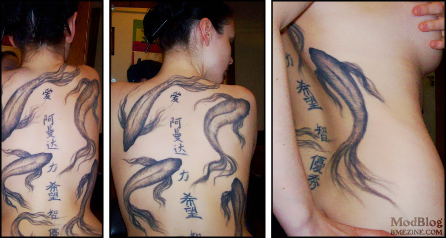
If you’d like to take a closer look at Amanda’s back, done by James at Planet Ink in Toronto, click through for a larger view (the same photo, just bigger).
If you’d like to take a closer look at Amanda’s back, done by James at Planet Ink in Toronto, click through for a larger view (the same photo, just bigger).
 BME/News and Modblog highlight only a small fraction of what BME has to offer. Take our free tour and subscribe to BME for access to over 3 million body modification related photos, videos, and stories.
I love this tattoo. It looks “soft”…it is amazing.
I love this tattoo. It looks “soft”…it is amazing.
I love this tattoo. It looks “soft”…it is amazing.
very cool!
very cool!
very cool!
I love the fish, but the writing seems to look slightly out of place. Overall it’s a stunning piece of work though.
I love the fish, but the writing seems to look slightly out of place. Overall it’s a stunning piece of work though.
I love the fish, but the writing seems to look slightly out of place. Overall it’s a stunning piece of work though.
beautiful. love it.
beautiful. love it.
beautiful. love it.
Wow – that’s gorgeous!
Wow – that’s gorgeous!
Wow – that’s gorgeous!
Of all the inkwork I’ve seen this is really, seriously, one of my two favorites. The other of the two was put up on Modblog just a few days ago — http://modblog.bmezine.com/2007/04/24/ursels-japanese-dragon/ — which kind of amuses me. Normally, a lot of time goes by between “favorites.”
Of all the inkwork I’ve seen this is really, seriously, one of my two favorites. The other of the two was put up on Modblog just a few days ago — http://modblog.bmezine.com/2007/04/24/ursels-japanese-dragon/ — which kind of amuses me. Normally, a lot of time goes by between “favorites.”
Of all the inkwork I’ve seen this is really, seriously, one of my two favorites. The other of the two was put up on Modblog just a few days ago — http://modblog.bmezine.com/2007/04/24/ursels-japanese-dragon/ — which kind of amuses me. Normally, a lot of time goes by between “favorites.”
i love this one!
i love this one!
i love this one!
love the fish, hate the kanji.
love the fish, hate the kanji.
love the fish, hate the kanji.
Absolutly perfect!
Absolutly perfect!
Absolutly perfect!
Thats really lovely delicate work.
Thats really lovely delicate work.
Thats really lovely delicate work.
Wooooah, that’s reallllly pretty.
Wooooah, that’s reallllly pretty.
Wooooah, that’s reallllly pretty.
fantastic!
fantastic!
fantastic!
are the koi Barbara Psimas koi???
xxx
are the koi Barbara Psimas koi???
xxx
are the koi Barbara Psimas koi???
xxx
this is this art major’s wet dream.
l
v
this is this art major’s wet dream.
l
v
this is this art major’s wet dream.
l
v
*sigh* at least the kanji are more or less correct, in that there are no strokes missing and it’s obvious what words this lady asked for — “love”, “amanda” (literally “ah!”+”slow”+”reach”), “strength”, “hope” and “excellence”.
But the calligraphy is clumsy, and the words don’t really suit the purpose, and most of all I still don’t understand why people chose simplified characters over traditional!
Sorry, I realise I’ve just become one of the bitchy people on Modblog who criticise everything. But kanji tattoos upset me when they’re… not right.
oops wrong “man” in amanda – actually it means “graceful” not “slow”.
oops wrong “man” in amanda – actually it means “graceful” not “slow”.
oops wrong “man” in amanda – actually it means “graceful” not “slow”.
Nice!
Nice!
Nice!
i agree the kanji doesn’t seem to go; it could be the color difference, but i can’t decide. The fish are absolutely beautiful, though. she has a really nice back, on a side note.
i agree the kanji doesn’t seem to go; it could be the color difference, but i can’t decide. The fish are absolutely beautiful, though. she has a really nice back, on a side note.
i agree the kanji doesn’t seem to go; it could be the color difference, but i can’t decide. The fish are absolutely beautiful, though. she has a really nice back, on a side note.
technically they arent “koi”. . . but hey, we can let technicalities slide for an awesome tattoo and piece of art work
technically they arent “koi”. . . but hey, we can let technicalities slide for an awesome tattoo and piece of art work
technically they arent “koi”. . . but hey, we can let technicalities slide for an awesome tattoo and piece of art work
I’m in love with how soft the fish look…just stunning.
I’m in love with how soft the fish look…just stunning.
I’m in love with how soft the fish look…just stunning.
I agree with the couple of people who’ve mentioned the kanji. I think the fish, on the other hand, are absolutely beautiful – they look like they could move at any moment!
I agree with the couple of people who’ve mentioned the kanji. I think the fish, on the other hand, are absolutely beautiful – they look like they could move at any moment!
I agree with the couple of people who’ve mentioned the kanji. I think the fish, on the other hand, are absolutely beautiful – they look like they could move at any moment!
BEAUTIFUL!
BEAUTIFUL!
BEAUTIFUL!
whoa, thanks everyone for the comments. Just to let you know, the kanji are old, they were done almost 7 years ago when i lived in labrador. they may look out of place and may not mean exactly what you think they should, but hey, they have a story, just like the koi. i love them.
whoa, thanks everyone for the comments. Just to let you know, the kanji are old, they were done almost 7 years ago when i lived in labrador. they may look out of place and may not mean exactly what you think they should, but hey, they have a story, just like the koi. i love them.
whoa, thanks everyone for the comments. Just to let you know, the kanji are old, they were done almost 7 years ago when i lived in labrador. they may look out of place and may not mean exactly what you think they should, but hey, they have a story, just like the koi. i love them.
DAMN! I think I’ve found out who I want to do my goldfish arm tattoo now, and he’s local. Hawt!
DAMN! I think I’ve found out who I want to do my goldfish arm tattoo now, and he’s local. Hawt!
DAMN! I think I’ve found out who I want to do my goldfish arm tattoo now, and he’s local. Hawt!
Ugh, what is it with people getting Chinese tattoos? Either it looks like the words were written by a kindergartener or they pick some boring font like SimHei that’s the Chinese equivalent of Arial.
Ugh, what is it with people getting Chinese tattoos? Either it looks like the words were written by a kindergartener or they pick some boring font like SimHei that’s the Chinese equivalent of Arial.
Ugh, what is it with people getting Chinese tattoos? Either it looks like the words were written by a kindergartener or they pick some boring font like SimHei that’s the Chinese equivalent of Arial.
Incredible. Those feathery fins and tails on the koi are just mind blowing, it takes true talent to do something like that.
Incredible. Those feathery fins and tails on the koi are just mind blowing, it takes true talent to do something like that.
Incredible. Those feathery fins and tails on the koi are just mind blowing, it takes true talent to do something like that.