Mostly things are a little bigger, the XML is cleaner, and from an end-user point of view, the really good news is that there’s a search box. If you’ve got feedback on the change, suggestions, or find a problem, please post them here! Thanks! (PS. Theme care of Jon)
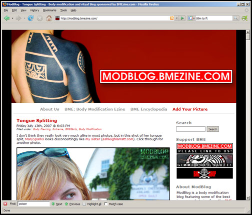
 BME/News and Modblog highlight only a small fraction of what
Thank the maker! That search box is going to feel so good!
Thank the maker! That search box is going to feel so good!
Looks good. Nice and clean. Thumbs up!
Looks good. Nice and clean. Thumbs up!
very nice! the search box is effin sweet!
very nice! the search box is effin sweet!
I love it. Looks great.
I love it. Looks great.
gorgeous interface shannon.
gorgeous interface shannon.
Nice and clean. Thumbs up, Shannon!
Nice and clean. Thumbs up, Shannon!
I like it better this way.
I like it better this way.
Oh, this redesign truly, truly rocks.
Oh, this redesign truly, truly rocks.
LOVE IT !
LOVE IT !
love it i think the search box is the greatest!!!!!!!!
love it i think the search box is the greatest!!!!!!!!
It’s super-duper.
I love Jon, and he loves me too.
It’s super-duper.
I love Jon, and he loves me too.
Looking good.
Looking good.
Yeap, thumbs-up for the new design. Looks brighter. And smarter. The search box adds somethin to that.
Yeap, thumbs-up for the new design. Looks brighter. And smarter. The search box adds somethin to that.
Thank goodness for a search box! It looks great.
Thank goodness for a search box! It looks great.
Wow thats weird it looking all different.
It is lovely and new though.
Wow thats weird it looking all different.
It is lovely and new though.
Looks great!
Looks great!
It’s like a new pair of underwear. At first it’s constrictive, but after a while it becomes a part of you.
It’s like a new pair of underwear. At first it’s constrictive, but after a while it becomes a part of you.
it’s nice, i like!
it’s nice, i like!
Very nice! A lot cleaner look. LOVE the search function. Thanks, Shannon!
Very nice! A lot cleaner look. LOVE the search function. Thanks, Shannon!
whoop whoop search box!
whoop whoop search box!
i love the bigger screen since my computer screen is tiny
i love the bigger screen since my computer screen is tiny
I like the new commentrs & the search box, but the black bars at the side make it feel really cramped, especially on a smaller screen like I use… I’d suggest ditching them or at least reducing them & substituting a lighter colour. Also, the larger link icons to the right make me feel like I’ve switched to impaired vision mode, unnecessarily large & obtrusive… detracts from content.
I don’t mean to be all negative, but all the positive comments have already been made! 😉
Was it just me, or were there speech bubbles around comments earlier?
awesome, i like the new theme alot.
awesome, i like the new theme alot.
i like this, it seems….trendy. hip. cooooooool.
very nice
i like this, it seems….trendy. hip. cooooooool.
very nice
I like it. It feels dyslexic. But I like it.
I like it. It feels dyslexic. But I like it.
I like it1
I like it1
haha, I second Viking’s Valkyrie comment – it feels backwards or something, but I’m sure I’ll get used to it. Overall, I love it, and am so happy about the search box!
haha, I second Viking’s Valkyrie comment – it feels backwards or something, but I’m sure I’ll get used to it. Overall, I love it, and am so happy about the search box!
It’s 291.994751 feet, haha
It’s 291.994751 feet, haha
New modblog = super modblog
New modblog = super modblog
Awesome changes, the only other thing I could think of is a threaded comment system, but thats just fluff stuff.
Awesome changes, the only other thing I could think of is a threaded comment system, but thats just fluff stuff.
YAY SEARCH BAR!!! You have been hearing my silent prayers 😉
YAY SEARCH BAR!!! You have been hearing my silent prayers 😉
and lol @ 17′s Waynes World reference!!
and lol @ 17′s Waynes World reference!!
Thank you 😀
Thank you 😀
Looks good, but the black bars are quite distracting. Also it’s impossible to read text before the site has completely loaded, which makes my blood pressure rise every time. It’s one of the most annoying there is when it comes to websites. Use light grey or something.
Looks good, but the black bars are quite distracting. Also it’s impossible to read text before the site has completely loaded, which makes my blood pressure rise every time. It’s one of the most annoying there is when it comes to websites. Use light grey or something.
Nice one.
By the way, I made search plugins months ago already for BMEzine, BME Encyclopedia.. and ModBlog! While the first two only work with Firefox, the ModBlog plugin also works with Internet Explorer (as if anyone would like to use such a thing ;P – since it follows the newer OpenSearch standard).
All three can be found by following this link:
http://mycroft.mozdev.org/download.html?name=bmezine
Black bars changed to light gray 🙂
Black bars changed to light gray 🙂
the grey is much better
the grey is much better
A+ in Opera.
A+ in Opera.
i prefered black sides. black red and white was nice.
i am a fan of minamalism. clean and simple. keep colours out of the main thing and photos will stand out more.
only other sugestion is trim the menu/index thing down by 10 or 20 pixels. drop the font size a little. shades of grey and the chunky side bar distract from the entrys a little for me.
but i love the search. no more will i have to look through 20 pages to find something i want to show friends. great work on this. better than the old for sure.
grey is much much better than the black, it feels less claustrophobic now 🙂 and THANK YOU for the search tis very helpful!
grey is much much better than the black, it feels less claustrophobic now 🙂 and THANK YOU for the search tis very helpful!
beautiful
beautiful
I love the right justified column…I read modblog in an RSS reader..and the window is a little small. The new layout also seems to render faster.. It’s Great!
I love the right justified column…I read modblog in an RSS reader..and the window is a little small. The new layout also seems to render faster.. It’s Great!