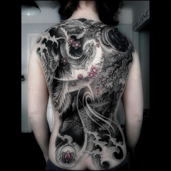
And this is the beautiful Japanese style backpiece that Aska and her tattooist (Johan Finné) have for their hard work and patience..

Evil Twins Heavenly Tattoo Studio, Helsingborg, Sweden.
See more in “Oriental-style Tattoos“ (Tattoos)
And this is the beautiful Japanese style backpiece that Aska and her tattooist (Johan Finné) have for their hard work and patience..

Evil Twins Heavenly Tattoo Studio, Helsingborg, Sweden.
See more in “Oriental-style Tattoos“ (Tattoos)
 BME/News and Modblog highlight only a small fraction of what BME has to offer. Take our free tour and subscribe to BME for access to over 3 million body modification related photos, videos, and stories.
gorgeous tattoo..
stunning.
This is beautiful, the composition, and the detail is great. I am floored by the shading of this too. Wonderful!
holy crap, a nice tattoo on modblog.
what a stunning tattoo. awesome work
That is absolutely stunning.
All I can say is wow…
If you could see me right now I am green with envy (yes envy not ink)…
I’ve always wanted a tattoo along those lines, but i could never sit though getting a whole backpiece (even session by session) no matter how much i wanted to…
Its just so beautiful, really, great design and practice…. especially the way its mostly B&W with just a dash of colour… stunning… I’m officially in love….
=]
<3
amazing tattoo! and I only live 20 km from that studio, think i’m gonna have to visit it real soon 🙂
it’s so perfect
i am so in love!
i’m digging it…but curious was the picture photoshopped by the person submitting it?
just curious case the background and even the individual in the picture looks like a fair bit of color has been removed to heighten/accentuate the black and grey shading.
regardless it looks absolutely amazing 😀
nevermind answered my own question by going to Aska’s page, slight photoshopping done in this pic…But regardless the non-edited picture is just as nice *nods* 😀
wow. thats so perfect. its so well balanced….
can i see the original picture somehow? i dont have IAM
wow! that is an awesome piece, and according to her IAM page with 2 sessions missing from pictures its still 24 + hours of work!
wow beautiful!
said it before:
all good things come from sweden.
Omg.
Thats stunning. really weird to see a quality tattoo on modblog.
has me bugging! :O
Absolutely Beautiful. I loved it =)
breath taking
i have trouble believing that is even a tattoo. it’s more gorgeously shaded and textured than a painting.
you are so lucky to have found such a great artist!
amazing.
That is perfect. So many things going on in one tattoo.
Wow. Just wow.
Gorgeous!
cerealkiller – It’s in the Oriental-style Tattoos gallery on BMEzine (see the link on the right below the photo) .
Page seven currently.
http://www.eviltwinstattoo.se/tattoos/497
There’s the tattoo without editing, which imo looks even more beautiful!
What a wonderful piece of art totally amazing!
STUNNING.
Cereal killer- click the link of his name. If you have myspace you can see that one along with several others. Seriously anyone that hasn’t went to his myspace needs to. There’s an edward scissorhands tattoo on his myspace that is so amazing that its unreal.
That is amazing work.
EPIC AWESOME.
holy fucking shit!
i’ve always loved black ink, but damn!!!!
this tattoo is simply stunning.
10 sessions? Seems like alot.
But Looks good none the less
shit thats amazing
I’m not taht into black and white tattoos, especially not in this size but seriously, I loved this and I love how you just colored the cherry blossoms.. beautiful!
i seriously can’t even handle how beautiful this is.
Such a beautiful back piece!
A classically beautiful tattoo. But could someone tell Roo to stop photoshopping the pictures? Compared to the original it looks like crap here. It’s an insult to the artist and the wearer. I have been noticing this a lot lately. Maybe Roo is feeling dark and blurry, but please keep that off modblog.
“http://www.eviltwinstattoo.se/tattoos/497
There’s the tattoo without editing, which imo looks even more beautiful!”
Fantastic!!
holy mother, that is absolutley stunning. everything about that tattoo is simply a work of art!
fancy….over photoshoped….but fancy….
This gives me shivers. Lovely!
… I don’t even have the words…