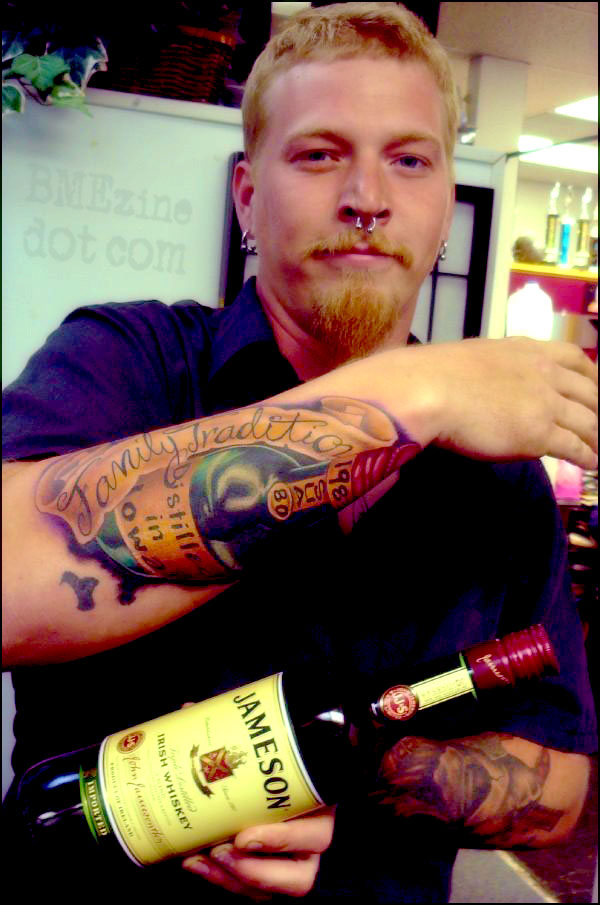
They’re both family traditions!

By Dave, Ultimate Arts Tattoo, Madison, WI.
See more in “Dave aka Juat tattoo mini portfolio“ (Tattoo Artist Portfolios)
They’re both family traditions!

By Dave, Ultimate Arts Tattoo, Madison, WI.
See more in “Dave aka Juat tattoo mini portfolio“ (Tattoo Artist Portfolios)
 BME/News and Modblog highlight only a small fraction of what BME has to offer. Take our free tour and subscribe to BME for access to over 3 million body modification related photos, videos, and stories.
man of my dreams.
rather- whiskey of my dreams.
fanily*** traditions. shame shame.
Oh man would I be pissed about that.
I think the m was intentional because if you look at the n it is done in the similar style.
I hope for him, that this is a M and not a N 😉
nice tattoo!!!
Cheers
InKubus – quite possibly…. or maybe they realized the fuck up and tried to fix it.
😉
regardless, I still like the overall design.
I was going to say the same as InKubus , it seems unlikely they’d make a nistake like that. (but then who knows).
Maybe hes just a huge fan of Jameson.
hehehehe clever response Roo!
I want to do this guy.
When getting my tattoo including the letter “m”, my tattoo artist kept trying to tell me it looked like this one pictured, however I asked him to add another ‘hump’ as the line should lead up to the actual letter m; so there would be 3 ridges. But to each their own, you can still tell what it’s meant to read.
I love drinking Irish coffee…it’s magic with Jameson’s in it
If anyone noticed, the n on the end of tradition only has one hump. so the m in family, while it does look like a cursive n, has one more hump than the n in tradition. so it works out, even if there aren’t a correct number of humps.
Fanily!!! fucking Fanily? do people proof read their tattoos? for fucks sake
It’s an “m” it looks like a script thats kind of cursive and kind of print… altho if it was mine id definately have the three humps of a traditional cursive m.
mmm whiskey
Ha! I live right near Madison and I know that guy! He’s the man!
mmm whiskey and ginger-man
I don’t really see a problem with the M. The bit that confuses me is that the curl of the Y goes off the scroll and on to the bottle label.
Still like it though.