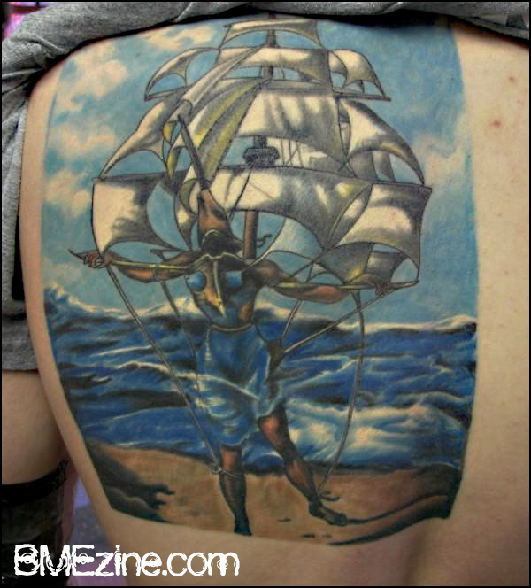
It can be a crap-shoot when adapting a painting into a tattoo, trying to balance which elements can be translated effectively and which will require certain modifications. Consider what Wil from Randy Adams Tattoo in Ft. Worth, Texas, did to interpret Dali’s The Ship here. Everything seems a little more “solid” in the tattoo than in the original (Ed. note: I am not a student of visual art and there is not even a slight chance that I’ll use the proper terminology here), and that it was consciously “tattooified” (Ed. note: This, however, is a perfectly cromulent art term) rather than the artist making an effort to create a carbon-copy of the source material. In this case, this seems like an appropriate course to take. What do you all think? About this interpretation, about adapting paintings into tattoos in general, about the world … let’s chat, ModBlog.
 BME/News and Modblog highlight only a small fraction of what
I think it turned out pretty darn nicely.
I enjoy this!
I see a lot of paintings turned tattoos (being an art history major) and they really do go either way…
Yeah they do. It appears the heyday of really unbelievably amazing tattoos has ended, if modblog is anything to measure with. What happened? Aren’t there any gupta, atchison, saigh, etc submissions?
ive seen a ton of dali on skin as well as a fair few characters from history paintings (im also an art history major). i agree, it is very hit or miss, this is a nice hit though. 🙂
I think it turned out nice!
I recognize that a lot of hard work went into this, and I can understand why the artist would consciously “tattooify” the painting, bus I just don’t know what to think about “The Ship” as a tattoo (then again, I’m a hardcore Dali fan and could just be biased towards the painting itself). I agree: these kind of tattoos can be a bit iffy on how they will turn out.
It turned out nice, but I don’t like the crop. His foot is cut off and that gives a tangential tension. I also wish there was some sort of border, or torn edge, to integrate this with his plan skin. From an artist’s standpoint, it’s kind of awkward around the edges.
it looks more like a pig head than helmet. but either way its sweet
Am I the only person that sees this resembling a Kavadi bearing?
#8: you really, really need to get something in your head besides this scene. man. 🙂
why cut off his foot?
also; ugly. those blues are way too harsh.
Exactly. As a matter of comparison, this is how a fine-art tattoo is done:
http://www.anilgupta.com/largepics/fineart/VanGouh251599.htm
Jordan, is there some kind of issue with getting a Gupta interview or a hunk of his later work somewhere on bme/modblog? Do you need a phone number?
its good he didnt try to do an exact replica of the ship because it would have defiantly been contrived. as for the tattoo itself, its okay, but nothing that stands out. I have 3 “Dali’s” hanging on my walls in my house and without being told this tattoo was supposed to be Dali’s the Ship, i didnt/couldnt tell. I thought it was just a very weird tattoo that didnt look bad, or amazing either.
i am generally not a fan paintings being turned into tattoos, they normally come out looking like all to obvious crap. (maybe i’ve never seen a great one, feel free to point me in the right direction to correct my argument)
and i dont like the strait edge border either, it just looks weird
and is it just me or that a strange placement on dudes back?
@yttrx – yup, thats a good painting turned good tattoo. thanks, even though u posted before me
Nice! I love dali.
I always thought that The Ship would be a really nice tattoo, but I just don’t think that this quite hit the mark. Even with knowing they could not make an exact replica, I just think it’s missing a lot of the finer details that could have been translated. Then again, the photo isn’t exactly top quality, so maybe we’re not seeing as much as is offered…
I don’t get it but I like it
I’m not crazy about the choice of blues used as compaired to the actual painting
Galy, what do you mean by “tangential tension”?
your use of cromulent embiggens all of us!!!
not a big fan. edges? cropping? color choices?.. not sure about it
I think it’s done nicely, however, I think the colors are a bit too bold. The original has that gentle, mute color scheme that adds to the light, airy feeling I get when I look at it (like you can almost feel the wind in the sails!) This is nice, as I said, but I feel more grounded when I look at this, and I don’t get the same feeling of motion and lightness. As others have said, I’m not down with the foot cut off and the border either…
i think besides the foot being cut off [which everyone else has already pointed out] it’s great work. obviously if youre a hardcore fan of the painting, you may not like the tattoo version, because like #23 said, you dont get the same light feeling, but its waaay easier to get that feeling in a painting on canvas than in a tattoo on skin. but as far as the overall meaning and composition of the painting, i think the tattoo does do it justice.
As an artist, I think if someone wanted something of mine on them, I would rather the tattoo made to be as much like what I did, rather than the tattoo artists style.. I mean I respect that every artists had their our style, but if they’re getting paid to copy someone else’s art work than they shouldn’t change the original artists vision. And if you don’t want to something that’s not your own, than don’t do the tattoo.
I love it. I think the brightness of the blues adds to this version, rather than being too harsh. It harmonizes the water and sky and gives the image an overall serenity that the original lacks, at least for me. I like how inspiration was drawn from the painting, and then added to and adapted to a new medium.
Drew, I’ve only seen a picture of Dali’s “The Ship” once in my life, and I immediately recognized it. It’s a rather distinctive image that I have never seen before or since (except for this, but that doesn’t count since it’s a copy)…
Oh man… after #13 posted that link, this tattoo is put to shame by the absolutely incredible work that is in Gupta’s portfolio. My jaw is pretty much dropping on every image I click. So thank you yttrx for turning a bad post into a good one, haha.
#27: That’s exactly the point. Gupta is a god in the scene, but not the “online” scene. There’s nothing wrong with raising the bar every chance you get. That way clients will expect more, more (but unfortunately not all) tattoo artists will have motivation to produce works of genius, and you and I will get to see more great work walking around.
It’s what happened in Chicago in the 90s. For some reason so many great artists all collected in one city that half the shitty ones went out of business. That’s how it goddamn should be.
It looks pretty good until you see the original, and then its weaknesses become quite obvious.
Amazing tattoo. And sorry yttrx, as usuual you are babbling shit. Thats different kind of styles. That one here looks great. the other too. Not comparable.
It would be a good idea to finish the last 1, 2 centimeters to the bottom, to avoid cutting of parts of the main theme.
The stronger blues…. ebt they will fade away, so it will look good also in a year…
#20, ana_morphic,
A tangent, in art terms, can be used to describe when some part of the piece is cut off/continues past the frame in an awkward manner. Usually this causes the piece to have an unintentional tension to it.
In art, you don’t want the focus object/subject to be cut off at certain points, like directly at the joints, nor do you want just a tiny part cut off if you show the rest of the subject or with bits resting directly on the frame.
I think that Jordan (the poster) may have put this tattoo into an unfair controversy; By making the assumption that tattoos which are indicative of paintings, either by inspiration or direct representation, are attempting to be direct copies.
While yttrx’s example of one style of tattooing shows what is a more superficially accurate representation of a work, that particular Van Gogh painting (having seen it in real life) is most interesting to me for the sheer density of color and layering of paint.
Paintings by definition carry their own practical considerations beyond their mere surface. They are a function of paint. Therefore tattoos, a radically different medium, aren’t equipped (for lack of a better word) to encapsulate paintings.
As a result, what the wearer is attempting to get is a tattoo, which depending on THEIR personal preference, and the tattoo artist’s, whom THEY have chosen, given style, results in a tattoo that is either an attempt to directly render, an artistic adaptation, a rough approximation, or any other way of saying something that hopefully makes them happy.
I am not going to excuse bad technique of artists (tattooing or otherwise), but this discussion is predicated upon the suggestion that these tattoos are necessarily attempting and suceeding/or failing to be strictly adhered to visual copies.
my .02
This is my favorite painting by Dali and I think it is a great idea for a tattoo. My personal opinion of redoing a painting into tattoos is kind of like a musician doing a cover song. The song shouldn’t be played exactly as the original artist, it should have the musicians own twist to it. So by doing this particular painting as a tattoo I think this individual should have tattooified it more instead of trying to replicate the original. The original has way to much detail with a soft texture. Very hard to replicate as a tattoo. I personally have “the ship” tattooed as a side piece but the difference between my tattoo and this guy’s tattoo is that when I brought the idea to my tattoo guy, I told him to go off with his own style and technique. The border, lack of detail, and harsh blue’s really takes away from what this tattoo could of been.