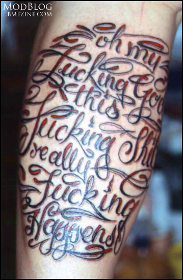
This script tattoo by Marc at Swastika Freak Shop in Germany is pretty funny… I wonder if it’s a specific reference, or if it’s just supposed to be a joke?

This script tattoo by Marc at Swastika Freak Shop in Germany is pretty funny… I wonder if it’s a specific reference, or if it’s just supposed to be a joke?

 BME/News and Modblog highlight only a small fraction of what BME has to offer. Take our free tour and subscribe to BME for access to over 3 million body modification related photos, videos, and stories.
does anyone know what that font is called?
does anyone know what that font is called?
does anyone know what that font is called?
does anyone know what that font is called?
It’s a custom tattoo, not a font…
It’s a custom tattoo, not a font…
It’s a custom tattoo, not a font…
It’s a custom tattoo, not a font…
Shannon, I can *taste* the annoyance in your voice. 😉
Shannon, I can *taste* the annoyance in your voice. 😉
Shannon, I can *taste* the annoyance in your voice. 😉
Shannon, I can *taste* the annoyance in your voice. 😉
I think that it was beautifully executed.
I think that it was beautifully executed.
I think that it was beautifully executed.
I think that it was beautifully executed.
well excuse my ignorance then…
well excuse my ignorance then…
well excuse my ignorance then…
well excuse my ignorance then…
That question annoys me, too, because I hate using fonts (unless they’re intentionally geeky and recognizable, like Courier New or Fixedsys).
That question annoys me, too, because I hate using fonts (unless they’re intentionally geeky and recognizable, like Courier New or Fixedsys).
That question annoys me, too, because I hate using fonts (unless they’re intentionally geeky and recognizable, like Courier New or Fixedsys).
That question annoys me, too, because I hate using fonts (unless they’re intentionally geeky and recognizable, like Courier New or Fixedsys).
I don’t think fonts are too bad. At least it means that the letter quality is usually higher (or at least more standardised) from what I’ve seen on BME.
I don’t think fonts are too bad. At least it means that the letter quality is usually higher (or at least more standardised) from what I’ve seen on BME.
I don’t think fonts are too bad. At least it means that the letter quality is usually higher (or at least more standardised) from what I’ve seen on BME.
I don’t think fonts are too bad. At least it means that the letter quality is usually higher (or at least more standardised) from what I’ve seen on BME.
I think that it could be commentary on any of a range of things. Think of a friend who died to soon and too horribly. I respect the person who had the tattoo for being able to acknowlege the scarier aspect of life, the things we have no control over.
I think that it could be commentary on any of a range of things. Think of a friend who died to soon and too horribly. I respect the person who had the tattoo for being able to acknowlege the scarier aspect of life, the things we have no control over.
I think that it could be commentary on any of a range of things. Think of a friend who died to soon and too horribly. I respect the person who had the tattoo for being able to acknowlege the scarier aspect of life, the things we have no control over.
I think that it could be commentary on any of a range of things. Think of a friend who died to soon and too horribly. I respect the person who had the tattoo for being able to acknowlege the scarier aspect of life, the things we have no control over.
It might not be cast in metal or Bézier curves, but a typeface is “a coordinated set of glyphs designed with stylistic unity”, after all. That definition seems to fit pretty well.
It might not be cast in metal or Bézier curves, but a typeface is “a coordinated set of glyphs designed with stylistic unity”, after all. That definition seems to fit pretty well.
It might not be cast in metal or Bézier curves, but a typeface is “a coordinated set of glyphs designed with stylistic unity”, after all. That definition seems to fit pretty well.
It might not be cast in metal or Bézier curves, but a typeface is “a coordinated set of glyphs designed with stylistic unity”, after all. That definition seems to fit pretty well.
That looks like cholo writing to me. I have no idea if I spelled “cholo” right.
That looks like cholo writing to me. I have no idea if I spelled “cholo” right.
That looks like cholo writing to me. I have no idea if I spelled “cholo” right.
That looks like cholo writing to me. I have no idea if I spelled “cholo” right.
Perhaps it is just Engrisch…
Perhaps it is just Engrisch…
Perhaps it is just Engrisch…
Perhaps it is just Engrisch…
Try watching boondock saints….morons.
Try watching boondock saints….morons.
Try watching boondock saints….morons.
Try watching boondock saints….morons.
Its Blasphemy!
Its Blasphemy!
Its Blasphemy!
Its Blasphemy!
*Amazed* I love it =]
*Amazed* I love it =]
*Amazed* I love it =]
*Amazed* I love it =]
Oh my fucking God, I really fucking love this fucking tattoo.
Oh my fucking God, I really fucking love this fucking tattoo.
Oh my fucking God, I really fucking love this fucking tattoo.
Oh my fucking God, I really fucking love this fucking tattoo.
holy pretentious hipsters batman!
holy pretentious hipsters batman!
holy pretentious hipsters batman!
holy pretentious hipsters batman!