Speaking of Iestyn

Gosh, I’d forgotten both how fun and how difficult posting here is for me. I’m simultaneously excited and nauseous! But before I call it a night, I wanted to share a few more pieces by Iestyn Flye that he’s posted while I’ve been largely offline. I should also mention, if you didn’t catch it earlier today, that he’s now online at the-absolute.co.uk. Anyway, I will try and post a bit more this weekend but I can’t promise a lot.

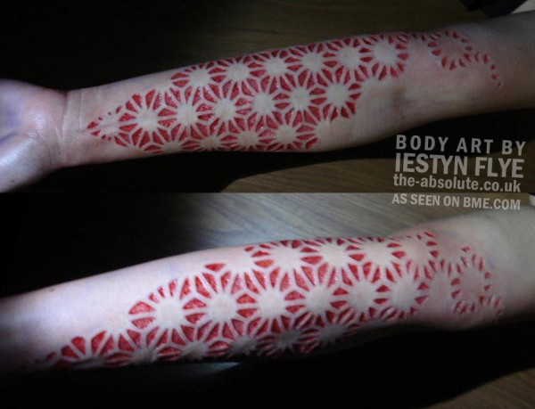
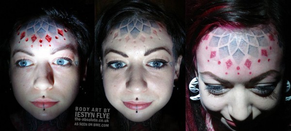
This first piece is really interesting and not something you see every day (for all of these I suggest zooming in for a closer look of course). It begins life (the left and middle image) as a skin-removal scar, which is then accentuated once it’s well healed using red dotwork tattooing.

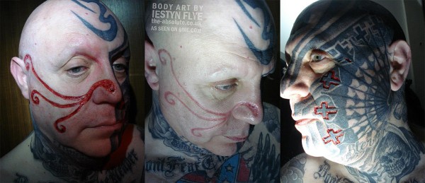
Next, a gorgeous example of facial scarification, with an organic free-flowing piece on one side that has a sort of early Celtic/Viking feel to it, balanced and contrasted on the other side of the face with a series of geometric crosses that instead of being free-flowing, integrate tightly and precisely into the tattoo work done earlier. A stunning and world-class creation.

Finally, the some mind-blowing geometric scarification that would be impressive if done as a tattoo, and unbelievable when done as a scar.
A new use for line weight

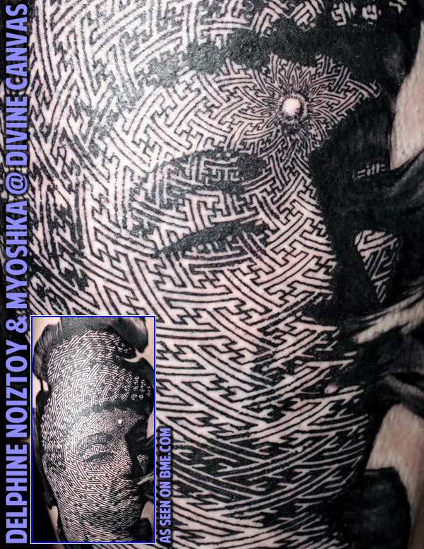
I’m sure everyone knows what halftoning is, if not by name — it’s creating a photographic image by using a pattern of dots, with the dots being different sizes to represent different levels of darkness. Like how newspapers print photos. What you may not know is that you don’t have to use dots — lines are commonly used (and in fact are a built in feature in most photo editing software), but this is the first time I’ve ever seen a tattoo take a common geometric swastika pattern and mix it up with halftoning techniques to represent a photographic image through variance in the line weight of a geometric tattoo. I suspect though it’s no surprise that this Buddha comes from London’s Divine Canvas (divine-canvas.com), tattooed by Delphine Noiztoy as a design collaboration with Myoshka. If you’re thinking the skin of the tattoo looks a little annoyed, that may be because it was done over a single brutally long eleven hour sit. I’m thrilled though to see people finding new ways to express geometric tattooing, because after a while it starts to all look the same — no one is going to say that about this one though!!! Click the cropped photo to see an uncropped version.

More tattoo mastery by Gerhard Wiesbeck

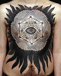
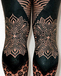
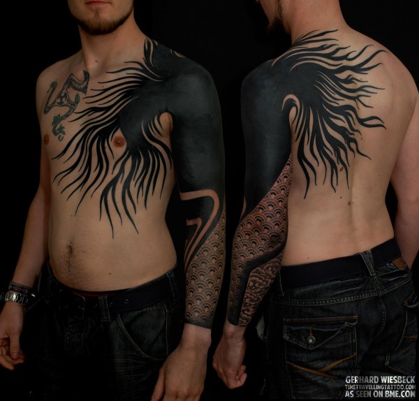
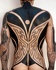
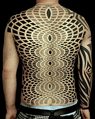
At the start of September I shared some work by the German blackwork master Gerhard Wiesbeck of Time Travelling Tattoo (timetravellingtattoo.com) in Landshut (near Munich). Today I want to share a few more of his incredible pieces. I enjoy Gerhard’s ability to tastefully integrate dotwork with bold solid black, fields of geometry with organic flowing designs, and the sacred with the psychedelic. I’ll tell you though, the thing I often am reminded of when I see these incredible large scale pieces is the advice I always give people about their first tattoo — wait until you’re 110% sure, and then go at it full-throttle, and err on the side of “huge”. Too many people get a small tattoo — and often a very nice and meaningful one — that ends up marring future large scale creations. I know so many heavily tattooed people that I am quite certain wish that they were completely un-tattooed so that they could allow a master like Gerhard Wiesbeck to fully transform them without having to worry about the scars of previous work throwing off the aesthetic.

A Red and Black Geometric Dance

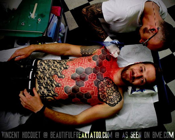
It’s common these days to see geometric tattoo projects that use multiple patterns puzzle-fit up against each other, but I really like the way that this works when those patterns are done in different colors — red and black in this case — to push them onto different layers visually. It both strengthens each individual piece of geometry, and helps them work together as well. Vincent Hoquet (note his new URL of beautifulfreaktattoo.com) has been featured regularly on ModBlog, and while it’s getting a little dated now I want to remind you that I did a lengthy interview with him in 2008 that you can read here.

Little Swastika-Style Hanya Backpiece

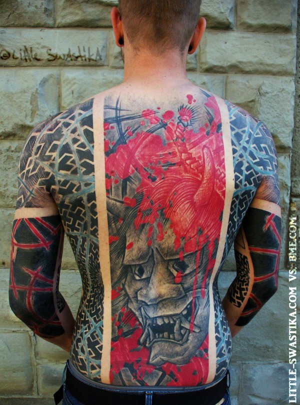
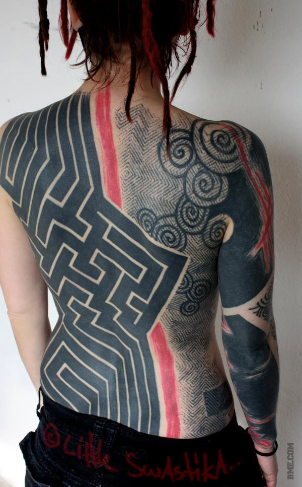
I’ve said this a few times, and I hope no one takes offense, but after being constantly exposed to the current deluge of stunning — and it really is amazing work — blackwork, oft-sacred geometry, neotribal, it all starts to look the same, without any particular message or explicit unique personality. Simultaneously empty and profound — I think that’s part of the beauty of math, especially when encoded in flesh. Meditative emptiness in a tattoo. But it’s hard for me to separate myself from the ego, and I always enjoy expression that comes with an easily identified unique identity. A good example of that is this backpiece by Marc (little-swastika.com), which combines his bold art-tribal with a traditional Japanese Hanya mask, done in a sketchy trash style… A great fusion of different styles in a tattoo that is unlikely to get mixed up with anyone else’s.

Two Great New Dotwork Tattoos

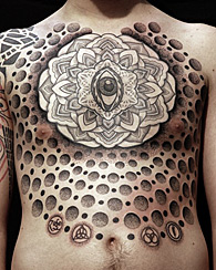
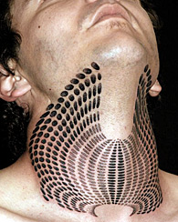
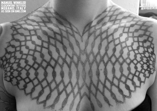
I saw two great pieces of dotwork tattooing today that I really wanted to share with you. This first is an upper chest piece by Manuel Winkler at Clockwork Tattoos in Merano, Italy. This design was inspired by the designs of myoshka.jp. It’s perhaps an odd first thought to have, but the first thing I thought when I saw this was that I hope the person isn’t married yet, because this tattoo will look incredible coming out of the top of a strapless wedding dress. Alternately it will be an amazing tattoo to show off at the beach. Or just admire privately in the mirror. Either way I like it a lot.

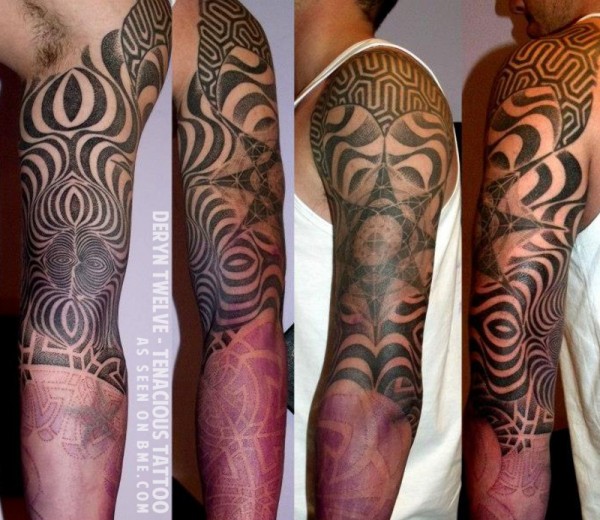
The other piece of dotwork that caught my mind today was this mix of psychedelia and sacred geometry by Deryn Twelve of Tenacious Tattoo in Sheffield. I should also mention that if you like Deryn’s designs, she’s been working on a series of t-shirts with her art that will be posted to her Etsy shop soon, so keep an eye open there or on her facebook page — and the mention of commerce also reminds me that BMEshop is finally up and running again!

BME logo vs. Jodi Lyford

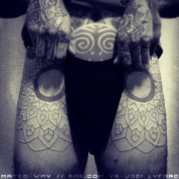
I love the way Mateo (a regular here on ModBlog) is integrating his BME logo with the new geometric work being done by Jodi Lyford of Chimera Tattoo Studio & Gallery (chimeratattoo.com) in Santa Cruz. This is just the very start of the session and the very beginning of what I’m sure will be a great addition to Mateo’s already impressive collection of body art.

mateo-bme-geometry

Palm Tattoo Healing

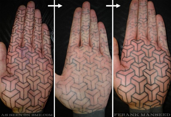
Both Rob and I have regularly covered the work of British tattoo artist Ferank Manseed ([email protected]) here on BME, enjoying his hand-poked machine-free tattooing. Today he touched up one of the geometric palm tattoos that we featured in the past that had less than perfect healing — even with the best technique, palm tattoos can be unpredictable. I’ve seen some people’s last perfectly on the first try, and other people’s skin never seems to be able to accept the ink. This is due to the fact that the palm has especially think and calloused temporary skin — the artist needs to punch through this layer to make it last and place the ink in the stable layer, without going so deep that the ink spreads, or is absorbed and removed by the body. Since going too deep can leave a permanent blown out tattoo, and not going deep enough just falls out, many artists choose to err on the side to too light. Next to the bottom of the foot, the inner surface of the hand — palm and fingers — is the most difficult anatomy to produce a good tattoo on. Anyway, Ferank shared with us photos of this palm tattoo. From left to right (and you can zoom in to this), these photos show the tattoo fresh, then how it healed after this first session, and finally mid-session on the touch-up.

EDIT/UPDATE: I should add two notes to this entry. First of all, the middle picture was taken eight weeks after the first one. Second, and this is perhaps most important, the client was a fellow tattoo artist, and thus has to both wear tight gloves and work with their hands every day, which greatly complicates healing.

palm-healing

Blackwork Tattoo Mastery

Marc (Little Swastika, little-swastika.com) recently posted this old tattoo he did in Blackie’s Heavy Blackwork group, and emphasized that it was one of his older pieces, during a period where he used much heavier swaths of solid black than he does nowadays. Even though his style has evolved a great deal since then, I wanted to publicly acknowledge it because it’s a beautiful piece of graphic design. The interplay between the heavy “maze” on the left have versus the dance of spirals on the right with a background that’s been tattooed to mimic the splotchy image of block printing, and the two halves separated with a strong scribbled red boundary line, is incredible. For a big bold piece that it is in some ways “simple”, it’s also got some great little nuances — for example, look at the very bottom right how the fine stamp pattern goes over the heavy black bar as negative space.

littleswastika-masterpiece

And in relation to some of the volatile discussion lately about the way tattoos heal, I also love that Marc almost exclusively posts healed tattoos (not that he has much choice on account of the sheer scale). These tattoos will look good forever in my opinion, not just because Marc is technically proficient, but by the very nature of their design being resilient to the natural effects of aging.

Hand on the Cross

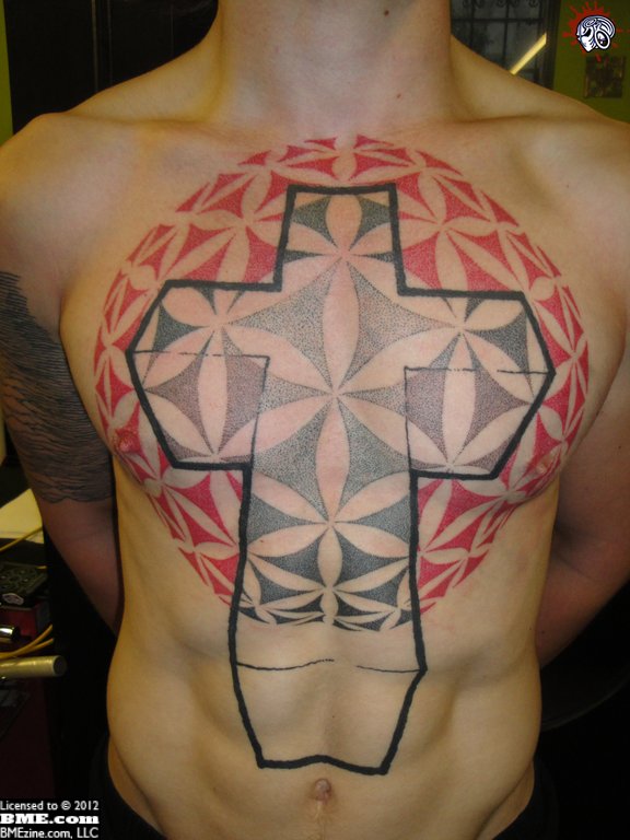
If this looks familiar to you, it’s because Shannon first posted about this hand poked circle of life tattoo a few weeks back.  Back then it was just the outline, but since then handpoked master (that sounds dirty) Ferank has finished up the sacred geometry, and the result is breathtaking.  Oh, it should be noted that the cross was tattooed by someone else.