This piece is by Lane Jensen at Dragon FX Kingsway Edmonton, Alberta, done using a combination of dermal punch and scalpel scar work. Oh, and if you can’t read braille, it says “Albert”.
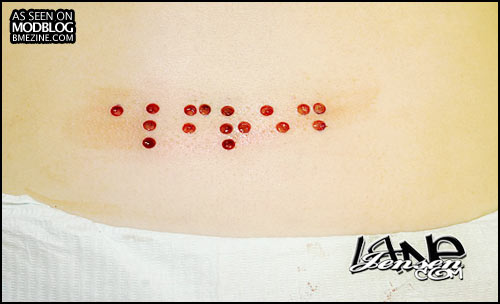
This piece is by Lane Jensen at Dragon FX Kingsway Edmonton, Alberta, done using a combination of dermal punch and scalpel scar work. Oh, and if you can’t read braille, it says “Albert”.
 BME/News and Modblog highlight only a small fraction of what BME has to offer. Take our free tour and subscribe to BME for access to over 3 million body modification related photos, videos, and stories.
The following comments were imported from our old comment system:
Posted on 05-12-2006 00:23:20 by sway
I love the idea of these functional braille scarifications, esp since my father’s blind. I only hesitate getting one myself because its really hard for me to keep my scars permanently raised.
Posted on 05-12-2006 01:19:56 by inksation
Then all you may need is Skin Removal to cause an implosion rather than having it raise. The name is actually “ALFRE” but the idea is what matters. This is and will always be one of the most meaningful mods I have ever and will ever preform on anybody.
Posted on 05-12-2006 03:25:32 by anon
great idea, poor execution. it’s a shame the braille isn’t evenly spaced. and some of the dots are crooked.
Posted on 05-12-2006 08:43:24 by glider
anon – I suspect that’s pose and skin tension and so on. I’d be very surprised if Lane didn’t lay down a perfect stencil and work from that.
Posted on 05-12-2006 08:44:46 by glider
PS. Nice, simple braille reference.
There are more advanced, almost short-hand like versions of Braille, but this version is what everyone will likely know.
Posted on 05-12-2006 12:15:21 by inksation
The spacing was perfect and when she bent over for the photo it distorted a little. I’ll take a healed photo of her standing to prove to ANON it is spaced out perfectly. I did use a graphic stencile and placed it on her standing but in this photo she is bent over, Typical, do something well and have someone rip and tear on you
Posted on 05-12-2006 17:26:59 by anon
lane, i’m sorry. you’ve made very serious progress with your piercings and procedures, and that’s absolutely wonderful for your clients, the community, and yourself. i suppose it’s just that your past work in the community makes some cautious of what to expect from you.
nonetheless, if you’re doing it right, you’re doing it right. congratulations, and don’t take the heat.
Posted on 05-12-2006 19:23:56 by /
yeah anon sounds like a real jerk it looks great and the client is happy with it what more is there to say
Posted on 05-12-2006 19:25:09 by outmywindow
^^^ Was it just me, or did that sound like an insult cheaply disguised as a compliment?
Posted on 05-12-2006 19:25:53 by outmywindow
Ahh, / got in my way! 😉 I was referring to anon’s post.
Posted on 05-12-2006 20:02:48 by inksation
I have several years of my past work on http://www.lanejensen.com as well as my IAM page and you can type in my name or my iam name on bme search and pull up pleanty on myself and my past work. I have no regrets, I am proud of my past and present and anyone who becomes great at what they do shows great improvement over time. I like what I see in the mirror.
Posted on 05-13-2006 00:40:19 by etoile
To the first anon (3rd commenter): I have to disagree with you. As a sighted Braille reader, that was perfectly clear to me. I’m reasonably certain a blind person would do okay with it too.
And glider, I hope you don’t mind if I toss out a little more education. This is a name, so it is Grade 1 out of necessity. Braille, at its most basic, is the alphabet, punctuation, and some excess stuff (like “upcoming is in caps” or “upcoming is a number”). Grade 2 Braille is indeed a lot like shorthand – plus it depends a lot on context to know which contraction it is. Most Brailled books are in Grade 2 Braille; it is also what is specified in the ADA for public signage in the United States.
Posted on 05-13-2006 09:32:07 by glider
Gotta love how the person hassling Lane as “anon” is fairly obviously his competition or someone who holds a grudge with him. Don’t worry, I won’t out you and I haven’t even looked up your IP 😉
Posted on 05-13-2006 14:35:47 by glider
Oh, and I should add that Lane is right about the translation (you can check the linked diagram) and see. What I wrote about is incorrect.
Posted on 05-13-2006 16:42:03 by Lexci Million
I looks awesome, Lane. I hope it scars up really nice. Anyone should know that the body is not symmetrical ever and to place a straight across symmetrical design on the body takes time, effort, and skill. I’ve seen this piece in person and can vouch that is very well done.
(And why post anonymously if you have a name to back up your statements? pssh. Funny!)
Posted on 05-13-2006 16:43:44 by Lexci Million
(PS, Lane’s name links to “Inksatation” rather than “inksation”)
Posted on 05-14-2006 22:46:48 by glider
I’ve gotta get more sleep!
Posted on 05-15-2006 01:41:02 by BrutalBeauty
I think your work is incrediable. Dont let the “competition” get you down. Youve shown us something amazing. And as long as the customer is happy with it, anon can suck it. Congrats on your work Lane. Im impressed and so is everyone who has seen it at our shop.
I don’t know if anyone else noticed but it actually says ALFRED. That looks really amazing though and I’d really love to get something along the lines of that done myself.