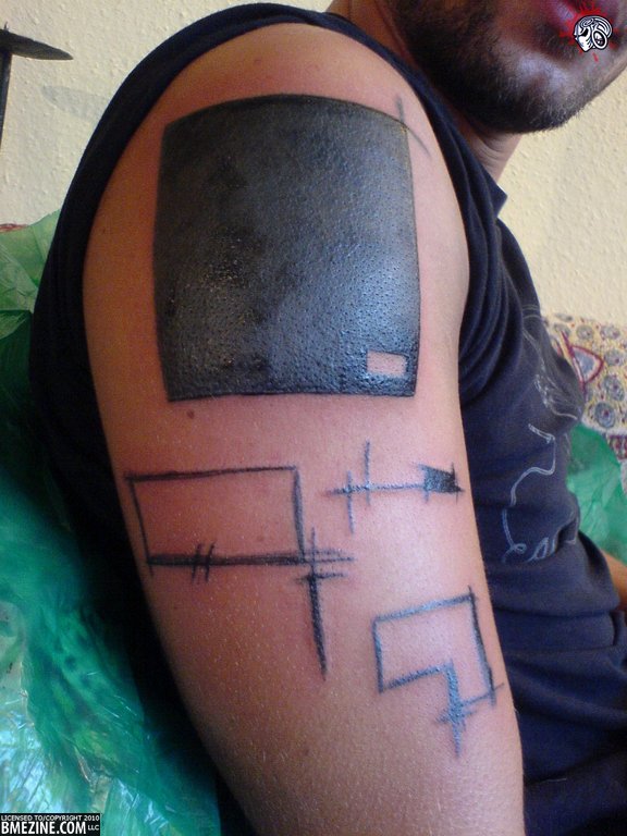
Earlier today we got to look at a dotwork & abstract “tribal” piece. As mentioned before, when most people think of tribal and blackwork tattoos they think of clean lines and heavy bands of black ink. In this second image from Magnutze, we see what is closer to the traditional tribal/blackwork tattoo, but with subtle abstract differences.

With the design being smaller, does it affect your perception of the style? While the first one was covering an entire chest, this being limited to the arm compacts the design into a smaller area. Or does this style just not sit well with you? To some people the lack of balance is aesthetically pleasing, while to others a lack of balance can almost ruin a piece in their mind.
 BME/News and Modblog highlight only a small fraction of what
i love balance, but not symmetry!
..like in this piece (in my mind) looks good because the big black block is balanced by the multiple empty boxes 🙂
i love balance, but not symmetry!
..like in this piece (in my mind) looks good because the big black block is balanced by the multiple empty boxes 🙂
I was just looking through Marisa Kakoulas’ book, “Black Tattoo Art” last night with some friends and this tattoo looks like it would fit in with the section called “Art Brut” with Yann Black’s and Noon’s work. I personally wouldn’t lump it in the category of tribal just because it is simplistic and solid black.
I was just looking through Marisa Kakoulas’ book, “Black Tattoo Art” last night with some friends and this tattoo looks like it would fit in with the section called “Art Brut” with Yann Black’s and Noon’s work. I personally wouldn’t lump it in the category of tribal just because it is simplistic and solid black.
I would like this if it weren’t sitting so squarely on his arm. If the entire design were offset or angled, I’d love it.
I would like this if it weren’t sitting so squarely on his arm. If the entire design were offset or angled, I’d love it.
I actually like this one better. That black square is pretty intense but really well balanced. Overall a very cool piece
I actually like this one better. That black square is pretty intense but really well balanced. Overall a very cool piece
The word tribal brings to mind two totally different aspects of tattooing to me. The bold black geometric designs popularized by Leo Zuletta’s work (and George Clooneys fake tattoo from Dusk Till Dawn). Then there is the true tribal tattoos done in traditional manners and with deep meaning behind them done by people actually involved in that culture. This type work shown here (to me at least) falls under neither of these categories. If anything I would call it avante garde, but really the term “blackwork” is the safest bet.
Magnutze, who I met recently really pulls this style off well. I believe this is a piece he did and not a piece on him, but the pieces he wears all fit so well together and gives him a remarkable look that really fits the bill for using Fakir’s catch phrase, “modern primitive”.
He’s not on IAM, but you can check out the work on him as well as some he’s done on his facebook page http://www.facebook.com/magnutze.