Joao Caldara sends in this wonderful piece by Anderson at Outlaws Tattoo in Petropolis, RJ, Brasil.
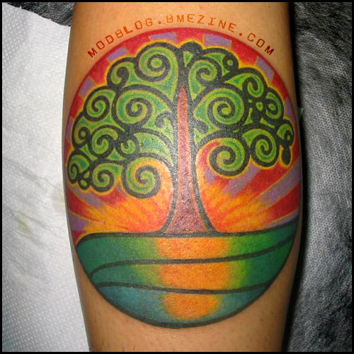
Joao Caldara sends in this wonderful piece by Anderson at Outlaws Tattoo in Petropolis, RJ, Brasil.
 BME/News and Modblog highlight only a small fraction of what BME has to offer. Take our free tour and subscribe to BME for access to over 3 million body modification related photos, videos, and stories.
What a lovely design, its kinda uplifting. I love the bright colours.
What a lovely design, its kinda uplifting. I love the bright colours.
Whoo! Go Green Party!
Whoo! Go Green Party!
This is so smooth and clean, it reminds me so much of the painted pebbles my hippy father has from the 70s… hmm ideas ideas.
This is so smooth and clean, it reminds me so much of the painted pebbles my hippy father has from the 70s… hmm ideas ideas.
that would be Petropolis, RJ, not RL (RJ stands for Rio de Janeiro) 😉
that would be Petropolis, RJ, not RL (RJ stands for Rio de Janeiro) 😉
Thanks Miguel, you’re right of course… just a typo.
Thanks Miguel, you’re right of course… just a typo.
pretty
pretty
Fantastic tat. Loving it completely.
Fantastic tat. Loving it completely.
I love it, the colours are wonderful!
I love it, the colours are wonderful!
You know for a minuet I thought that the words “modblod.bmezine.com” were tattooed above it *shakes head* I can be so dim sometimes.
You know for a minuet I thought that the words “modblod.bmezine.com” were tattooed above it *shakes head* I can be so dim sometimes.
I’m with you Amy – totally thought the Modblog stamp was part of the tattoo! I was wondering, since when does BME have a tree logo?
Shannon, you are getting way too good at putting those watermarkie type things in!
I’m with you Amy – totally thought the Modblog stamp was part of the tattoo! I was wondering, since when does BME have a tree logo?
Shannon, you are getting way too good at putting those watermarkie type things in!
Same here, 9 and 10. XD
Same here, 9 and 10. XD
beautiful.
beautiful.
haha I feel better now that I know i’m not the only one that thought the url was apartf the tattoo.
nice work though, beautiful peice.
haha I feel better now that I know i’m not the only one that thought the url was apartf the tattoo.
nice work though, beautiful peice.
Very nice work…=)
Very nice work…=)
Absolutely stunning! The colours and linework are just great.
Absolutely stunning! The colours and linework are just great.
the colors are INTENSE!! i love it 🙂
the colors are INTENSE!! i love it 🙂
love the colours/tree pattern, reflection seems kinda wrong though
still an awesome tattoo
love the colours/tree pattern, reflection seems kinda wrong though
still an awesome tattoo
This tattoo makes me feel all warm inside, I LOVE it. It’s so simple, colourful and uplifting. This goes in my top 3 modblog tattoos, along with the stained glass window shoulder and cave painting lower back.
This tattoo makes me feel all warm inside, I LOVE it. It’s so simple, colourful and uplifting. This goes in my top 3 modblog tattoos, along with the stained glass window shoulder and cave painting lower back.
It looks a bit like some type of Logo or a patch sewn to a ball cap. The lettering isn’t helping any.
It looks a bit like some type of Logo or a patch sewn to a ball cap. The lettering isn’t helping any.
Very beautiful. I love it.
Very beautiful. I love it.
It´s quite a small world.
The guy who made this tattoo also made my sister´s tattoo.
And it´s very nice!
It´s quite a small world.
The guy who made this tattoo also made my sister´s tattoo.
And it´s very nice!
sooooooo pretty. =) i love the colors!
sooooooo pretty. =) i love the colors!
Gorgeous, unique, and simple…
Bravo to you!
Gorgeous, unique, and simple…
Bravo to you!