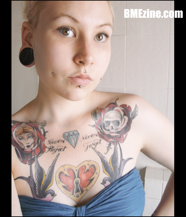
Hey, it’s Friday finally! Let’s kick this sucker off with the very lovely “Anonymous German,” sporting numerous piercings (including six-month-old cheek piercings) by Linus at Serious Piercing in Bochum, Germany. After the jump, we go back in time, briefly, to a simpler era when her cheek piercings were only a day old and her chest tattoos were nowhere near as close to being finished. What a time to be alive.

See more in “Cheeks“ (Lip Piercing)
 BME/News and Modblog highlight only a small fraction of what
que linda!
que linda!
que linda!
que linda!
meh. I prefer the dude with the Motely Crue mess on his back.
meh. I prefer the dude with the Motely Crue mess on his back.
meh. I prefer the dude with the Motely Crue mess on his back.
meh. I prefer the dude with the Motely Crue mess on his back.
that “chest piece” is a MESS.
that “chest piece” is a MESS.
that “chest piece” is a MESS.
that “chest piece” is a MESS.
Not a big fan of tearing people down, but yeah, the color fading on the heart alone is embarassing.
But she’s cute.
So she gets posted.
Not a big fan of tearing people down, but yeah, the color fading on the heart alone is embarassing.
But she’s cute.
So she gets posted.
Not a big fan of tearing people down, but yeah, the color fading on the heart alone is embarassing.
But she’s cute.
So she gets posted.
Not a big fan of tearing people down, but yeah, the color fading on the heart alone is embarassing.
But she’s cute.
So she gets posted.
bush league
bush league
bush league
bush league
im sure we all have at least one crappy tattoo. but, she is georgous.
im sure we all have at least one crappy tattoo. but, she is georgous.
im sure we all have at least one crappy tattoo. but, she is georgous.
im sure we all have at least one crappy tattoo. but, she is georgous.
eck.
eck.
eck.
eck.
You know guys…the color fade on the heart might not be great, but don’t forget that that particular area of the chest gets a huge amount of motion, especially for the ladies. Just a contributing factor.
It’s a little disjointed…but otherwise a good start to an old-schoolish chest piece. If she can get it a bit more connected.
And just my two cents but: Holy beautiful lips and eyes batman.
spacing?
spacing?
spacing?
spacing?
Her eyes, her cheeks and her face is generally beautiful.
Her eyes, her cheeks and her face is generally beautiful.
Her eyes, her cheeks and her face is generally beautiful.
Her eyes, her cheeks and her face is generally beautiful.
reminds me of my “never forget, never regret” tattoo…
ha.
reminds me of my “never forget, never regret” tattoo…
ha.
reminds me of my “never forget, never regret” tattoo…
ha.
reminds me of my “never forget, never regret” tattoo…
ha.
yall talkin bout her tattoo fading
when you should be talking about her head to body ratio
bitch looks like predator
yall talkin bout her tattoo fading
when you should be talking about her head to body ratio
bitch looks like predator
yall talkin bout her tattoo fading
when you should be talking about her head to body ratio
bitch looks like predator
yall talkin bout her tattoo fading
when you should be talking about her head to body ratio
bitch looks like predator
boy the wording around the diamond is horribly done, it’s not even at all. i had some badly done lettering in one of my tattoos, got that shit covered up quickfast. i’d recommend the same for her.
boy the wording around the diamond is horribly done, it’s not even at all. i had some badly done lettering in one of my tattoos, got that shit covered up quickfast. i’d recommend the same for her.
boy the wording around the diamond is horribly done, it’s not even at all. i had some badly done lettering in one of my tattoos, got that shit covered up quickfast. i’d recommend the same for her.
boy the wording around the diamond is horribly done, it’s not even at all. i had some badly done lettering in one of my tattoos, got that shit covered up quickfast. i’d recommend the same for her.
The wording does look messed up and uneven…does it say “Never Forget” twice??
There’s not much unison in the chest piece – it just looks like a bunch of stuff slapped together
And I’m sure she’d look much cuter with a nice smile instead of pursed lips 🙂
The wording does look messed up and uneven…does it say “Never Forget” twice??
There’s not much unison in the chest piece – it just looks like a bunch of stuff slapped together
And I’m sure she’d look much cuter with a nice smile instead of pursed lips 🙂
The wording does look messed up and uneven…does it say “Never Forget” twice??
There’s not much unison in the chest piece – it just looks like a bunch of stuff slapped together
And I’m sure she’d look much cuter with a nice smile instead of pursed lips 🙂
The wording does look messed up and uneven…does it say “Never Forget” twice??
There’s not much unison in the chest piece – it just looks like a bunch of stuff slapped together
And I’m sure she’d look much cuter with a nice smile instead of pursed lips 🙂
I thought it said never forget twice, too.
But then I realized it said Never Regret, Never Forget, and the R is just really really messed up.
I thought it said never forget twice, too.
But then I realized it said Never Regret, Never Forget, and the R is just really really messed up.
I thought it said never forget twice, too.
But then I realized it said Never Regret, Never Forget, and the R is just really really messed up.
I thought it said never forget twice, too.
But then I realized it said Never Regret, Never Forget, and the R is just really really messed up.
Or, actually, on third glance, maybe the R is made with one of the thorns or what not coming from that rose.
Which doesn’t make it look any better, IMO.
Or, actually, on third glance, maybe the R is made with one of the thorns or what not coming from that rose.
Which doesn’t make it look any better, IMO.
Or, actually, on third glance, maybe the R is made with one of the thorns or what not coming from that rose.
Which doesn’t make it look any better, IMO.
Or, actually, on third glance, maybe the R is made with one of the thorns or what not coming from that rose.
Which doesn’t make it look any better, IMO.
I prefer the uncoloured look, but the skull-in-rose looks pretty cool.
I prefer the uncoloured look, but the skull-in-rose looks pretty cool.
I prefer the uncoloured look, but the skull-in-rose looks pretty cool.
I prefer the uncoloured look, but the skull-in-rose looks pretty cool.
I don’t really like the chest piece, but she has beautiful lips!
I don’t really like the chest piece, but she has beautiful lips!
I don’t really like the chest piece, but she has beautiful lips!
I don’t really like the chest piece, but she has beautiful lips!
I really don’t care for her tattoos. And I guess she’s not my type. Idk.
I really don’t care for her tattoos. And I guess she’s not my type. Idk.
I really don’t care for her tattoos. And I guess she’s not my type. Idk.
I really don’t care for her tattoos. And I guess she’s not my type. Idk.
I think she’s gorgeous.
Gosh modblog has really become a place for bashing other modifiers. It’s getting kinda sad 🙁
I think she’s gorgeous.
Gosh modblog has really become a place for bashing other modifiers. It’s getting kinda sad 🙁
I think she’s gorgeous.
Gosh modblog has really become a place for bashing other modifiers. It’s getting kinda sad 🙁
I think she’s gorgeous.
Gosh modblog has really become a place for bashing other modifiers. It’s getting kinda sad 🙁
I prefer the tattoos uncoloured too – I do love the swallows though.
And she’s stunning 🙂
I prefer the tattoos uncoloured too – I do love the swallows though.
And she’s stunning 🙂
I prefer the tattoos uncoloured too – I do love the swallows though.
And she’s stunning 🙂
I prefer the tattoos uncoloured too – I do love the swallows though.
And she’s stunning 🙂
I don’t like how disconnected her tattoos are. Her piercings however, look awesome and suit her face really well.
I don’t like how disconnected her tattoos are. Her piercings however, look awesome and suit her face really well.
I don’t like how disconnected her tattoos are. Her piercings however, look awesome and suit her face really well.
I don’t like how disconnected her tattoos are. Her piercings however, look awesome and suit her face really well.
egads should have left that emptiness open for later please…. I thought the pieces here were placed in reverse order based on quality. the text is wobbly and being eaten by the preexisting work. and that diamond is egregiously defying physics. cool phrase, why not give it the proper size maybe higher up? nothing here that can’t be enhanced/corrected/made more fluid but right now it just looks like she was desperate to have her chest filled in…
not offensive, breaching awkward, nice piercings