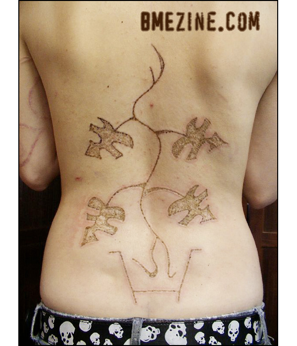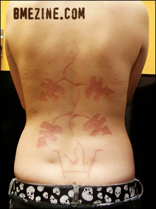
Like I’ve been saying, our scarification submissions lately have just been spectacular, and this hyfricator branding by Blair is no exception. Blair won’t be in Philadelphia, but hey, he’s in Toronto most of the time! Go see him there, and just let him go nuts. Healed shot of this brand, after the jump.

See more in “Scarification by Blair“ (Scarification)
 BME/News and Modblog highlight only a small fraction of what
i’m first to leave a comment!![Ed. note]: This is Jordan. I’m leaving this message here as a warning: There will be no “firsties” on ModBlog. This is one of the worst trends on the Internet. Absolutely not. Thank you for your cooperation.
i’m first to leave a comment!![Ed. note]: This is Jordan. I’m leaving this message here as a warning: There will be no “firsties” on ModBlog. This is one of the worst trends on the Internet. Absolutely not. Thank you for your cooperation.
Good job KD. You don’t win a prize.
But i like this piece. The bottom part of the roots kinda confuses me though.
Good job KD. You don’t win a prize.
But i like this piece. The bottom part of the roots kinda confuses me though.
Nice, looks like comments can be chopped and screwed, altered to however the editor sees fit. Seig heil Jordon!
Nice, looks like comments can be chopped and screwed, altered to however the editor sees fit. Seig heil Jordon!
Haha, yes, how fascistic. This is the first and only time that’s been done, and simply to enforce the only standard of decorum I really have. But you’re right, this is basically the first step towards Internet death camps. Astute.
Haha, yes, how fascistic. This is the first and only time that’s been done, and simply to enforce the only standard of decorum I really have. But you’re right, this is basically the first step towards Internet death camps. Astute.
You Suck, Jordan!
I got you a present, Jon P!
Heavens to Murgatroid, even.
You Suck, Jordan!
I got you a present, Jon P!
Heavens to Murgatroid, even.
design doesn’t do much for me, but that’s really nicely healed!
design doesn’t do much for me, but that’s really nicely healed!
No firsties? No I pOpPeD yOuR cOmMeNt ChErRy!’s?
Myspace’s mom lets her do it.
No firsties? No I pOpPeD yOuR cOmMeNt ChErRy!’s?
Myspace’s mom lets her do it.
Cute scar. Maybe it’s just me but the roots make it look like little stick figure legs. Looks like it’s walking around. I like.
Cute scar. Maybe it’s just me but the roots make it look like little stick figure legs. Looks like it’s walking around. I like.
B’aw.
The freshly branded appearance looks amazing.
Like a scar outlining a tattoo [with perfect color-choice], kind of.
And then it turns out looking like a regular scar~
And it’s a pot on the bottom, right?
B’aw.
The freshly branded appearance looks amazing.
Like a scar outlining a tattoo [with perfect color-choice], kind of.
And then it turns out looking like a regular scar~
And it’s a pot on the bottom, right?
I like… and Blair is absolutely fantastic.. he did a hyfricator brand on me, and it went so well.. he’s the best at what he does and is an absolute sweetheart at that..
I think it turned out nicely.
I like… and Blair is absolutely fantastic.. he did a hyfricator brand on me, and it went so well.. he’s the best at what he does and is an absolute sweetheart at that..
I think it turned out nicely.
This is a ” spectacular” brand? It looks like a 5 year old drew the design.
This is a ” spectacular” brand? It looks like a 5 year old drew the design.
Am I the only one who noticed the pun in the first post?
Am I the only one who noticed the pun in the first post?
It healed well is about the only thing nice I can say about it.
The design is horrible and it isn’t something i think an artist would be proud to have in their portfolio. Honestly if I saw that I would take my business elsewhere.
It healed well is about the only thing nice I can say about it.
The design is horrible and it isn’t something i think an artist would be proud to have in their portfolio. Honestly if I saw that I would take my business elsewhere.
looks like a very poorly executed idea.
to each their own though. i hope the owner is happy
looks like a very poorly executed idea.
to each their own though. i hope the owner is happy
#12- you mean like LEAVE, like leaves, a comment?
I don’t know if that was intended. KD?
#12- you mean like LEAVE, like leaves, a comment?
I don’t know if that was intended. KD?
Not too fond of it but Jordan, continue on with the Internet Dictatorship-ness cause the less idiots leaving myspace-esque comments on here the better. Huzzah!
Not too fond of it but Jordan, continue on with the Internet Dictatorship-ness cause the less idiots leaving myspace-esque comments on here the better. Huzzah!
stupid. D:
stupid. D:
I for one personally love the design. Its simple and not overly complicated, unlike the plethora of cuttings/brandings we’re seeing these days. Back to the basics. Minimalistic is in I say.
I also love his wood burnt art that he’s been putting out these days.
But in the end its art…and just like every lame ass holier than thou hipster art gallery showing, you’re going to have people either love it or hate it…But that’s whats so great about true art, the contrast of opinion.
Warren: I disagree with you…for the sake of art!
Warren: I disagree with you…for the sake of art!
what is that thing at the bottom?
what is that thing at the bottom?
It is a pot at the bottom of the design with the roots inside. Blair drew this design actually – so for those of you saying I brought a shitty child like design to Blair and he shouldn’t be proud to have branded it into me, you’re wrong. Him and I both like the design very much, including it’s simplicity. Of course it turned out looking like a regular scar, we didn’t add any tattooing or anything to it. It was meant to look like a scar. As for it looking like a poorly executed idea, I’d like to know how it comes across as not turning out just as it should have. Last I talked with Blair we were both quite happy with how it turned out. I think he did a fantastic job and I chose a design we were both happy to work with.
It is a pot at the bottom of the design with the roots inside. Blair drew this design actually – so for those of you saying I brought a shitty child like design to Blair and he shouldn’t be proud to have branded it into me, you’re wrong. Him and I both like the design very much, including it’s simplicity. Of course it turned out looking like a regular scar, we didn’t add any tattooing or anything to it. It was meant to look like a scar. As for it looking like a poorly executed idea, I’d like to know how it comes across as not turning out just as it should have. Last I talked with Blair we were both quite happy with how it turned out. I think he did a fantastic job and I chose a design we were both happy to work with.
I’d have to agree with #11. This really isn’t worthy of modblog, IMO. It seems that the quality of the work being showcased has been declining as of late.
I’d have to agree with #11. This really isn’t worthy of modblog, IMO. It seems that the quality of the work being showcased has been declining as of late.