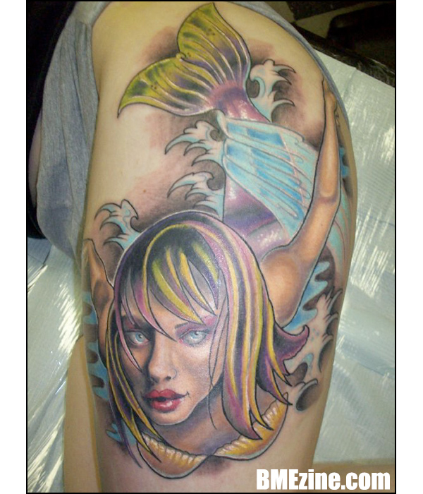
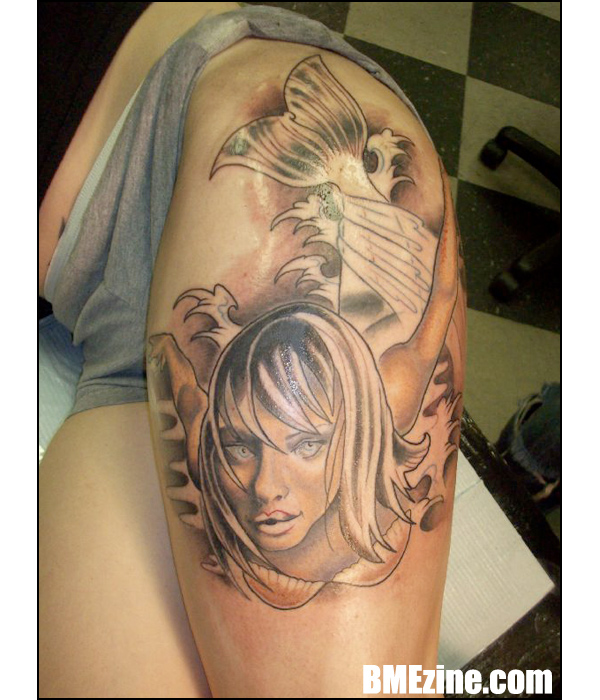
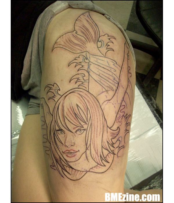
… in reverse! Leftie01‘s sultry mermaid here was tattooed by Sean Herman at Royal Street Tattoo in Mobile, Alabama. The chrysalid stages are after the jump.
See more in “Fantasy Tattoos“ (Tattoos)

… in reverse! Leftie01‘s sultry mermaid here was tattooed by Sean Herman at Royal Street Tattoo in Mobile, Alabama. The chrysalid stages are after the jump.


See more in “Fantasy Tattoos“ (Tattoos)
 BME/News and Modblog highlight only a small fraction of what BME has to offer. Take our free tour and subscribe to BME for access to over 3 million body modification related photos, videos, and stories.
that’s so fucking awesome
that’s so fucking awesome
there’s something about it that’s making me go, that’s sweet! but it could be sweeter..
there’s something about it that’s making me go, that’s sweet! but it could be sweeter..
Urgh, face is creepy.
Urgh, face is creepy.
Wow, so nicely done, and such a neat combination of realism and cartoon.
I always find I like the initial linework best, even more than the finished tattoo (which obviously shows far much more skill in the art that the lines alone would) but it may just be the minimalist in me.
Wow, so nicely done, and such a neat combination of realism and cartoon.
I always find I like the initial linework best, even more than the finished tattoo (which obviously shows far much more skill in the art that the lines alone would) but it may just be the minimalist in me.
I’m confused. So if the latter two photos are the chrysalid stage, are you implying that the outline is the pupal stage and the fully colored image is the “butterfly” stage — if you will. Or are you saying that the cocoon stage of a mermaid is a merely deficiency in skin (and scale) pigmentation?
I’m confused. So if the latter two photos are the chrysalid stage, are you implying that the outline is the pupal stage and the fully colored image is the “butterfly” stage — if you will. Or are you saying that the cocoon stage of a mermaid is a merely deficiency in skin (and scale) pigmentation?
looked awesome before colour was added.
looked awesome before colour was added.
AMZAING WORK!
her eyes are creeping me out something fierce…
but i really don’t like the perspective, the tail seems way too short for the body.
AMZAING WORK!
her eyes are creeping me out something fierce…
but i really don’t like the perspective, the tail seems way too short for the body.
it took me a while to realise that was a thigh and now i think i like it even more than if it were on an arm.
looks great.
it took me a while to realise that was a thigh and now i think i like it even more than if it were on an arm.
looks great.
nice perspective!
nice perspective!
masterpiece!
masterpiece!
Sean Herman is a beast. And by beast I mean amazing person.
Sean Herman is a beast. And by beast I mean amazing person.
@4 i totally agree. the bottom photo of just linework is my favorite.
@4 i totally agree. the bottom photo of just linework is my favorite.
lovely mermaid…)))
lovely mermaid…)))
The face/chest/arms look really good but like #7 I’m not sure on the perspective of the tail, but it is a difficult sort of angle to illustrate. It looks like maybe you should be able to see more of her torso below the chest to indicate the curve of the spine, rather than it looking like the tail joins straight into her armpits.
The face/chest/arms look really good but like #7 I’m not sure on the perspective of the tail, but it is a difficult sort of angle to illustrate. It looks like maybe you should be able to see more of her torso below the chest to indicate the curve of the spine, rather than it looking like the tail joins straight into her armpits.
wow, thats amazing.
I had a shell bra once…
wow, thats amazing.
I had a shell bra once…
something about the shell bra doesnt flow with the whole piece like it doesnt connect or something but still it look good
something about the shell bra doesnt flow with the whole piece like it doesnt connect or something but still it look good
Totally looked better in just sepia tones, in my opinion.
Totally looked better in just sepia tones, in my opinion.
i agree with #7, the eyes are pretty creepy. love the depth, not too sure about the combination of colors in the hair though.
i agree with #7, the eyes are pretty creepy. love the depth, not too sure about the combination of colors in the hair though.
Oh my, I dont understand much about tattooing, but something about drawning/art and that colouring and lining looks kind of.. hmm.. weird? But it’s still pretty and nice piece.
Oh my, I dont understand much about tattooing, but something about drawning/art and that colouring and lining looks kind of.. hmm.. weird? But it’s still pretty and nice piece.
hmmm, definitely agree with 6… liked it more before the colour.
really great placement though.
hmmm, definitely agree with 6… liked it more before the colour.
really great placement though.
Sean is the man – That is all.
Sean is the man – That is all.
That one line……the tail to the hair….it’s killing me. otherwise, beautiful
That one line……the tail to the hair….it’s killing me. otherwise, beautiful