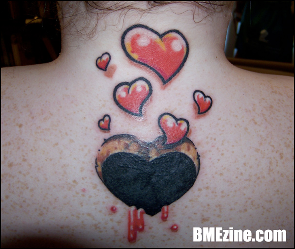
And here we have a cover-up piece on Laura, done by Cory Hand at By The Book Tattoos in Columbus, Mississippi. “I had a flower that I wasn’t really into anymore,” Laura says, “and he came up with this amazing idea for me. In a couple of weeks, we’ll add the lettering, ‘All You Need Is Love’ underneath the hole.”
 BME/News and Modblog highlight only a small fraction of what
I love this tat but i personally think it would be best to leave the lettering out, the image itself is really strong enough. But i always say to each his/her own so do what you feel is best.
I love this tat but i personally think it would be best to leave the lettering out, the image itself is really strong enough. But i always say to each his/her own so do what you feel is best.
I love this tat but i personally think it would be best to leave the lettering out, the image itself is really strong enough. But i always say to each his/her own so do what you feel is best.
Love it! I personally think it would be better without the words underneath but i love the illustration, very cute.
Love it! I personally think it would be better without the words underneath but i love the illustration, very cute.
Love it! I personally think it would be better without the words underneath but i love the illustration, very cute.
i don’t get the brown part of the heart…
i don’t get the brown part of the heart…
i don’t get the brown part of the heart…
it’s supposed to look like a cutout.
i think its cute !
it’s supposed to look like a cutout.
i think its cute !
it’s supposed to look like a cutout.
i think its cute !
cool!
cool!
cool!
omg i love it. i agree with #1 no words!! but yeah great tattoo. love the cut out effect.
omg i love it. i agree with #1 no words!! but yeah great tattoo. love the cut out effect.
omg i love it. i agree with #1 no words!! but yeah great tattoo. love the cut out effect.
is the little red dot on the left side a pimple or part of the tatto? 😛
is the little red dot on the left side a pimple or part of the tatto? 😛
is the little red dot on the left side a pimple or part of the tatto? 😛
the blood looks like ketchup 🙂
great idea
the blood looks like ketchup 🙂
great idea
the blood looks like ketchup 🙂
great idea
very cute and well illustrated tattoo, haert cut out idea is awesome with the floating tiny hearts above very awesome
very cute and well illustrated tattoo, haert cut out idea is awesome with the floating tiny hearts above very awesome
very cute and well illustrated tattoo, haert cut out idea is awesome with the floating tiny hearts above very awesome
awww! so cute 🙂
awww! so cute 🙂
awww! so cute 🙂
The two bottom drops keep throwing me off. They look like huge zits:\
The two bottom drops keep throwing me off. They look like huge zits:\
The two bottom drops keep throwing me off. They look like huge zits:\
love the cut out idea i want one now thank you;)
love the cut out idea i want one now thank you;)
love the cut out idea i want one now thank you;)
I like it, but first thing that threw me off was the two blood drops too… they look like awful zits.
I like it, but first thing that threw me off was the two blood drops too… they look like awful zits.
I like it, but first thing that threw me off was the two blood drops too… they look like awful zits.
I like the concept, but IMO the execution wasn’t too great…don’t mean to knock it, but I had to look at the caption to get what it was supposed to be. the perspective of the blood is off too…I’m not sure how its supposed to flow up the sides of a hole.
nice idea, but a few problems
I like the concept, but IMO the execution wasn’t too great…don’t mean to knock it, but I had to look at the caption to get what it was supposed to be. the perspective of the blood is off too…I’m not sure how its supposed to flow up the sides of a hole.
nice idea, but a few problems
I like the concept, but IMO the execution wasn’t too great…don’t mean to knock it, but I had to look at the caption to get what it was supposed to be. the perspective of the blood is off too…I’m not sure how its supposed to flow up the sides of a hole.
nice idea, but a few problems
its just my opinion obviously but this is the latest in a long line of very poor tattoos featured on modblog,at least shes happy with it i guess.
its just my opinion obviously but this is the latest in a long line of very poor tattoos featured on modblog,at least shes happy with it i guess.
its just my opinion obviously but this is the latest in a long line of very poor tattoos featured on modblog,at least shes happy with it i guess.
it reminds me of tara mcpherson. i like it!
it reminds me of tara mcpherson. i like it!
it reminds me of tara mcpherson. i like it!
ADORABLE
ADORABLE
ADORABLE
I’m lost too. I like the red and the thick outlining, but what’s with the brown cut out thing? What is supposed to look like it’s been cut out? And cut out from where? Is it to look as if it has been cut out of her skin? Because it doesn’t, does it? I don’t get it, but I want to understand – not bashing, just seeking clarification. I’d see it and think it’s a kids’ sticker.
I’m lost too. I like the red and the thick outlining, but what’s with the brown cut out thing? What is supposed to look like it’s been cut out? And cut out from where? Is it to look as if it has been cut out of her skin? Because it doesn’t, does it? I don’t get it, but I want to understand – not bashing, just seeking clarification. I’d see it and think it’s a kids’ sticker.
I’m lost too. I like the red and the thick outlining, but what’s with the brown cut out thing? What is supposed to look like it’s been cut out? And cut out from where? Is it to look as if it has been cut out of her skin? Because it doesn’t, does it? I don’t get it, but I want to understand – not bashing, just seeking clarification. I’d see it and think it’s a kids’ sticker.
Leave the lettering out! I love this by its self. Very neat idea!
Leave the lettering out! I love this by its self. Very neat idea!
Leave the lettering out! I love this by its self. Very neat idea!
very nice.
very nice.
very nice.
i think it def looks like its been cut out!
i think it def looks like its been cut out!
i think it def looks like its been cut out!
Hey guys. Thank you for your compliments. I’m very happy with this piece. To each his own is probably the most appropriate statement. I did get the lettering added to it about two weeks after. 🙂
Hey guys. Thank you for your compliments. I’m very happy with this piece. To each his own is probably the most appropriate statement. I did get the lettering added to it about two weeks after. 🙂
Hey guys. Thank you for your compliments. I’m very happy with this piece. To each his own is probably the most appropriate statement. I did get the lettering added to it about two weeks after. 🙂