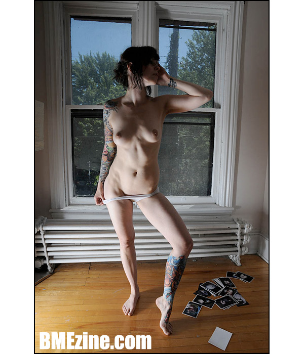
Well, isn’t this a lovely surprise! Lindsey May makes her triumphant return to ModBlog after a prolonged, inexplicable absence. Here she is, lounging pretty hard, wearing pumps inside because why the hell not, right? Never underestimate the power of a good high-heeled shoe. This, of course, is just a moment of relative calm before tragedy strikes! After the jump, Lindsey is accosted by what must be the storm of the century, or some other terrible force that just tears off most of her clothes. Luckily, her wonderful tattoo work by Craig Driscoll and Pol was left unscathed. I guess when you put it like that, everyone’s kind of a winner here.

See more in “New Skool tattoos“ (Tattoos)
See more in “Modded Women“ (members only)
 BME/News and Modblog highlight only a small fraction of what
great tattoos aside… she has a really interesting looking body.
great tattoos aside… she has a really interesting looking body.
great tattoos aside… she has a really interesting looking body.
wowzers
im an instant fan!
wowzers
im an instant fan!
wowzers
im an instant fan!
holy shit she’s stunning
holy shit she’s stunning
holy shit she’s stunning
How come girls like that dont live where I live.
How come girls like that dont live where I live.
How come girls like that dont live where I live.
Beautiful! Isn’t she a Suicide Girl?
Beautiful! Isn’t she a Suicide Girl?
Beautiful! Isn’t she a Suicide Girl?
insta-crush.
now iam off to lurk.
insta-crush.
now iam off to lurk.
insta-crush.
now iam off to lurk.
first pic: i was really liking. second pic: i’m liking even more.
love the tattoos and love the b-day suit :]
first pic: i was really liking. second pic: i’m liking even more.
love the tattoos and love the b-day suit :]
first pic: i was really liking. second pic: i’m liking even more.
love the tattoos and love the b-day suit :]
photo A to photo B was so surprising
it was shocking, but an effective change
the tattoo colour is stunning, too
photo A to photo B was so surprising
it was shocking, but an effective change
the tattoo colour is stunning, too
photo A to photo B was so surprising
it was shocking, but an effective change
the tattoo colour is stunning, too
I bet that chick fucks like an animal!
I bet that chick fucks like an animal!
I bet that chick fucks like an animal!
This is a really awesome sequence. There’s quite a bit to appreciate.
So, I liked the first shot a lot and didn’t even notice at first how the leg and the sleeve matched and were put together like they were continuous. The look is alluring and the legs are QUITE distracting.
And, as JonD said above, the change took me aback as well! The more I looked, the more I thought that everything was perfect. The panties pulled aside, the photographs on the floor, the absolutely PERFECT lighting, and the feminine reveal of the ink on the wrist… yet my favorite part (ok, my second favorite part!) is how the two largest spots of ink are farthest apart.
I don’t know if this was all a poetic accident or not, but I am really inspired and wish I could shoot like this.
This is the ONLY time I’ve seen ANYONE look good in a footless legging…I always thought it looked odd but her tattoos really make it look good…
and yeah that second pick is a real POW in the face but it’s a good picture
This is the ONLY time I’ve seen ANYONE look good in a footless legging…I always thought it looked odd but her tattoos really make it look good…
and yeah that second pick is a real POW in the face but it’s a good picture
This is the ONLY time I’ve seen ANYONE look good in a footless legging…I always thought it looked odd but her tattoos really make it look good…
and yeah that second pick is a real POW in the face but it’s a good picture
O_O wowza.
O_O wowza.
O_O wowza.
nom nom nom nom
nom nom nom nom
nom nom nom nom
shs beautiful, but i wish it looked more natural. there’s so much posturing in each picture.
shs beautiful, but i wish it looked more natural. there’s so much posturing in each picture.
shs beautiful, but i wish it looked more natural. there’s so much posturing in each picture.
nice shot, nice tats
nice shot, nice tats
nice shot, nice tats
that leg sleeve is popppin’ like her body, i want to knock hip bones
that leg sleeve is popppin’ like her body, i want to knock hip bones
that leg sleeve is popppin’ like her body, i want to knock hip bones
That is one long radiator.
That is one long radiator.
That is one long radiator.
11. POW RIGHT IN THE KISSER!
11. POW RIGHT IN THE KISSER!
11. POW RIGHT IN THE KISSER!
#13 X2
#13 X2
#13 X2
So incredibly gorgeous. The first picture is so deceiving and makes her appear extremely heavily tattooed, but in the nude she’s got so much open canvas!
I love it. If you’re not already a Suicide Girl, you should be. Gorgeous work by Driscoll!
So incredibly gorgeous. The first picture is so deceiving and makes her appear extremely heavily tattooed, but in the nude she’s got so much open canvas!
I love it. If you’re not already a Suicide Girl, you should be. Gorgeous work by Driscoll!
So incredibly gorgeous. The first picture is so deceiving and makes her appear extremely heavily tattooed, but in the nude she’s got so much open canvas!
I love it. If you’re not already a Suicide Girl, you should be. Gorgeous work by Driscoll!
Didn’t come to modblog to see her nasty milktits
Someone should tell her to go back to the coffee house she crawled out of
Didn’t come to modblog to see her nasty milktits
Someone should tell her to go back to the coffee house she crawled out of
Didn’t come to modblog to see her nasty milktits
Someone should tell her to go back to the coffee house she crawled out of
shes absolutely gorgeous and has amazing work as well
shes absolutely gorgeous and has amazing work as well
shes absolutely gorgeous and has amazing work as well
Lovely combination of Godwork + Artwork
Lovely combination of Godwork + Artwork
Lovely combination of Godwork + Artwork
I’M TIRED OF SEEING THINGS I CAN’T HAVE!
I’M TIRED OF SEEING THINGS I CAN’T HAVE!
I’M TIRED OF SEEING THINGS I CAN’T HAVE!
I really dislike the composition of the first photo. It feels too posey. Her face looks awkward. I do like the second photo better. Very lovely mods 🙂
I really dislike the composition of the first photo. It feels too posey. Her face looks awkward. I do like the second photo better. Very lovely mods 🙂
I really dislike the composition of the first photo. It feels too posey. Her face looks awkward. I do like the second photo better. Very lovely mods 🙂