Hey, you heard the legs. Sound advice.
Well, it was a short week on account of the holidays, but I think we squeezed some fun out of it. To send off 2008, we:
And lest you think we forgot, the annual BME Year-End Awards will be up very shortly. (You think you’re excited? Feel these nipples!) Other than that, a couple posts over the weekend, and then we get back into the regular routine, Monday morning. Be safe, folks, and of course, thank you for your continued support of BME. Have a great weekend.
 BME/News and Modblog highlight only a small fraction of what
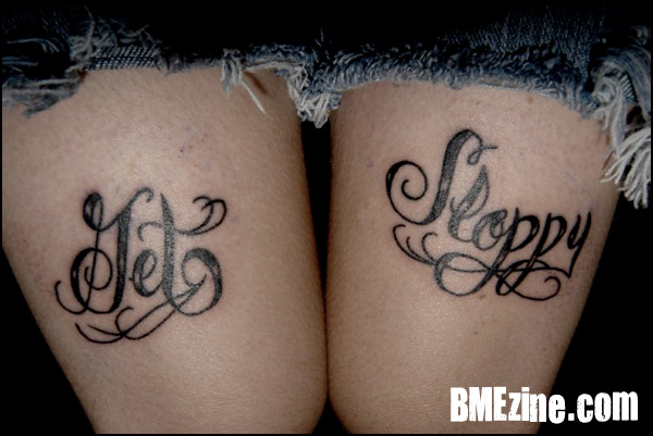
get happy or get sloppy?
get happy or get sloppy?
get happy or get sloppy?
get happy or get sloppy?
Looks like Jet Sloppy to me :S
Looks like Jet Sloppy to me :S
Looks like Jet Sloppy to me :S
Looks like Jet Sloppy to me :S
where are MY naked pictures i submitted?!
lawls.
love to my modblog/bme friends.
where are MY naked pictures i submitted?!
lawls.
love to my modblog/bme friends.
where are MY naked pictures i submitted?!
lawls.
love to my modblog/bme friends.
where are MY naked pictures i submitted?!
lawls.
love to my modblog/bme friends.
I’m reading “Jet Sloppy” too
I’m reading “Jet Sloppy” too
I’m reading “Jet Sloppy” too
I’m reading “Jet Sloppy” too
that is one terribly done tattoo….
that is one terribly done tattoo….
that is one terribly done tattoo….
that is one terribly done tattoo….
yeah, definately “jet sloppy”
yeah, definately “jet sloppy”
yeah, definately “jet sloppy”
yeah, definately “jet sloppy”
Am I the only one that doesn’t get it?
Am I the only one that doesn’t get it?
Am I the only one that doesn’t get it?
Am I the only one that doesn’t get it?
Yeah, I’m with everyone else. All I see is Jet Sloppy.
Yeah, I’m with everyone else. All I see is Jet Sloppy.
Yeah, I’m with everyone else. All I see is Jet Sloppy.
Yeah, I’m with everyone else. All I see is Jet Sloppy.
Pretty obvious that it’s get sloppy.
I actually like how the tattoo is done to be honest.
If the back of the cursive g was as thick as the rest of the letters I think it would look awkward…
“jet sloppy” just doesn’t even make any sense..c’mon people. Don’t make yourselves sound like five year olds even if you think the tattoo is poorly done, it’s obviously not jet.
im with vancey on this one.
im with vancey on this one.
im with vancey on this one.
im with vancey on this one.
It clearly says Get Sloppy, people should be less oblivious to different types of calligraphy
It clearly says Get Sloppy, people should be less oblivious to different types of calligraphy
It clearly says Get Sloppy, people should be less oblivious to different types of calligraphy
It clearly says Get Sloppy, people should be less oblivious to different types of calligraphy
I don’t necessarily like the calligraphy (I think the ‘P’s and the ‘S’ look a little awkward), but I definitely feel like it is easily read.
I don’t necessarily like the calligraphy (I think the ‘P’s and the ‘S’ look a little awkward), but I definitely feel like it is easily read.
I don’t necessarily like the calligraphy (I think the ‘P’s and the ‘S’ look a little awkward), but I definitely feel like it is easily read.
I don’t necessarily like the calligraphy (I think the ‘P’s and the ‘S’ look a little awkward), but I definitely feel like it is easily read.
Georgia, Synie, Lisalou, Graelston.
Just because your primary school education lacks cursive writing don’t take it out on people’s who do have it. It is clearly a proper cursive capitol “G”, which you would know if you attended Grade 3. Grow up.
And Lisalou, do you even have a tattoo or just enjoy knocking people who do? Just because you don’t like it doesn’t mean it sucks.
I like it.
excuse me binah.. but just because we are more familiar with our capital G’s having a bigger upper curve.. does not make us childish or is a comment on our schooling..
at first i read it as JET rather than listening to all logic saying it should be GET.. the upper curve (i feel) should be bigger.. but if someone can point me to a font where the g’s are like that.. i will agree that it says GET.. not JET
defffffffffffinitely ‘Get Sloppy’ and it’s obviously that way on purpose. ‘Get Happy’ is out of the question, i think. ‘Jet (whatever)’ is also not right…
and if the legs are an indicator of the rest… we can definitely get sloppy sometime.
defffffffffffinitely ‘Get Sloppy’ and it’s obviously that way on purpose. ‘Get Happy’ is out of the question, i think. ‘Jet (whatever)’ is also not right…
and if the legs are an indicator of the rest… we can definitely get sloppy sometime.
defffffffffffinitely ‘Get Sloppy’ and it’s obviously that way on purpose. ‘Get Happy’ is out of the question, i think. ‘Jet (whatever)’ is also not right…
and if the legs are an indicator of the rest… we can definitely get sloppy sometime.
defffffffffffinitely ‘Get Sloppy’ and it’s obviously that way on purpose. ‘Get Happy’ is out of the question, i think. ‘Jet (whatever)’ is also not right…
and if the legs are an indicator of the rest… we can definitely get sloppy sometime.
my problem isn’t that the ‘g’ looks like a ‘j’, my problem is the fact that the ‘sl’ in sloppy is curving down, whereas get is completely straight.. unless like thats the pun..
my problem isn’t that the ‘g’ looks like a ‘j’, my problem is the fact that the ‘sl’ in sloppy is curving down, whereas get is completely straight.. unless like thats the pun..
my problem isn’t that the ‘g’ looks like a ‘j’, my problem is the fact that the ‘sl’ in sloppy is curving down, whereas get is completely straight.. unless like thats the pun..
my problem isn’t that the ‘g’ looks like a ‘j’, my problem is the fact that the ‘sl’ in sloppy is curving down, whereas get is completely straight.. unless like thats the pun..
calligraphy sucks sometimes.
i have a baseballhat saying “racetraitor”, but most people read “basetraitor”. and i have a friend with “pure rage” on his knuckels. i looks like “pure race”.
calligraphy sucks sometimes.
i have a baseballhat saying “racetraitor”, but most people read “basetraitor”. and i have a friend with “pure rage” on his knuckels. i looks like “pure race”.
calligraphy sucks sometimes.
i have a baseballhat saying “racetraitor”, but most people read “basetraitor”. and i have a friend with “pure rage” on his knuckels. i looks like “pure race”.
calligraphy sucks sometimes.
i have a baseballhat saying “racetraitor”, but most people read “basetraitor”. and i have a friend with “pure rage” on his knuckels. i looks like “pure race”.
I love it.
It looks like exactly what it is supposed to look like.
Beautiful calligraphy. I want my script to look something like that.
I love it.
It looks like exactly what it is supposed to look like.
Beautiful calligraphy. I want my script to look something like that.
I love it.
It looks like exactly what it is supposed to look like.
Beautiful calligraphy. I want my script to look something like that.
I love it.
It looks like exactly what it is supposed to look like.
Beautiful calligraphy. I want my script to look something like that.
whether it says it or not i still see jet sloppy.
shit pure race cud get him in a bit of trouble. how unfortunate. hahaha.
whether it says it or not i still see jet sloppy.
shit pure race cud get him in a bit of trouble. how unfortunate. hahaha.
whether it says it or not i still see jet sloppy.
shit pure race cud get him in a bit of trouble. how unfortunate. hahaha.
whether it says it or not i still see jet sloppy.
shit pure race cud get him in a bit of trouble. how unfortunate. hahaha.
Sloppy tattoo, very funny. I like it, nothing wrong with the g in ‘Get’, but the sloppy seems a bit high on the leg in comparison…or is the get a bit low?! (I do admit it could just be the photo)
I like it.
Sloppy tattoo, very funny. I like it, nothing wrong with the g in ‘Get’, but the sloppy seems a bit high on the leg in comparison…or is the get a bit low?! (I do admit it could just be the photo)
I like it.
Sloppy tattoo, very funny. I like it, nothing wrong with the g in ‘Get’, but the sloppy seems a bit high on the leg in comparison…or is the get a bit low?! (I do admit it could just be the photo)
I like it.
Sloppy tattoo, very funny. I like it, nothing wrong with the g in ‘Get’, but the sloppy seems a bit high on the leg in comparison…or is the get a bit low?! (I do admit it could just be the photo)
I like it.
Binah:
for the record i’m pretty sure no schools in england teach you to write in cursive, just regular handwriting where letters look like they should be. because really, where does it ever come in useful in life? just because maybe in america or whereever you’re from they do, dont assume that people had a lesser education than you just because they didnt learn to write in fancy letters, because it really isnt that impotant at all in the grand scheme of things
I thought the G was a J… But it makes alot more sense now knowing its a G….
“Jet Sloppy” makes absolutely NO sense.
I thought the G was a J… But it makes alot more sense now knowing its a G….
“Jet Sloppy” makes absolutely NO sense.
I thought the G was a J… But it makes alot more sense now knowing its a G….
“Jet Sloppy” makes absolutely NO sense.
I thought the G was a J… But it makes alot more sense now knowing its a G….
“Jet Sloppy” makes absolutely NO sense.
I knew Jet Sloppy made no sense, thats just what I was seeing, of course shortly after I posted that my brain registered the other line and I was all “OH IT IS GET” and yeah, they dont teach calligraphy in schools here and even if they did it SURE as hell wasnt in grade 3.
I knew Jet Sloppy made no sense, thats just what I was seeing, of course shortly after I posted that my brain registered the other line and I was all “OH IT IS GET” and yeah, they dont teach calligraphy in schools here and even if they did it SURE as hell wasnt in grade 3.
I knew Jet Sloppy made no sense, thats just what I was seeing, of course shortly after I posted that my brain registered the other line and I was all “OH IT IS GET” and yeah, they dont teach calligraphy in schools here and even if they did it SURE as hell wasnt in grade 3.
I knew Jet Sloppy made no sense, thats just what I was seeing, of course shortly after I posted that my brain registered the other line and I was all “OH IT IS GET” and yeah, they dont teach calligraphy in schools here and even if they did it SURE as hell wasnt in grade 3.
I’m british and I had no idea it was a ‘G’ and I’m qualified up to the hilt. I have never seen a cap’G’ like that before.
-And so what if anyone thought it was ‘Jet’? Since when did this blog state a logical and straight forward explanation is required for a tattoo? I’ve seen some tatts on here that have no rhyme or reason at all and no one complains. A few people pipe up that they read it as ‘Jet’ and thought it was a little odd and all hell breaks loose as the self righteous professors of calligraphy file in.
To me that clearly looks like a ‘J’. look at the font we are typing with … little ‘j’ big ‘J’, little ‘g’ big ‘G’- which one do you think it looks like?
”But that’s not the correct font” says professor calligraphy -no but it’s the standard one most people who can read, read. Hence the confusion- and anyone with a grade 3 education under their belt would have appreciated that.
At first I thought it said “get sleepy” hahahah
At first I thought it said “get sleepy” hahahah
At first I thought it said “get sleepy” hahahah
At first I thought it said “get sleepy” hahahah
http://www.peterson-handwriting.com/animCrsvCap/G%20CrsvCapAnL2.html
let’s do it together now class.
http://www.peterson-handwriting.com/animCrsvCap/G%20CrsvCapAnL2.html
let’s do it together now class.
http://www.peterson-handwriting.com/animCrsvCap/G%20CrsvCapAnL2.html
let’s do it together now class.
http://www.peterson-handwriting.com/animCrsvCap/G%20CrsvCapAnL2.html
let’s do it together now class.
jet.
jet.
jet.
jet.
coetzee – I think the confusion was the lackage of “rocks” and abundance of “swirls” in the capital G
ha.
coetzee – I think the confusion was the lackage of “rocks” and abundance of “swirls” in the capital G
ha.
coetzee – I think the confusion was the lackage of “rocks” and abundance of “swirls” in the capital G
ha.
coetzee – I think the confusion was the lackage of “rocks” and abundance of “swirls” in the capital G
ha.
#19, “Sloppy” does look a little high now that you mention it…
And I didn’t see “Jet” until I read the comments, heh
#19, “Sloppy” does look a little high now that you mention it…
And I didn’t see “Jet” until I read the comments, heh
#19, “Sloppy” does look a little high now that you mention it…
And I didn’t see “Jet” until I read the comments, heh
#19, “Sloppy” does look a little high now that you mention it…
And I didn’t see “Jet” until I read the comments, heh
I dont see a G at all.
🙁
I dont see a G at all.
🙁
I dont see a G at all.
🙁
I dont see a G at all.
🙁
i read it as ‘get sloppy’ – and in the grand scheme of things who cares what we think. she likes her tattoo and that is probably why she sent it in.
i read it as ‘get sloppy’ – and in the grand scheme of things who cares what we think. she likes her tattoo and that is probably why she sent it in.
i read it as ‘get sloppy’ – and in the grand scheme of things who cares what we think. she likes her tattoo and that is probably why she sent it in.
i read it as ‘get sloppy’ – and in the grand scheme of things who cares what we think. she likes her tattoo and that is probably why she sent it in.
It’s definitely a “G” and it’s easy to read.
On the flip side, it’s a little crooked…
It’s definitely a “G” and it’s easy to read.
On the flip side, it’s a little crooked…
It’s definitely a “G” and it’s easy to read.
On the flip side, it’s a little crooked…
It’s definitely a “G” and it’s easy to read.
On the flip side, it’s a little crooked…
It’s a J.
Basically.
If she wanted people to read it as Get Sloppy then surely she would have made it clearer?!
And why there is so much animosity towards people who thought it said Jet I dont know, it’s just a tattoo. People see things how they see things, chill.
It’s a J.
Basically.
If she wanted people to read it as Get Sloppy then surely she would have made it clearer?!
And why there is so much animosity towards people who thought it said Jet I dont know, it’s just a tattoo. People see things how they see things, chill.
It’s a J.
Basically.
If she wanted people to read it as Get Sloppy then surely she would have made it clearer?!
And why there is so much animosity towards people who thought it said Jet I dont know, it’s just a tattoo. People see things how they see things, chill.
It’s a J.
Basically.
If she wanted people to read it as Get Sloppy then surely she would have made it clearer?!
And why there is so much animosity towards people who thought it said Jet I dont know, it’s just a tattoo. People see things how they see things, chill.
who gives a fuck the tattoo says get sloppy aka get fucking drunk suck on my limp one eye and have a drink
who gives a fuck the tattoo says get sloppy aka get fucking drunk suck on my limp one eye and have a drink
who gives a fuck the tattoo says get sloppy aka get fucking drunk suck on my limp one eye and have a drink
who gives a fuck the tattoo says get sloppy aka get fucking drunk suck on my limp one eye and have a drink
oh and im just a skinny boy not a girl sorry about the daisy dukes i roll country
oh and im just a skinny boy not a girl sorry about the daisy dukes i roll country
oh and im just a skinny boy not a girl sorry about the daisy dukes i roll country
oh and im just a skinny boy not a girl sorry about the daisy dukes i roll country
Except for the fact that it is not a J.
I can see how one would come to that conclusion,
but the vertical curved line through the loop of the G
would not exist were it a J.
You can ‘see things how you see things’all night and day
but that doesn’t make you right.
Except for the fact that it is not a J.
I can see how one would come to that conclusion,
but the vertical curved line through the loop of the G
would not exist were it a J.
You can ‘see things how you see things’all night and day
but that doesn’t make you right.
Except for the fact that it is not a J.
I can see how one would come to that conclusion,
but the vertical curved line through the loop of the G
would not exist were it a J.
You can ‘see things how you see things’all night and day
but that doesn’t make you right.
Except for the fact that it is not a J.
I can see how one would come to that conclusion,
but the vertical curved line through the loop of the G
would not exist were it a J.
You can ‘see things how you see things’all night and day
but that doesn’t make you right.
at first glance i read “get sloppy”
at first glance i read “get sloppy”
at first glance i read “get sloppy”
at first glance i read “get sloppy”
J – http://www.janbrett.com/alphabet/cursive_alphabet_j_jellyfish.htm
G- http://www.janbrett.com/alphabet/cursive_alphabet_g_goat.htm
J – http://www.janbrett.com/alphabet/cursive_alphabet_j_jellyfish.htm
G- http://www.janbrett.com/alphabet/cursive_alphabet_g_goat.htm
J – http://www.janbrett.com/alphabet/cursive_alphabet_j_jellyfish.htm
G- http://www.janbrett.com/alphabet/cursive_alphabet_g_goat.htm
J – http://www.janbrett.com/alphabet/cursive_alphabet_j_jellyfish.htm
G- http://www.janbrett.com/alphabet/cursive_alphabet_g_goat.htm
Binah there is no need to take that tone and insinuate we’ve not had a proper education, and as the_logic_of_crocodiles said, no schools in the UK teach cursive writing :S
The ‘G’ resembles a ‘J’ and i was just pointing this out as, as most people have said, when they first look at it, it looks like it says Jet Sloppy
Now obviously, we ALL know that doesn’t make sense but it doesn’t stop it looking like that.
Its definitely a J. No question.
FACT.
Its definitely a J. No question.
FACT.
Its definitely a J. No question.
FACT.
Its definitely a J. No question.
FACT.
Definitely Get Sloppy IMHO. I’m thinking a reference to doing sexy times? Each to their own but not a very classy tattoo. I couldn’t imagine my mom having a tattoo like that.
Definitely Get Sloppy IMHO. I’m thinking a reference to doing sexy times? Each to their own but not a very classy tattoo. I couldn’t imagine my mom having a tattoo like that.
Definitely Get Sloppy IMHO. I’m thinking a reference to doing sexy times? Each to their own but not a very classy tattoo. I couldn’t imagine my mom having a tattoo like that.
Definitely Get Sloppy IMHO. I’m thinking a reference to doing sexy times? Each to their own but not a very classy tattoo. I couldn’t imagine my mom having a tattoo like that.
I can also see it as “Tet Sloppy”. That could make sense, too…
Now, as a history teacher, I can tell you that The Tet Offensive was indeed sloppy. Lots of slippery blood and stuff. Maybe she is a history teacher too, and decided to get this so whenever she teaches the subject, she simply has to lift her skirt and show her class. Lesson over, and some appreciative and engaged students to boot :p
its a dude not a chick
its a dude not a chick
its a dude not a chick
its a dude not a chick
i agree with binah can we please stop arguing about the tattoo and go outside. if this is what you people do all day i feel real bad. i love bme as much as the next guy but can we please not sit on modblog and just tear people apart who might take great pride in their tattoo. put on a nice face say “het nice tat” and learn not to judge or critique. isnt that what this website is all about hah. and frogster like the joke lol
i agree with binah can we please stop arguing about the tattoo and go outside. if this is what you people do all day i feel real bad. i love bme as much as the next guy but can we please not sit on modblog and just tear people apart who might take great pride in their tattoo. put on a nice face say “het nice tat” and learn not to judge or critique. isnt that what this website is all about hah. and frogster like the joke lol
i agree with binah can we please stop arguing about the tattoo and go outside. if this is what you people do all day i feel real bad. i love bme as much as the next guy but can we please not sit on modblog and just tear people apart who might take great pride in their tattoo. put on a nice face say “het nice tat” and learn not to judge or critique. isnt that what this website is all about hah. and frogster like the joke lol
i agree with binah can we please stop arguing about the tattoo and go outside. if this is what you people do all day i feel real bad. i love bme as much as the next guy but can we please not sit on modblog and just tear people apart who might take great pride in their tattoo. put on a nice face say “het nice tat” and learn not to judge or critique. isnt that what this website is all about hah. and frogster like the joke lol
This is a really sloppy tattoo, I don’t know if they did that on purpose, seeing as that’s sort of the theme of the tattoo, but there are so many little faults in this, it just plain irks me.
This is a really sloppy tattoo, I don’t know if they did that on purpose, seeing as that’s sort of the theme of the tattoo, but there are so many little faults in this, it just plain irks me.
This is a really sloppy tattoo, I don’t know if they did that on purpose, seeing as that’s sort of the theme of the tattoo, but there are so many little faults in this, it just plain irks me.
This is a really sloppy tattoo, I don’t know if they did that on purpose, seeing as that’s sort of the theme of the tattoo, but there are so many little faults in this, it just plain irks me.
Lol so many silly people here.
Its a joke tattoo obviously….
It does say “Jet Sloppy” —- 100% guarantee you the story goes that she wanted a tattoo that celebrated being drunk and nothing says it better than a “PURPOSELY MISSPELLT TATTOO”
/\
End discussion imho 😛
Lol so many silly people here.
Its a joke tattoo obviously….
It does say “Jet Sloppy” —- 100% guarantee you the story goes that she wanted a tattoo that celebrated being drunk and nothing says it better than a “PURPOSELY MISSPELLT TATTOO”
/\
End discussion imho 😛
Lol so many silly people here.
Its a joke tattoo obviously….
It does say “Jet Sloppy” —- 100% guarantee you the story goes that she wanted a tattoo that celebrated being drunk and nothing says it better than a “PURPOSELY MISSPELLT TATTOO”
/\
End discussion imho 😛
Lol so many silly people here.
Its a joke tattoo obviously….
It does say “Jet Sloppy” —- 100% guarantee you the story goes that she wanted a tattoo that celebrated being drunk and nothing says it better than a “PURPOSELY MISSPELLT TATTOO”
/\
End discussion imho 😛
dandi learn cursive real quick sweets youre a fucking idiot
dandi learn cursive real quick sweets youre a fucking idiot
dandi learn cursive real quick sweets youre a fucking idiot
dandi learn cursive real quick sweets youre a fucking idiot
wow… 🙁 my comment wasnt even meant to be any kind of mean. i was simply agreeing that what i had initially seen looked like “jet”.
. Binah, no need to be mean.
wow… 🙁 my comment wasnt even meant to be any kind of mean. i was simply agreeing that what i had initially seen looked like “jet”.
. Binah, no need to be mean.
wow… 🙁 my comment wasnt even meant to be any kind of mean. i was simply agreeing that what i had initially seen looked like “jet”.
. Binah, no need to be mean.
wow… 🙁 my comment wasnt even meant to be any kind of mean. i was simply agreeing that what i had initially seen looked like “jet”.
. Binah, no need to be mean.
did anyone think that maybe the tattoo is supposed to be sloppy? as in get sloppy? huh? huh?
did anyone think that maybe the tattoo is supposed to be sloppy? as in get sloppy? huh? huh?
did anyone think that maybe the tattoo is supposed to be sloppy? as in get sloppy? huh? huh?
did anyone think that maybe the tattoo is supposed to be sloppy? as in get sloppy? huh? huh?
i think that most of us get that point, it’s just that some of us had mentioned we thought the “G” looked like a “J”…. because it’s supposed to look sloppy.
i think that most of us get that point, it’s just that some of us had mentioned we thought the “G” looked like a “J”…. because it’s supposed to look sloppy.
i think that most of us get that point, it’s just that some of us had mentioned we thought the “G” looked like a “J”…. because it’s supposed to look sloppy.
i think that most of us get that point, it’s just that some of us had mentioned we thought the “G” looked like a “J”…. because it’s supposed to look sloppy.
i know the guy that has this tattoo.
it definatly says “get sloppy”.
i know the guy that has this tattoo.
it definatly says “get sloppy”.
i know the guy that has this tattoo.
it definatly says “get sloppy”.
i know the guy that has this tattoo.
it definatly says “get sloppy”.
Gawd I hate to be a moaner, but I miss modblog being updated a ton every day 🙁
Gawd I hate to be a moaner, but I miss modblog being updated a ton every day 🙁
Gawd I hate to be a moaner, but I miss modblog being updated a ton every day 🙁
Gawd I hate to be a moaner, but I miss modblog being updated a ton every day 🙁
yeah, updates, pleeeeeeease?
yeah, updates, pleeeeeeease?
yeah, updates, pleeeeeeease?
yeah, updates, pleeeeeeease?
i was taught cursive in school (in england, i’m 23 years old and back in the day we HAD to be taught cursive), though never to do G’s that way, however, if anyone has seen any of Boog’s script work, you’ll see that the G is perfectly legible.
as a tattooist, when i’m doing script (or any text), i always show the client the piece (and when it’s transferred on too) and if they are unsure, i alter it until they’re happy. as long as the person wearing it loves it, then its perfect.
personally, i would have made the thicker part of the top of the G a bit higher and reduced the length of the ‘stem’ to keep it the right size……and i think that the ‘Sloppy’ is slightly too high (again, could be the photo tho)……………… but thats MY opinion.
the young lady wearing the tattoo (i assume its a lady) is obviously proud of her tattoo, and in my eyes, thats all that matters.
He says he’s a boy…. we need more boys in booty shorts 😉
He says he’s a boy…. we need more boys in booty shorts 😉
He says he’s a boy…. we need more boys in booty shorts 😉
He says he’s a boy…. we need more boys in booty shorts 😉