Degrees of black

With another piece out of Scarab Body Arts in Syracuse, NY, Nik Moore sent in this incredible blackwork shoulder.  At first glance it may seem to be a straight black and white piece, but if you look close you can see how he worked greyscale into some of the designs in order to create some depth.

You can check out more works by Nik in his BME portfolio gallery.

Mother Nature

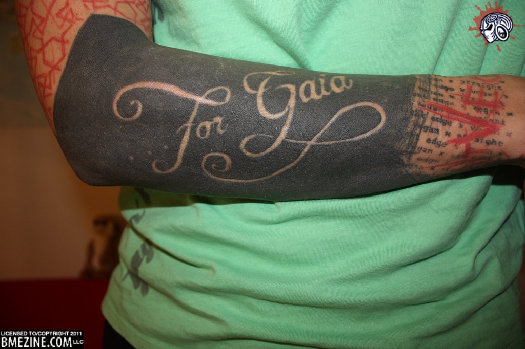
With everything going on in Australia lately, some may think that the earth has it out for them.  Of course, this isn’t the case and they’ve just had a horrible string of luck lately.  This does still make some think of the earth, as well as those mythological figures people have attributed to the planet over the centuries.  In Greek mythology, Gaia (or Gaea) was the primal goddess of the earth, the forerunner to Mother Nature.  Taking a look at this blackwork/cutting combination you can see how even today the myths stay strong.

Of course this could be a cutting dedicated to a person, or possibly the video game.  In any case, the flowing script provides a nice contrast against the black and the other writing on the wrist.

You can check out the full sized image in the blackwork and tribal gallery, as well as in the miscellaneous cutting gallery.

BMEBoy, Beard, and Blackwork

I’m pretty certain there are quite a few ModBlog readers who would list those three things as their favorite ModBlog topics.  So why not put them all together?

This dashing young man goes by the name of Somekindarobot, and wouldn’t you know it, it’s his birthday tomorrow!  So lets wish this bearded gent a very happy birthday.

If you’re a big fan of his arm, you can check out more in the tribal and blackwork gallery.

Welcome to BME

According to the description attached to this photo, Toino has been working on his tattoos non-stop for the past three years.  After getting work done by Richard Van Pelt, Stefano Negro and Hohepa Goebel, Toino has decided to sign up to BME to become a member of the community.

Let’s give him a nice warm welcome.

Living De Stijl

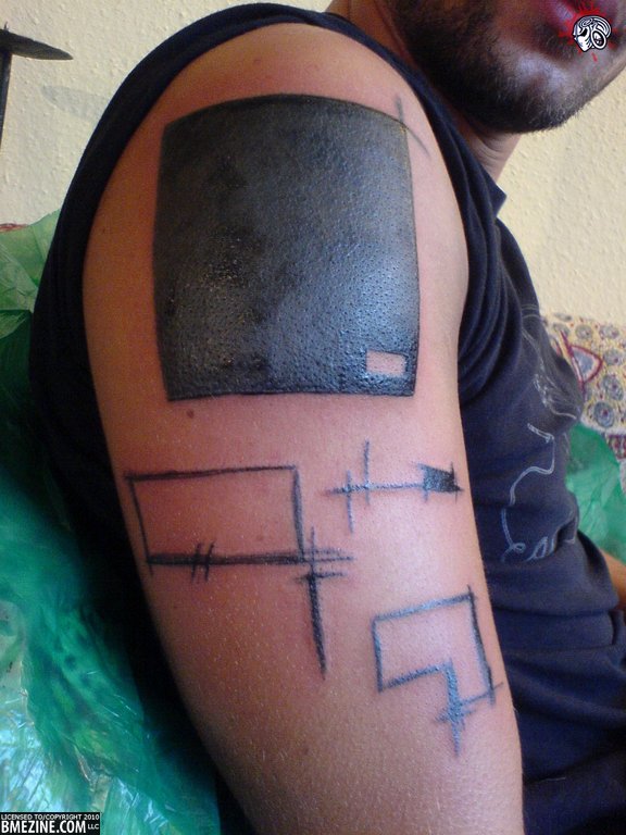
For those who aren’t art history majors, De Stijl was an artistic movement from in and around the 1920s.  You may not know it by name, but you’d probably recognize some of the art.  Most notably Piet Mondrian’s Composition series, a white background with thick black lines filled in with red, blue and yellow.  The movement was wide reaching and affected not only artists, but architects, fashion designers, and even a musician.  The key elements of the movement were horizontal and vertical black lines, rectangular forms, and only incorporated red, blue, and yellow for colors, as well as black, white, and grey.

IAM: KnifeInTheMachine has taken these elements to heart, and with the help of his artist, Jerson Filho from Brazil, have created a stunning piece that fits into the De Stijl style perfectly.
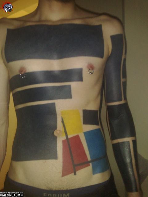
If you’re an IAM member, head on over to his page to check out some more pictures of the piece.
A Touch of Abstract pt.2

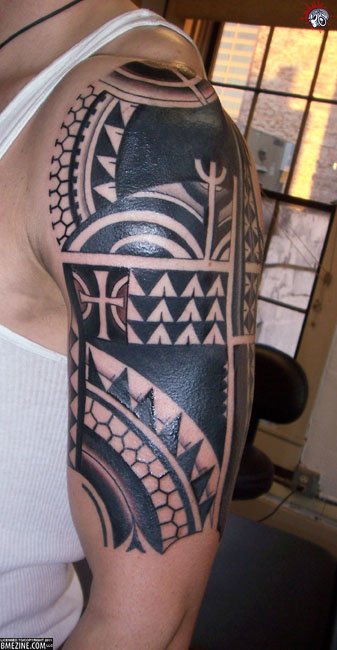
Earlier today we got to look at a dotwork & abstract “tribal” piece.  As mentioned before, when most people think of tribal and blackwork tattoos they think of clean lines and heavy bands of black ink.  In this second image from Magnutze, we see what is closer to the traditional tribal/blackwork tattoo, but with subtle abstract differences.

With the design being smaller, does it affect your perception of the style?  While the first one was covering an entire chest, this being limited to the arm compacts the design into a smaller area.  Or does this style just not sit well with you?  To some people the lack of balance is aesthetically pleasing, while to others a lack of balance can almost ruin a piece in their mind.

Back in black

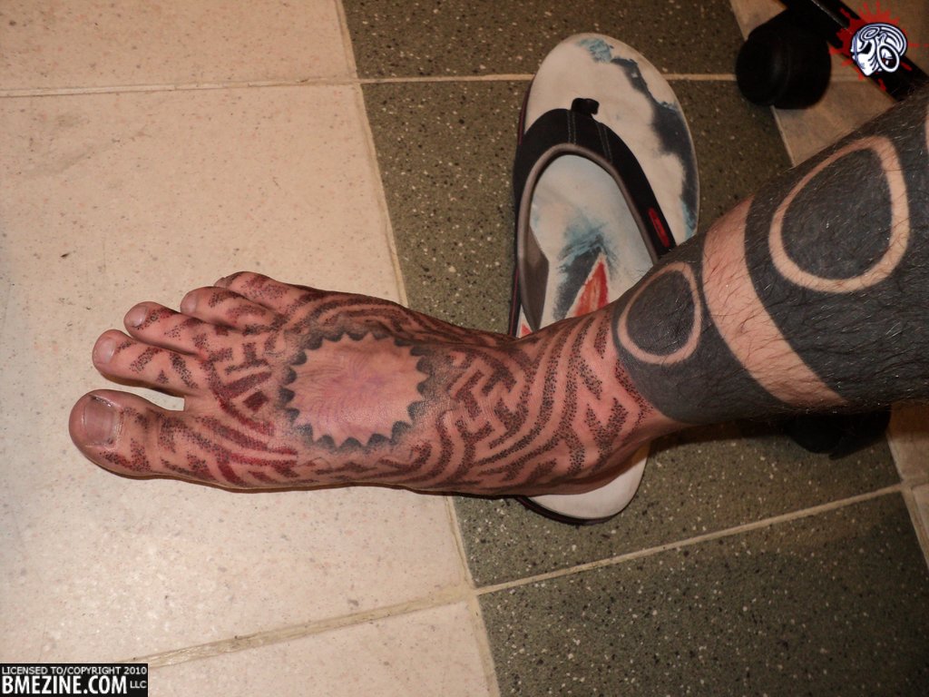
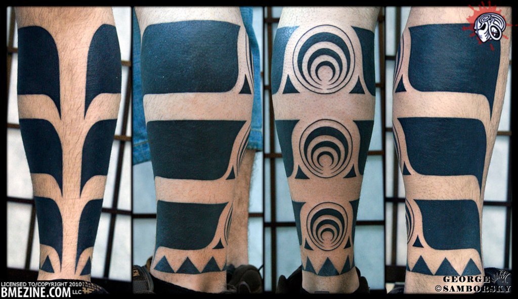
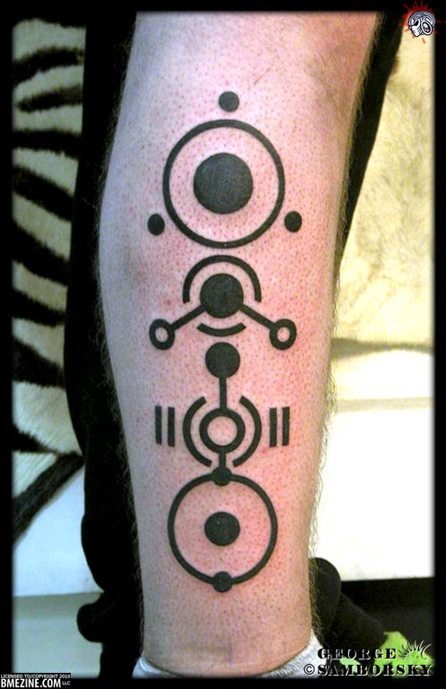
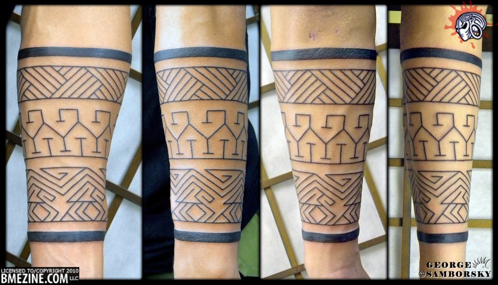
You know a day is going to be a good one when you open up the recent additions to the galleries and discover that the gang at Kipod Tattoo in Tel Aviv have sent in a new batch of photos.

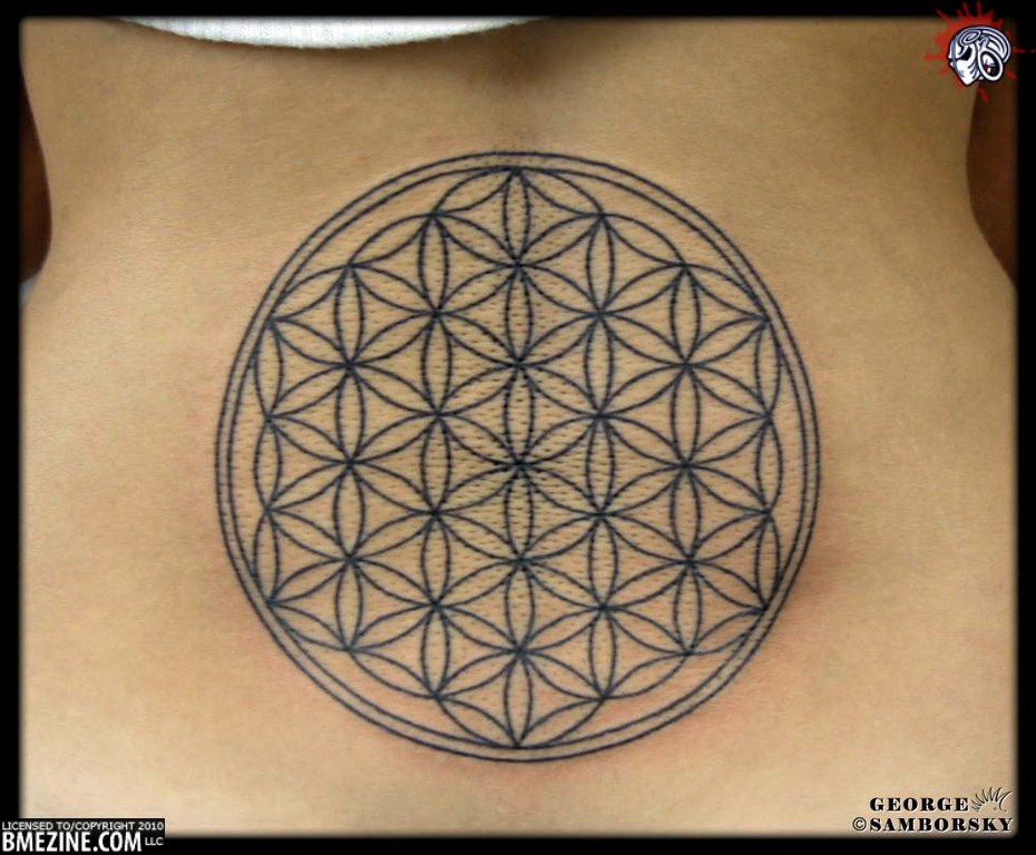
There aren’t enough good things to say about the bevy of talented artists they have out there, so I’ll just let the work speak for itself.  All the photos below are by George Samborsky.

But wait!  There’s more!  Keep on reading to see what other intricate geometric designs George has come up with.

And this is just the beginning of it.  Seriously, stop reading right now and go to the Kipod Studio Gallery.  You can thank me later.